Today I wanted to share my latest flip with you. After an entire year of construction an incredible amount of attention and love, this beautiful home is finally ready to make long-lasting memories in. When I take a moment to sit back and look around this sophisticated flip home, my heart feels full. My heart feels heavy, because not only is this a true representation of my aesthetic, but a true love letter to the principles of design and transformation.
We gutted this house and everything in it. Every item and system in the house is brand, spanking new and every part of the design and furnishings was lovingly and methodically thought out. We put in all the latest SMART features, and used natural materials like Italian marble and onyx in bathrooms and natural wood pieces and linens in the bedrooms. Thank you to all of my friends at Visual Lighting & Co, Pinky’s Iron Doors, Vesta Home and JennAir for outfitting my dream home.
We put in a foyer, which I think is important to have in any home, and we were lucky to have enough room to raise the ceiling in the entrance in a geometric pattern that mimicked an existing ceiling in one of the rooms in the house. (What’s great is that the foyer connects to den, the formal living room and the dining room for a great flow.) The entrance to a home is so much more than just a doorway. It’s the first impression, the greeting, the invitation. It should be welcoming and warm, yet also hold a hint of mystery and intrigue. After all, the journey is just as important as the destination.
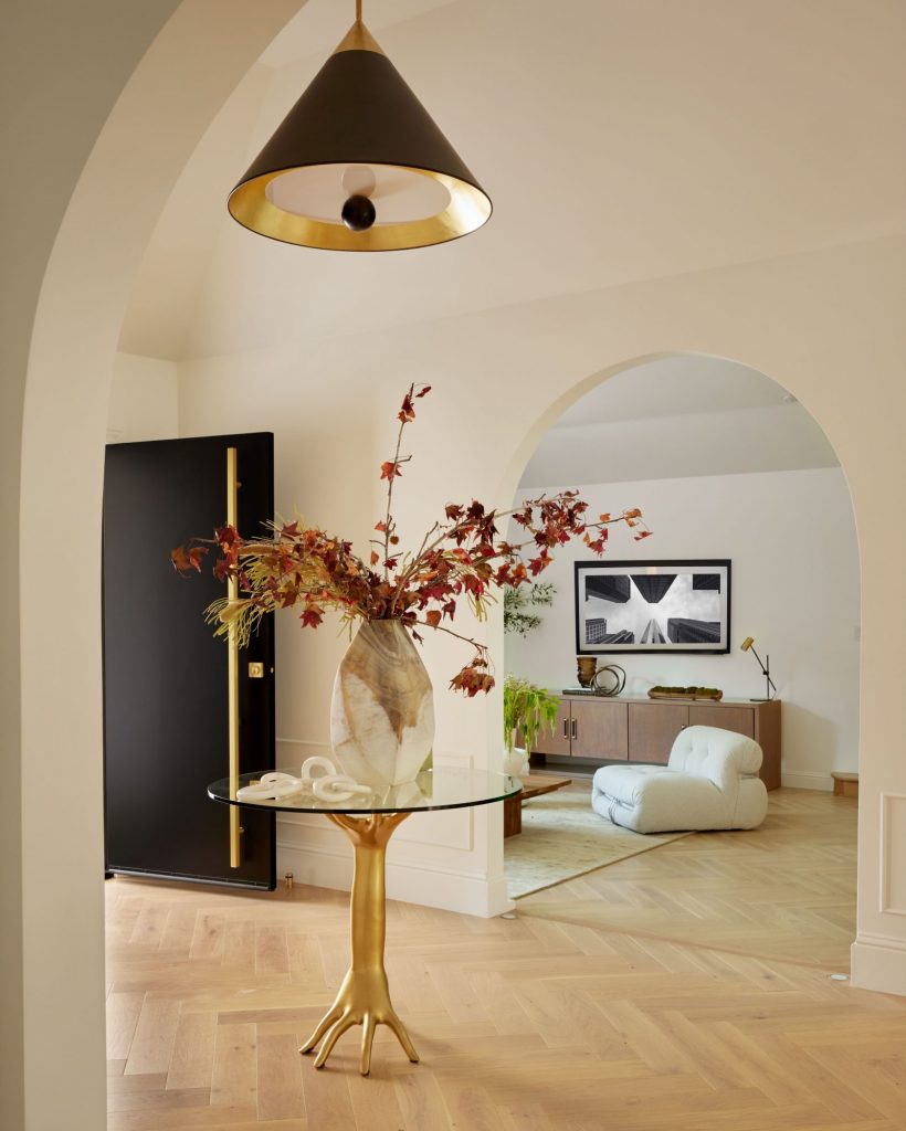
My favorite part of the house is the arches, which we used as a theme. There were none here originally but now, wherever you stand throughout the house, you see arches one behind another, giving it a great visual flow. For me, the arches really made this home, and we carried on the theme with curved marble fireplaces and shower doors. I describe the house as transitional. The home has a mid-century modern shell but we designed the interior with classical features such as white oak herringbone floors, casing around – and blocks at the base – of doors, and then we staged it with mid-century furniture.
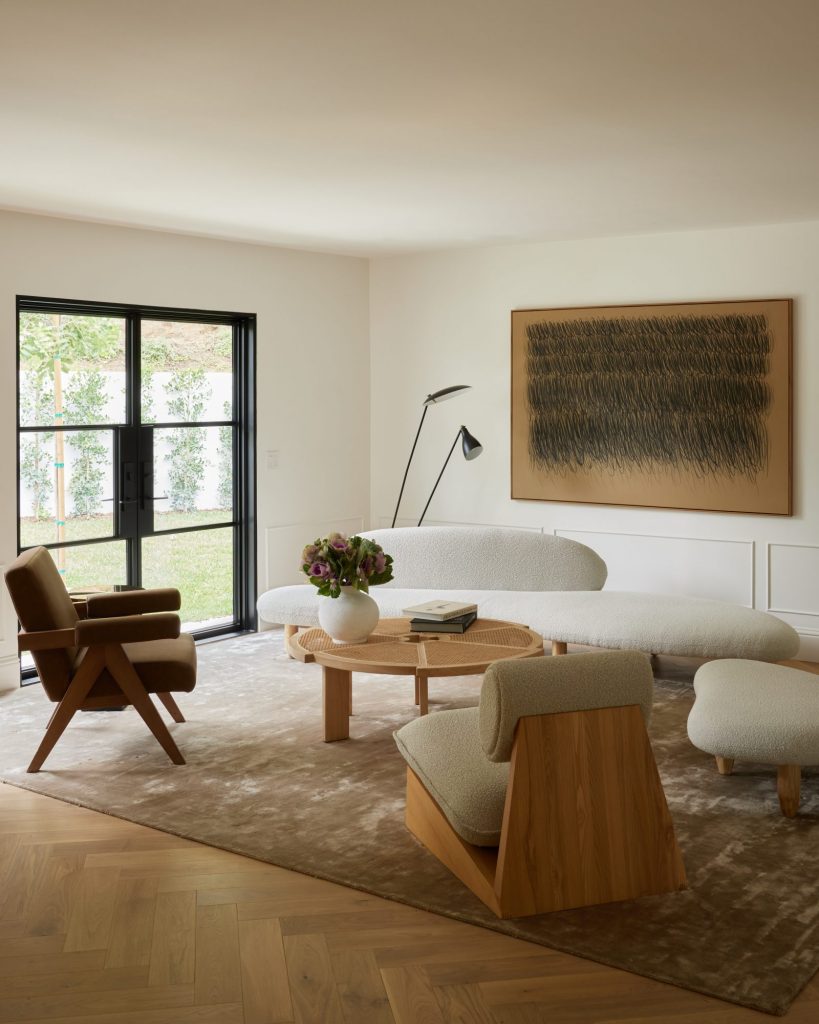
The Formal Living Room
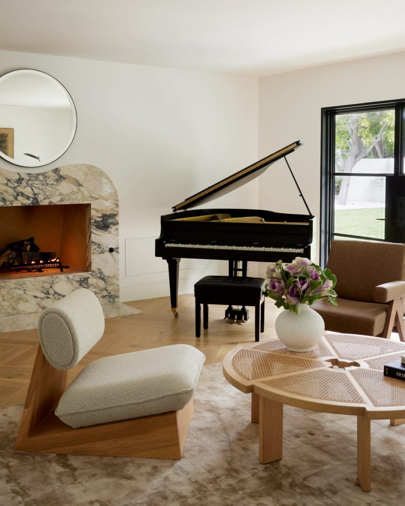
White oak herringbone floors, Calacatta Monet marbled fireplace, mid century furniture, steel doors and a baby grand piano have created the perfect Parisian look.
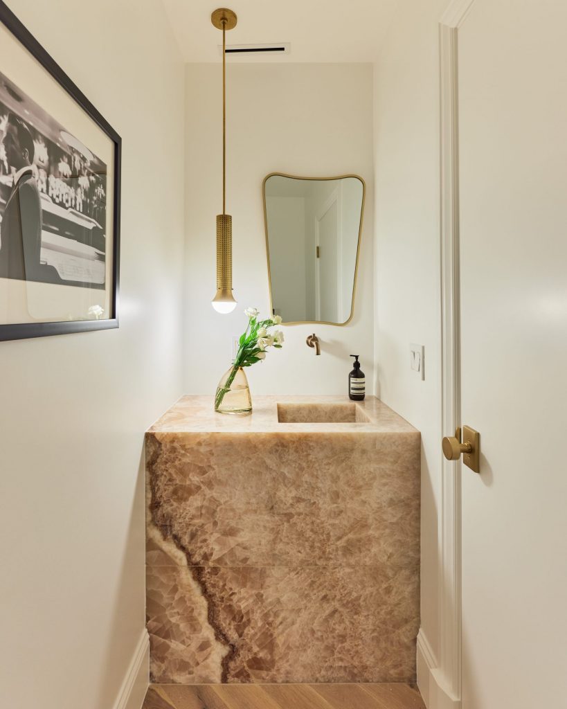
The Onyx Powder room is truly a space of unparalleled elegance and sophistication. The pink onyx slab and integrated sink are simply breathtaking, and the brass structural pendant adds a touch of luxury.
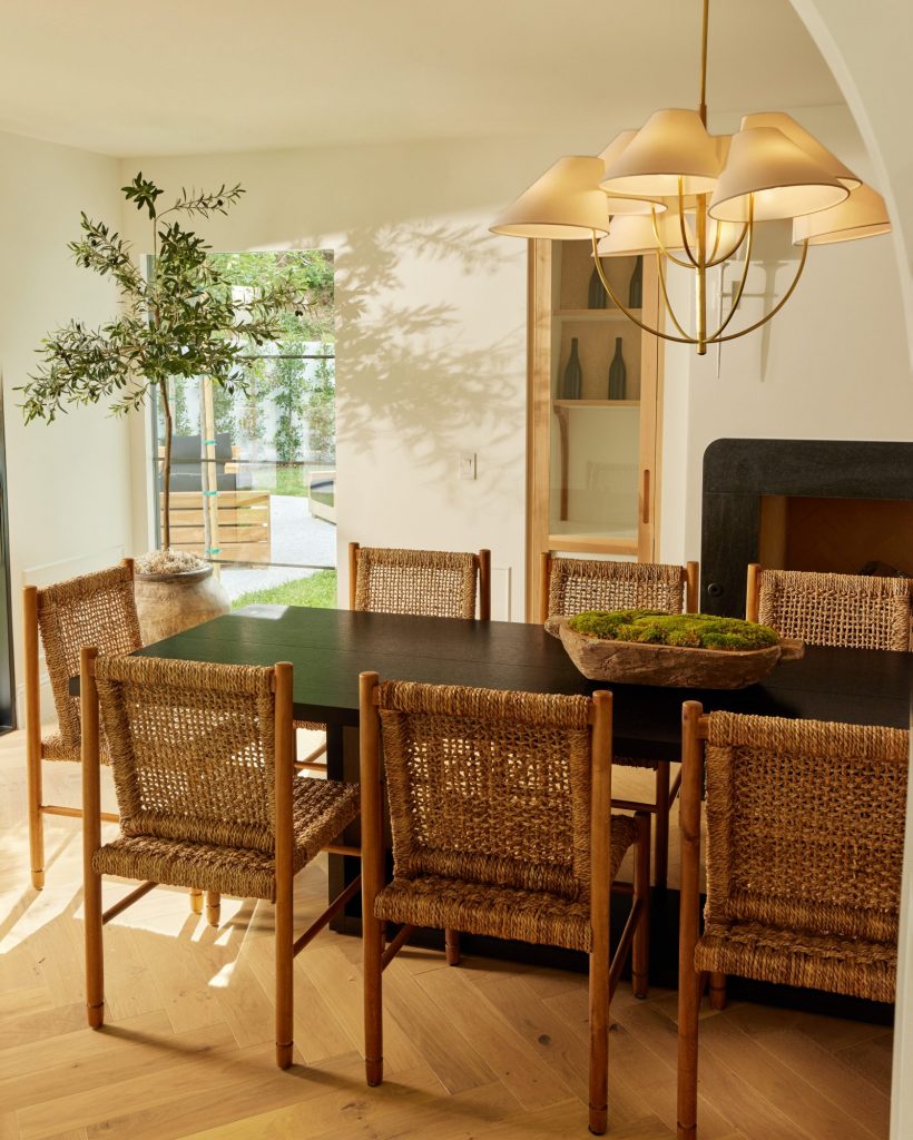
The large dining room is a great mix of casual and high end: you have a very large, black polished oak table, black rounded marble fireplace and black steel French doors, juxtaposed with woven chairs that give the room a sense of informality and ease.
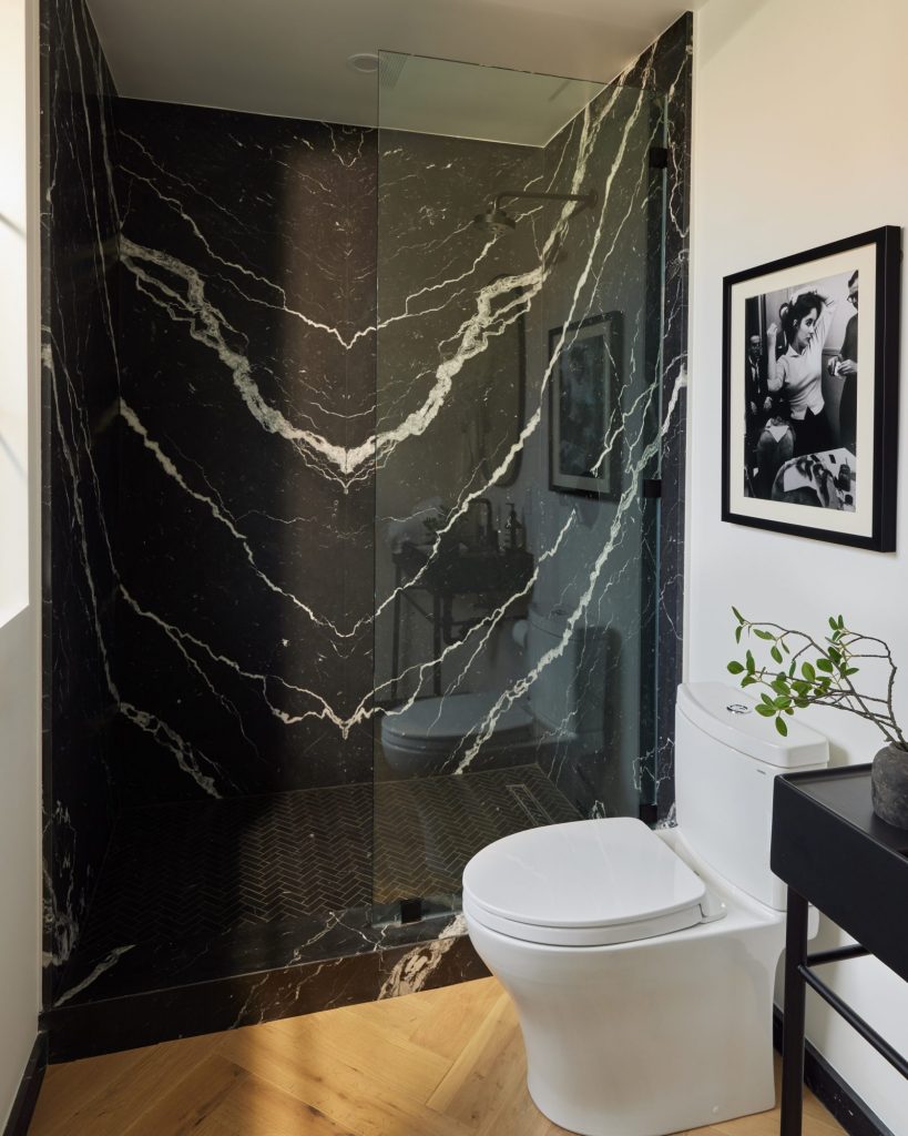
This stunning bathroom is attached to the office. The bookmatched Nero Marquina marble walls and Nero Marquina herringbone floor create a sense of elevated elegance and timeless sophistication that is sure to impress. The Matt black fixtures add a modern and cultivated touch to the space, creating a striking contrast against the marble and herringbone surfaces. But it’s not just the materials and finishes that make this bathroom so special. The finishing touches, like the Elizabeth Taylor classic framed photography on the walls, add a touch of nostalgia and sophistication. These elegant and timeless pieces add an extra layer of sophistication to the space, creating a truly luxurious and indulgent experience for the lucky homeowner.
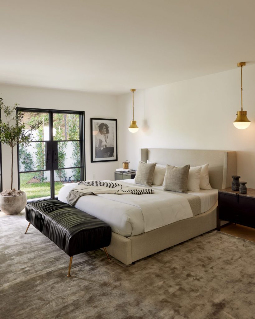
The Primary Bedroom
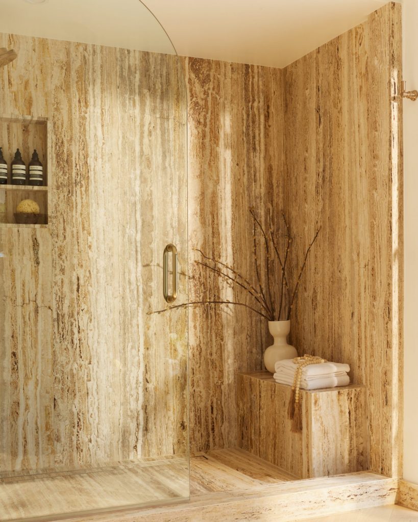
The Primary Bathroom – I designed this curved shower glass door as an ode to the arches that are seen throughout the architecture of the house. Slabs of Antolini Silver Travertine Titanium Vein line the shower walls.
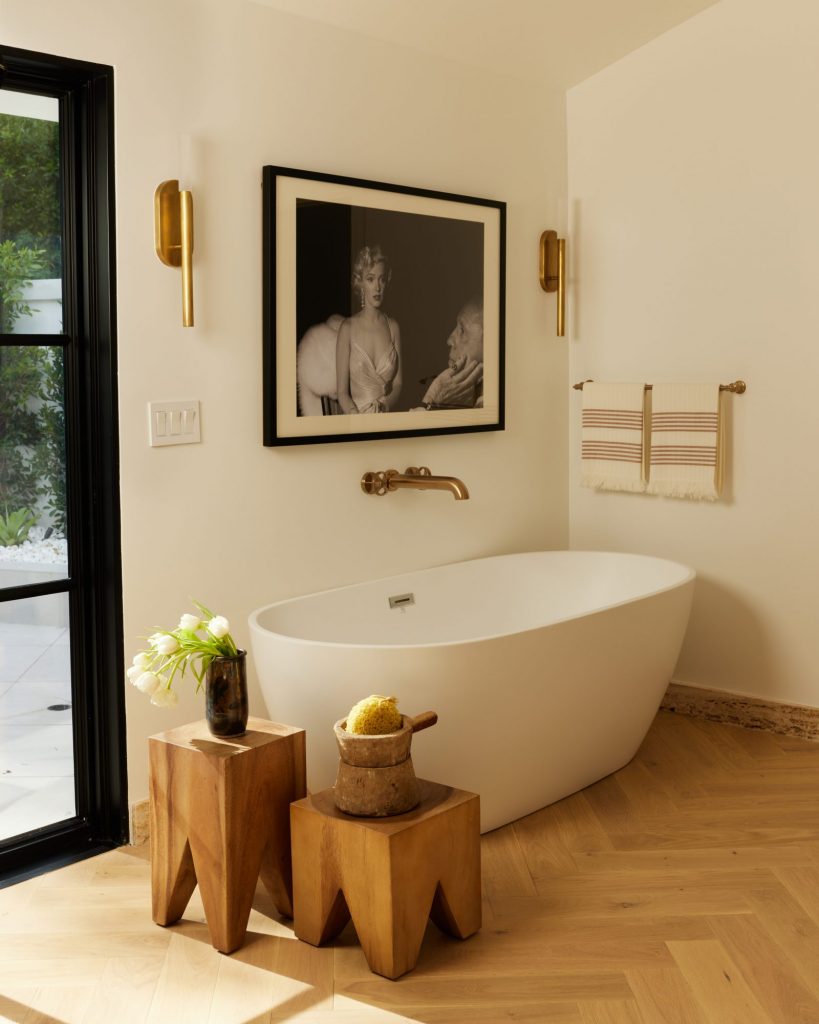
Marilyn Monroe’s iconic smile and sultry stare adds a captivating effect to any space, making her an ideal focal point for the mesmerizing primary bathroom. The antique-burnished brass and etched crystal sconces complete the overall look to create an inviting aesthetic that is calming, serene and glamorous.
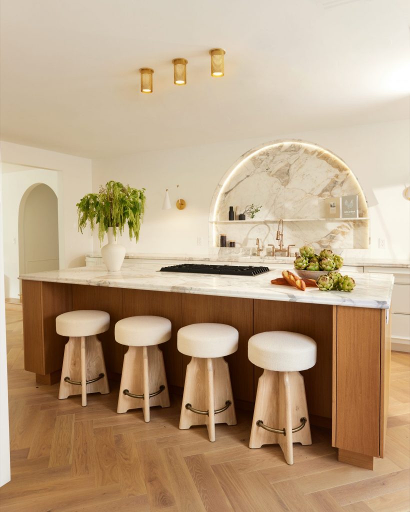
The “No Kitchen Kitchen” – To have total artistic freedom to be able to create the kitchen of my dreams is precisely why doing a flip project is so rewarding. This kitchen exudes sophistication and refinement, with the addition of luxurious Calacatta Paola Vagli countertops and custom cabinets with discreet hidden hinges and the exclusive Nina Takesh applied moulding. The open and airy layout, characteristic of the “no kitchen kitchen” design, enhances the overall aesthetic of the space, creating a harmonious and elegant environment for culinary pursuits.
The combination of form and function in this kitchen is what truly sets it apart. Additionally, the inclusion of library sconces and flush mount mini pendants from Visual Comfort & Co enhances the overall ambiance of the room, casting a warm and inviting glow. The attention to detail and careful selection of every element in this kitchen truly makes it a one-of-a-kind.
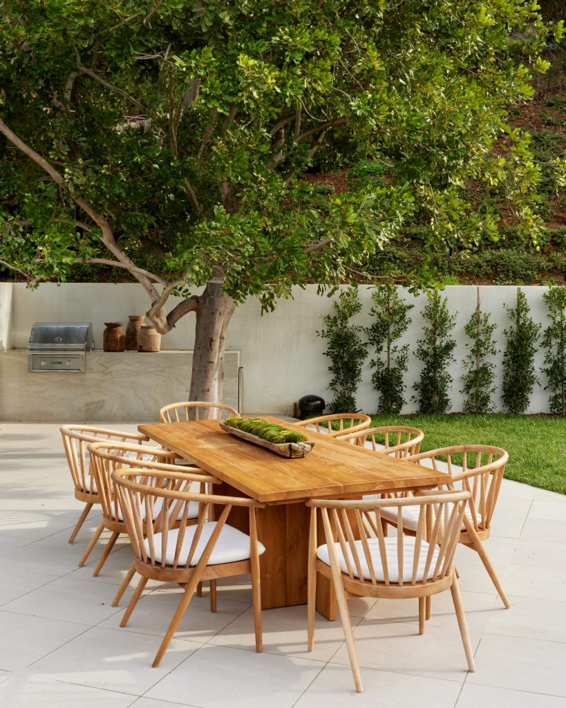
The back yard is expansive and very private. When we first saw it, it was lacking maintenance and there was basketball court stuck in its middle. We opened the yard up and created a retaining wall, fire pit sit-down area, a dining area, and a white plaster hot tub for soaking in while gazing at the stars.
This project was a true labor of love. It took a lot of time and dedication. When we first toured the home, it was a dilapidated ’50s house that hadn’t been touched since the 1970s and boy, did it look like it. But we saw the potential. Why? Because it was a 3300-square-foot, single-story home on a 20,000-square-foot flat lot with large, spacious rooms. Not to mention the lot has a private driveway! (It’s getting harder and harder to find those in Los Angeles.) As always, I hope to inspire you to follow your passions, thank you for letting me share mine.
Love, Nina Xx
