Beauty

Nina’s Prime Picks

Summer is officially here and you know what that means? V-A-C-A-T-I-O-N! And guess what else? Lucky you, Amazon Prime Day is here just in time for you to get all of your travel essentials! From July 12-13, Amazon has the BEST deals, and I have searched deep into the vast array of products at Amazon to give you my must have travel and home essentials.  No matter where you’re headed, make sure and check out my trip organization suggestions. After all, when you are organized, you are less likely to lose items.  Especially when traveling from hotel to hotel.  So without further ado, go ahead and check out my favorite Amazon Prime Picks:

Decor

Shop With Me: CB2

All photography is courtesy of CB2.com

This week I went shopping at one of my most favorite stores: CB2. I can’t wait to show you what I found and I’m going to tell you specifically what pieces are must-haves.

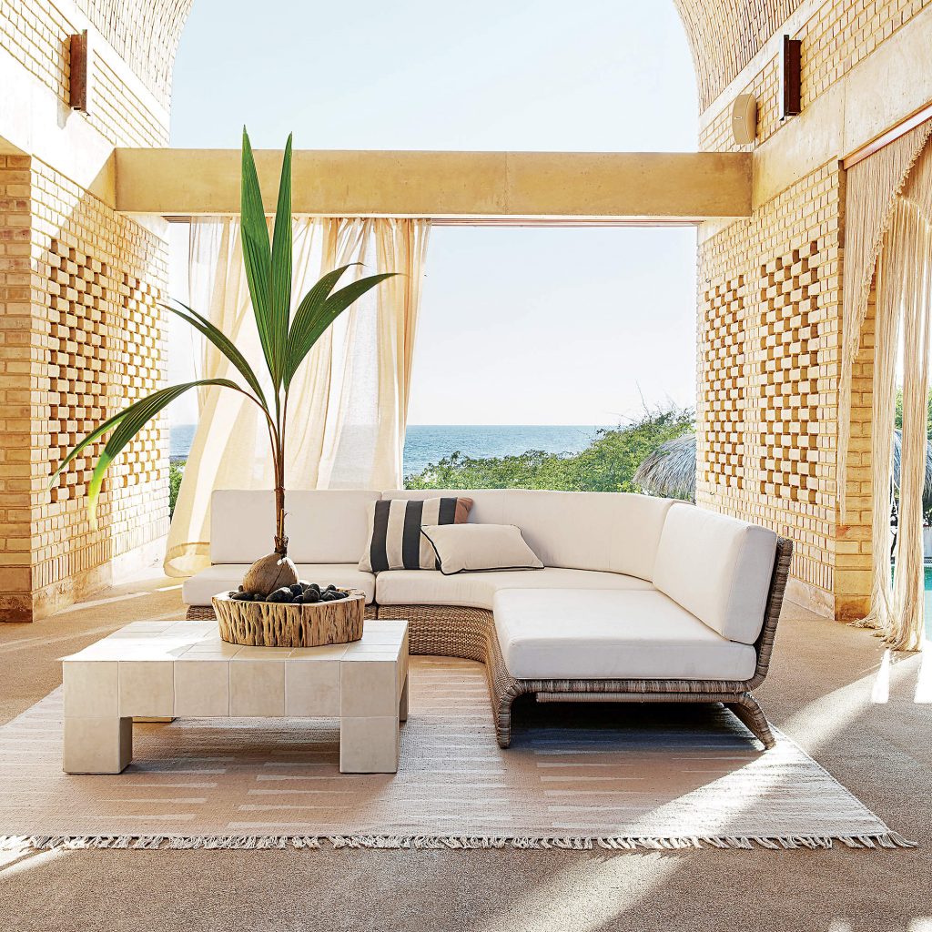
CB2 is by far one of the best secret destinations for designers. We love the store for its quality, high-design items. I adore this Foss three-piece outdoor sofa. For $5500, this is not a bad find, and you could also put it in your living room if you wanted to! It has a curved frame wrapped in a woven resin rattan for a great sculptural look from every angle. The cushions are in durable, easy-to-clean fabric.

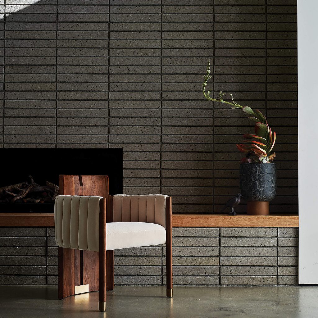
Lawson-Fenning is a high-end brand that has partnered with CB2 and this Muir Half Moon dining chair in velvet ivory is so elegant. I love the solid brass detailing at the bottom  that accents the deep richness of the wood.

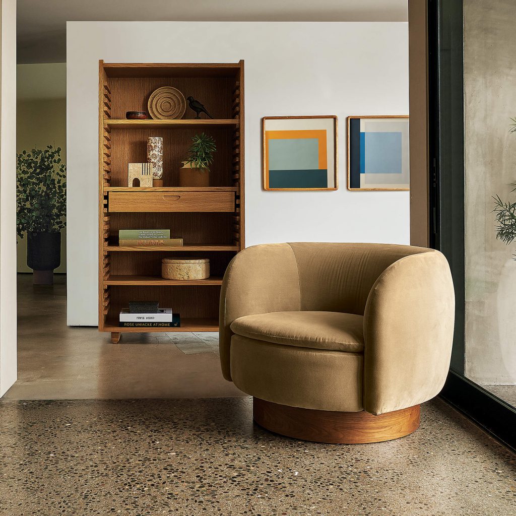
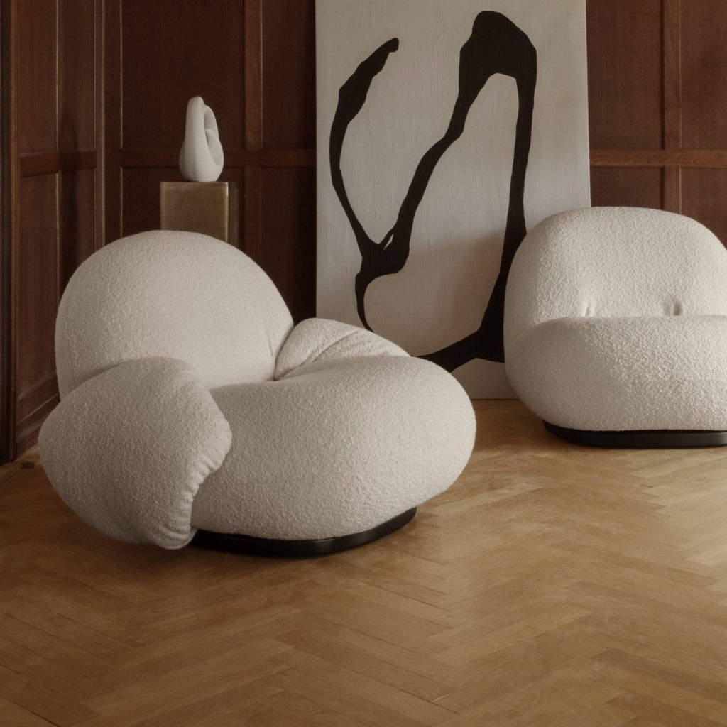
The velvet Muir swivel chair in camel at $1300 is probably my favorite item in this collection.

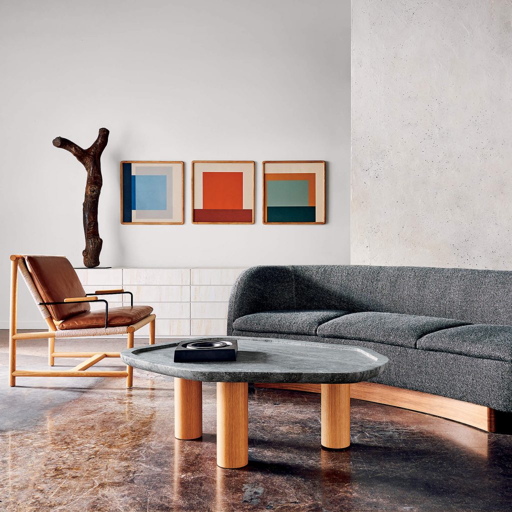
The sofa is great too: an arched silhouette mirrored by wood legs that bend and follow the curve, chunky wool fabric and lots of plush cushions.

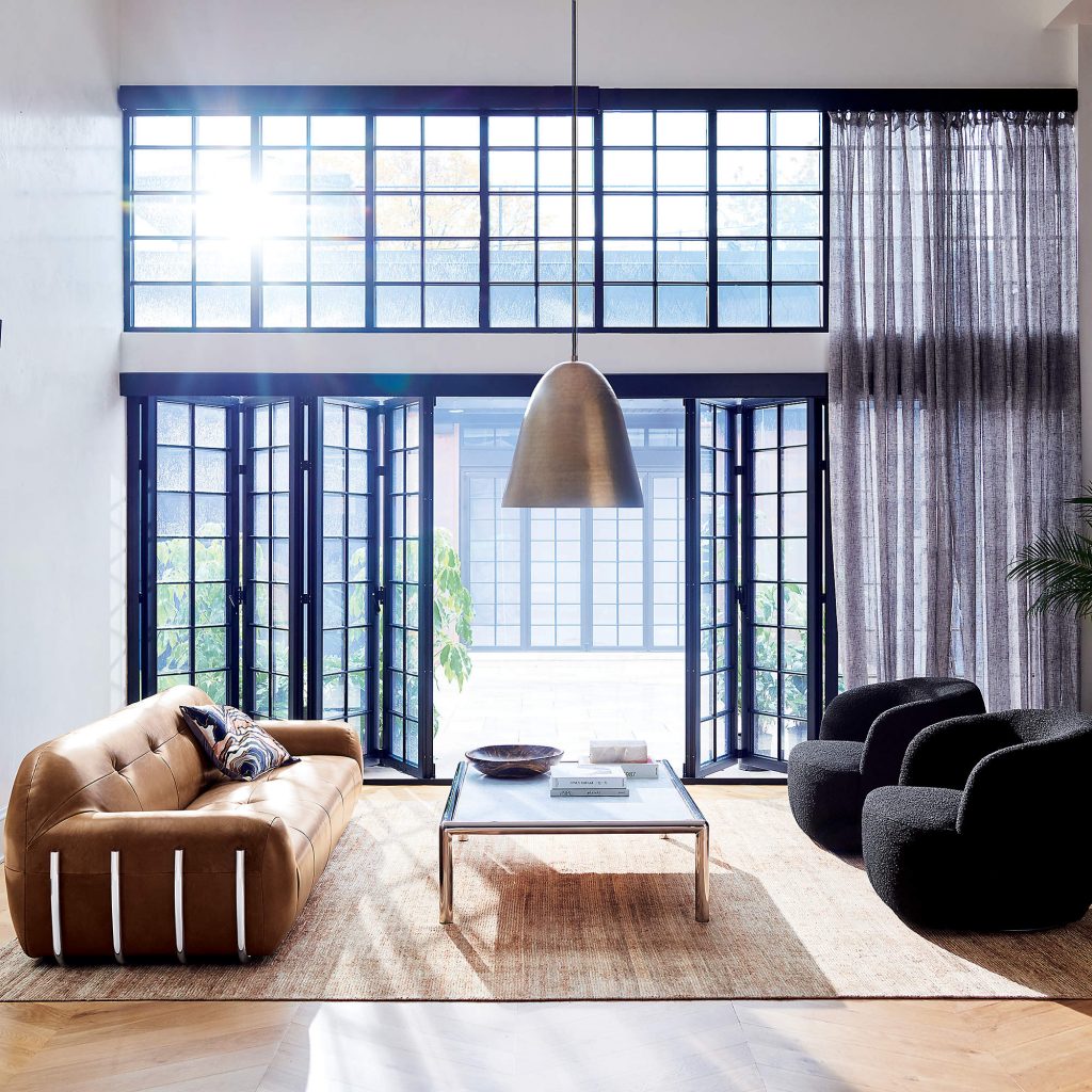
The ‘70s are back, people! This Jannis Ellenberger couch has rich leather and natural distressing. The tobacco color is beautiful and this piece retails for $4000.

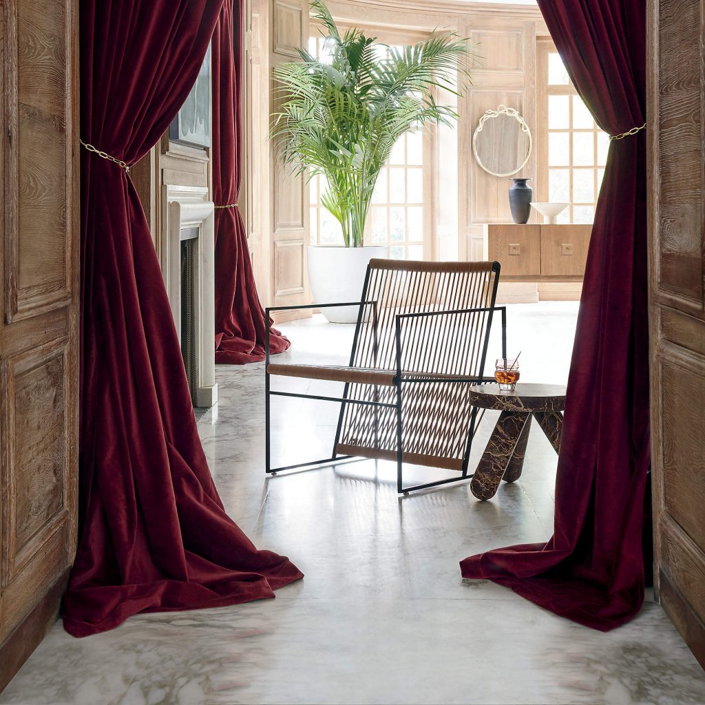
Look at this gorgeous loom leather lounge chair by Indian designer Ayush Kasliwa. It has thin strips of untanned leather woven tautly across a glossy black metal frame giving it dimension and a sculptural quality. At $699 this is very elevated.

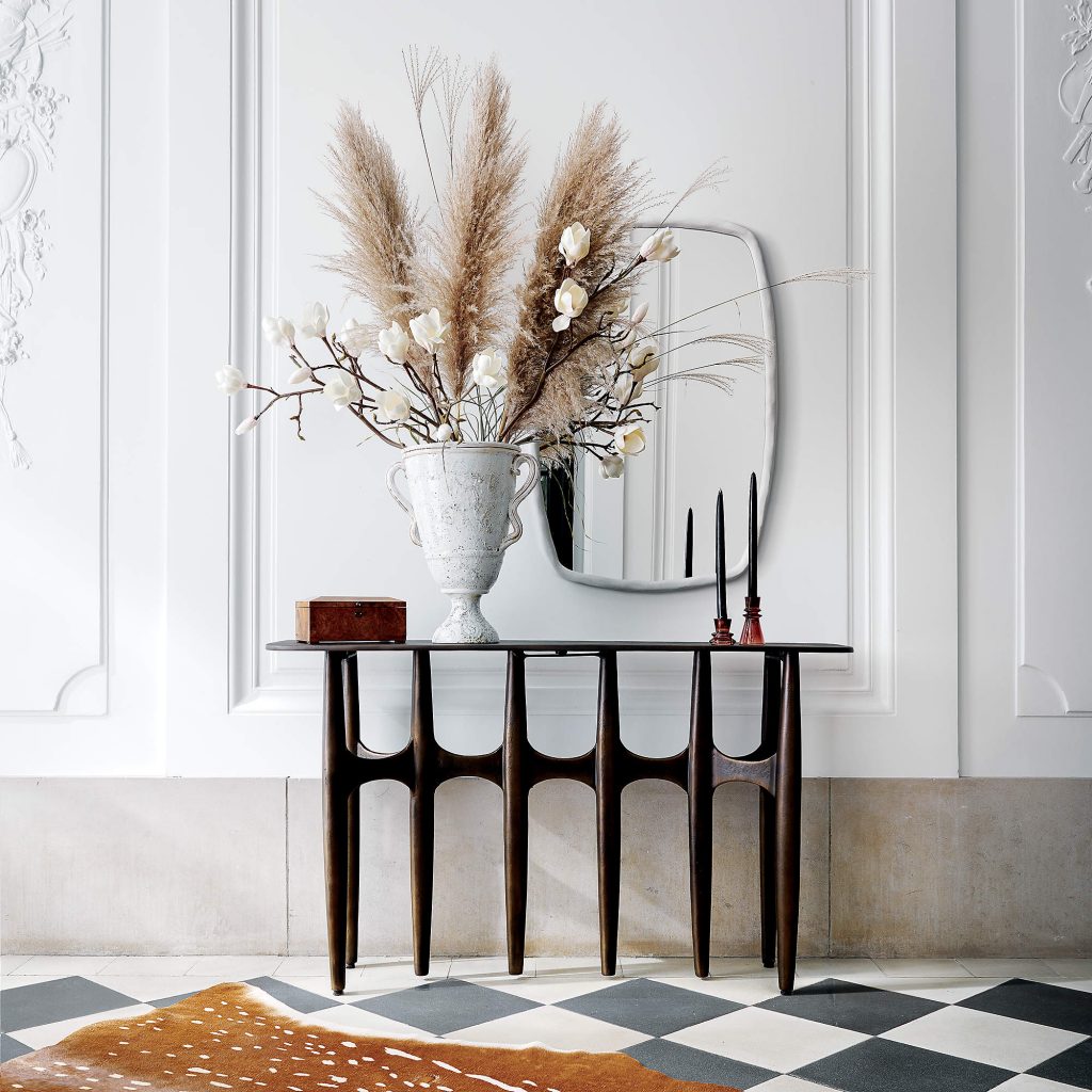
I also like this console table designed by Amanda Ip of Slate Design, a Brutalist-inspired piece that will stand out no matter where you put it. It’s made of a textured cast aluminum and has a dark bronze, powder-coated finish. Its subtle demi-lune shape is curved in front and flat at the back so you can put it up against a wall or behind a sofa. At $899 I think it’s a great buy.

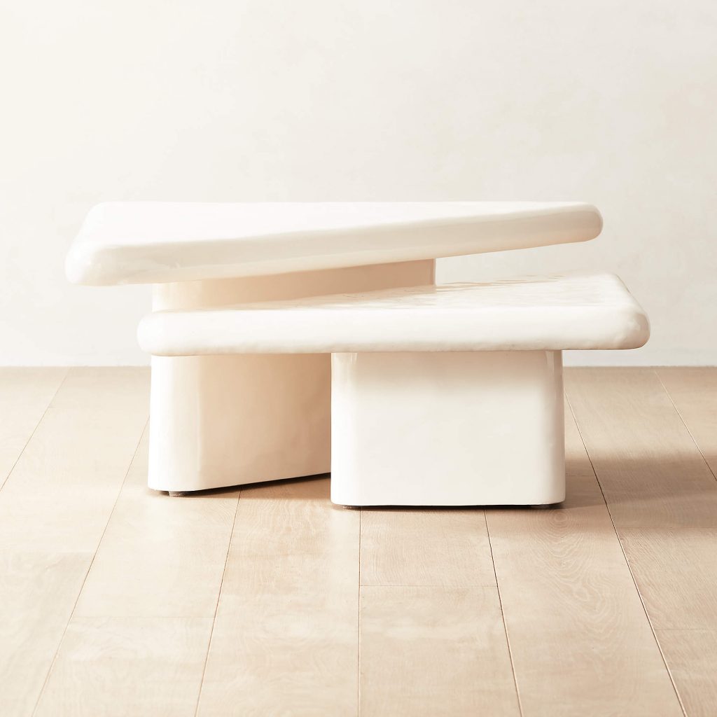
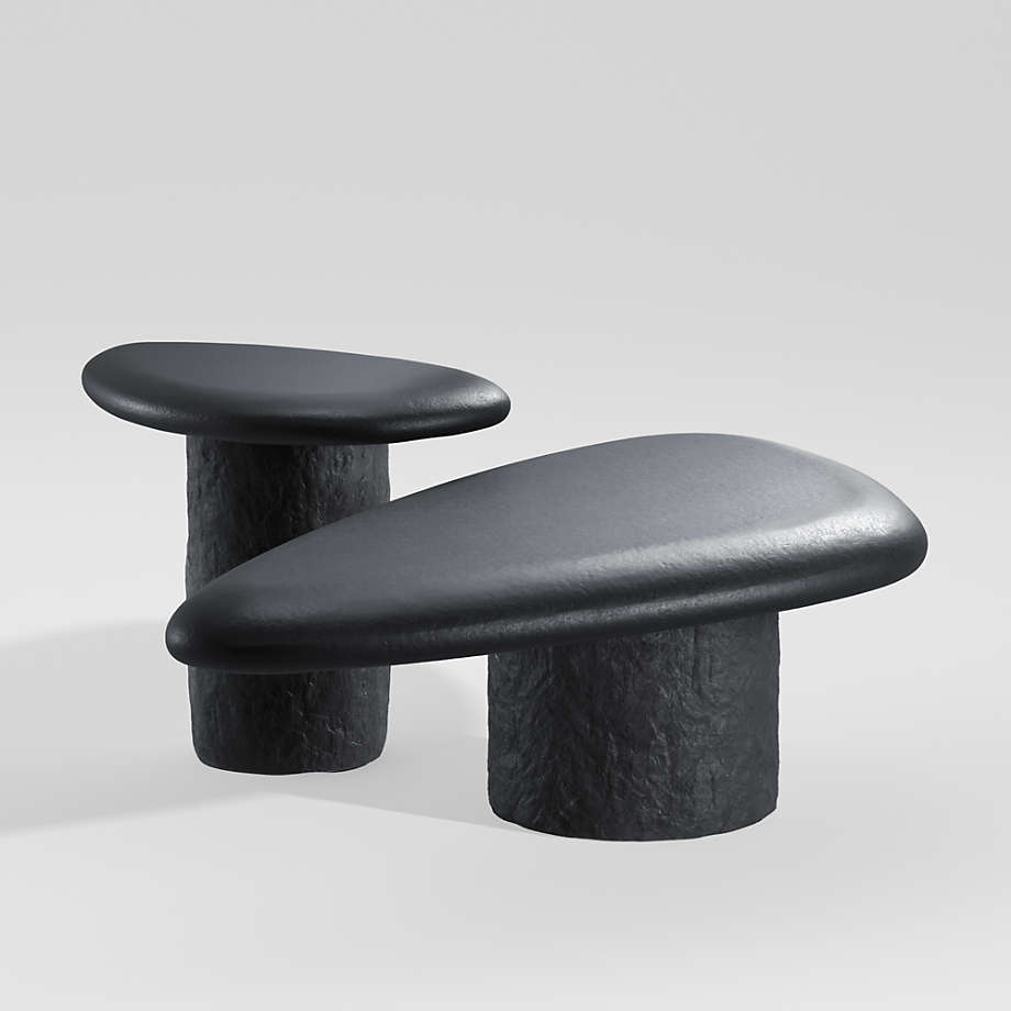
This double coffee table is very cute and would work great for outdoors. It’s made of concrete triangular tops in a high-gloss wavy finish with curved edges and is another piece that is inspired by the ‘70s.

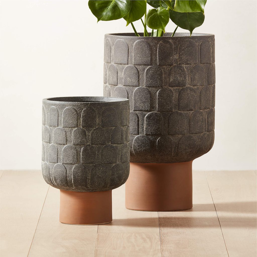
A lot of CB2’s planters are great this season and I like this style which retails from $129 to $249. Designed by Lawson-Fenning, it’s made of sandy black earthenware and has a footed base in clay.

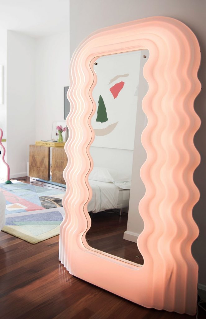
Let’s not forget this gorgeous mirror by Brett Beldock framed by buffalo bone and black resin.

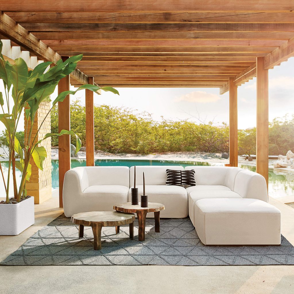
I got the chance to lounge on VUUE’s Suelo four-piece outdoor sectional that’s upholstered with weather resistant fabric. The slip cover attaches to the frame for easy removal and cleaning. It runs at around $3800.

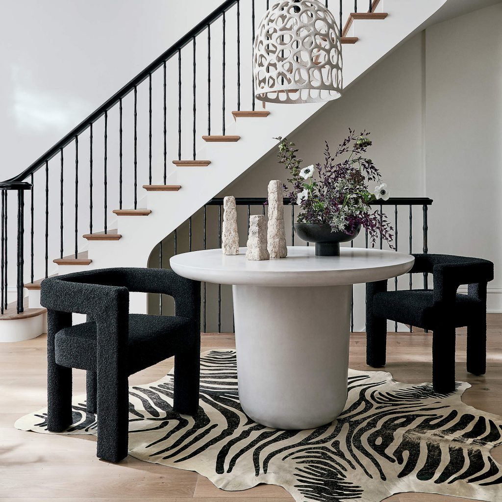
One of the best sellers in CB2’s collection that continues to remain in the collection is the Lola round dining table that has a plump base and rounded top made of a concrete mixture. It’s great for a foyer, priced well at about $1100 and I think it’s a great find.

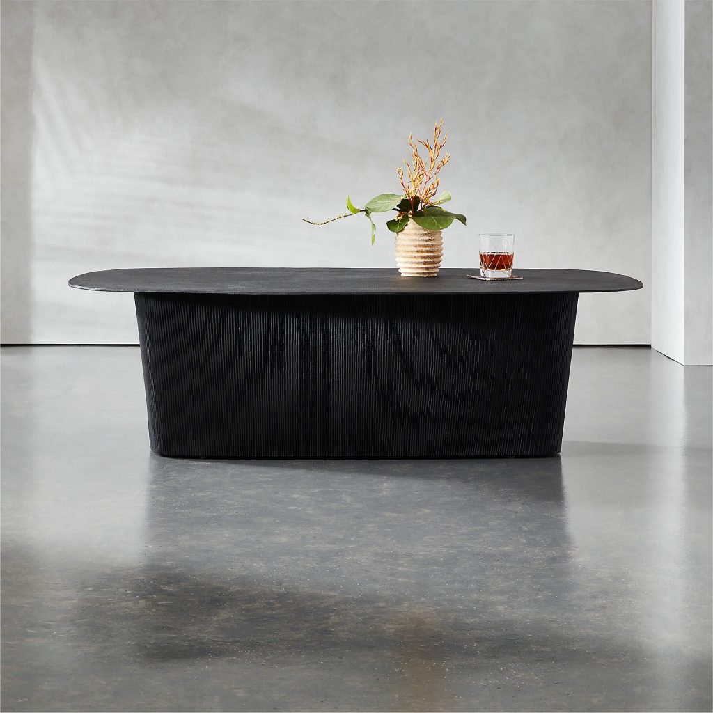
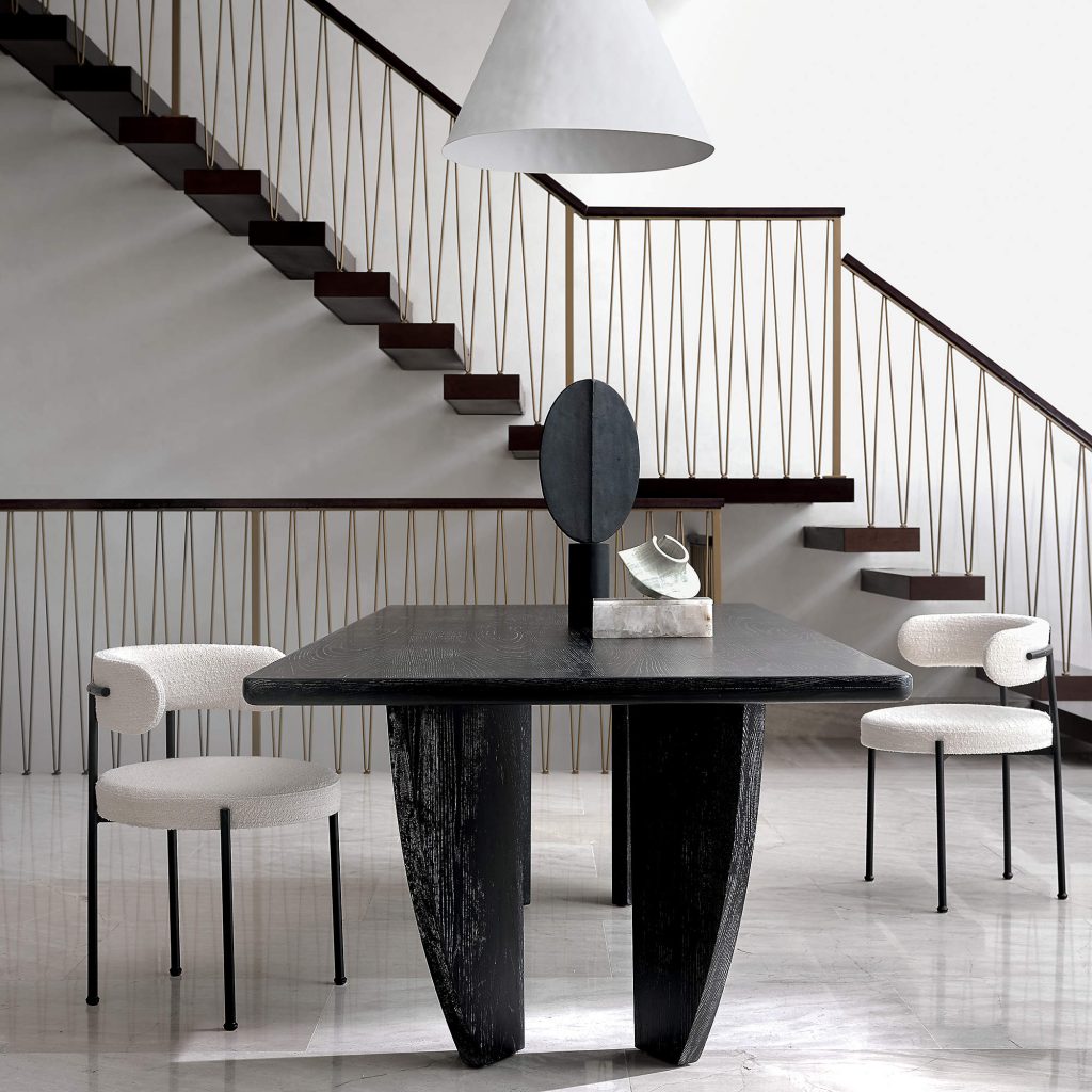
I’m obsessed with this table that is completely hand-cast and has a great fluted base. A black finish creates a rich contrast and texture.

This Angolo espresso velvet sofa is on sale for about $2000. It has an acacia wood frame with a walnut finish and unlacquered brass details. Paired with this Escapade boucle lounge chair for about $800, it’s a home run.

I’m always on the lookout for a large dining table and this cerused ash wood one at $1899 is perfect. It has been wire brushed and then stained black allowing the wood to reveal a varied grain pattern.

And look at this gorgeous little chair. It’s made of matte black steel with wood armrests and makes a great chair to pair with the table.

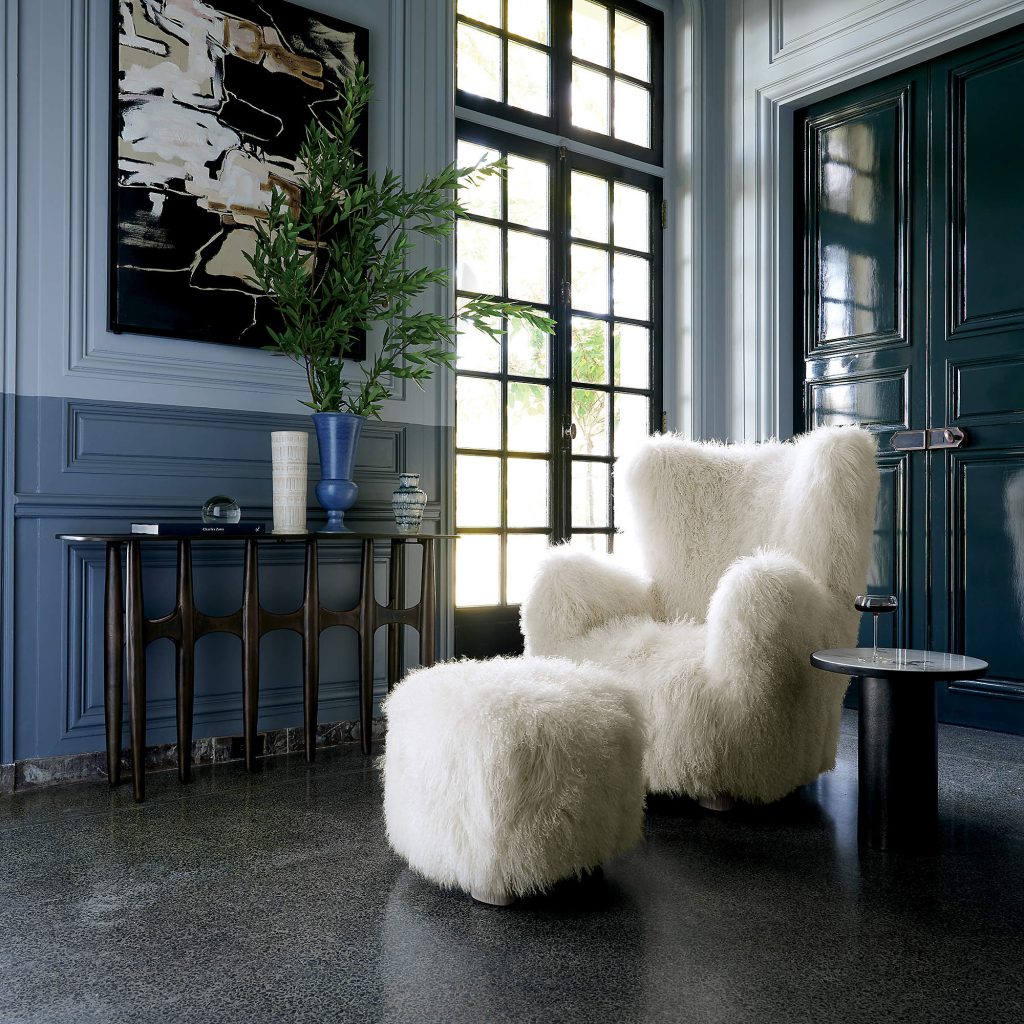
 There’s no question that my most favorite piece in the entire store is this statement piece of a classic wing chair designed by Ross Cassidy that is wrapped in Mongolian sheepskin. It’s finished with wire-brushed feet made of bleached oak and has a matching ottoman.

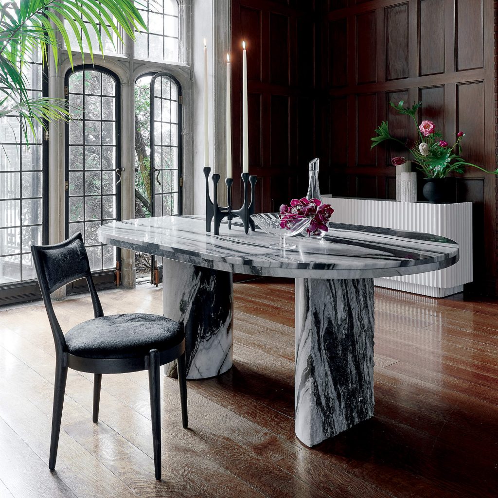
Holey moley, this black and white spider marble oval table with subtle green undertones is by Brett Beldock and, at $3500, it’s expensive but fabulous.

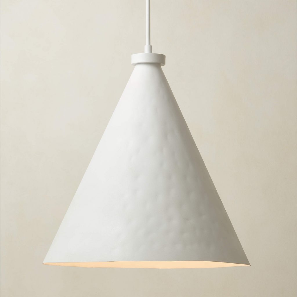
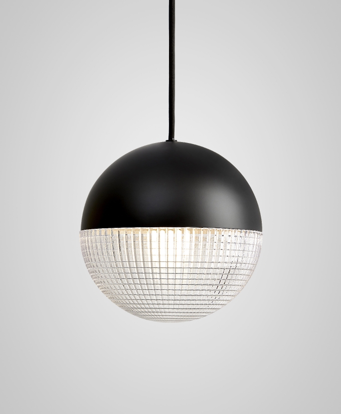
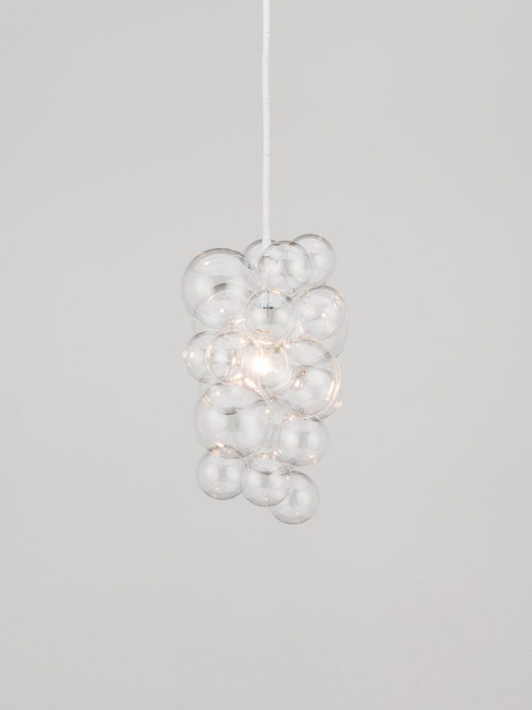
And I left CB2 with this Lani white pendant light. It’s made of iron finished by hand with a plaster-like texture for a simple but attractive statement and at $499 it’s a must-have.

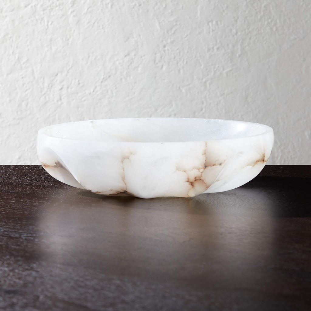
One of my favorite pieces is this alabaster scalloped bowl. I use it in every project. It’s hand carved, then polished and has rich brown tones darting through it. At $299, it’s pricey, but worth it.

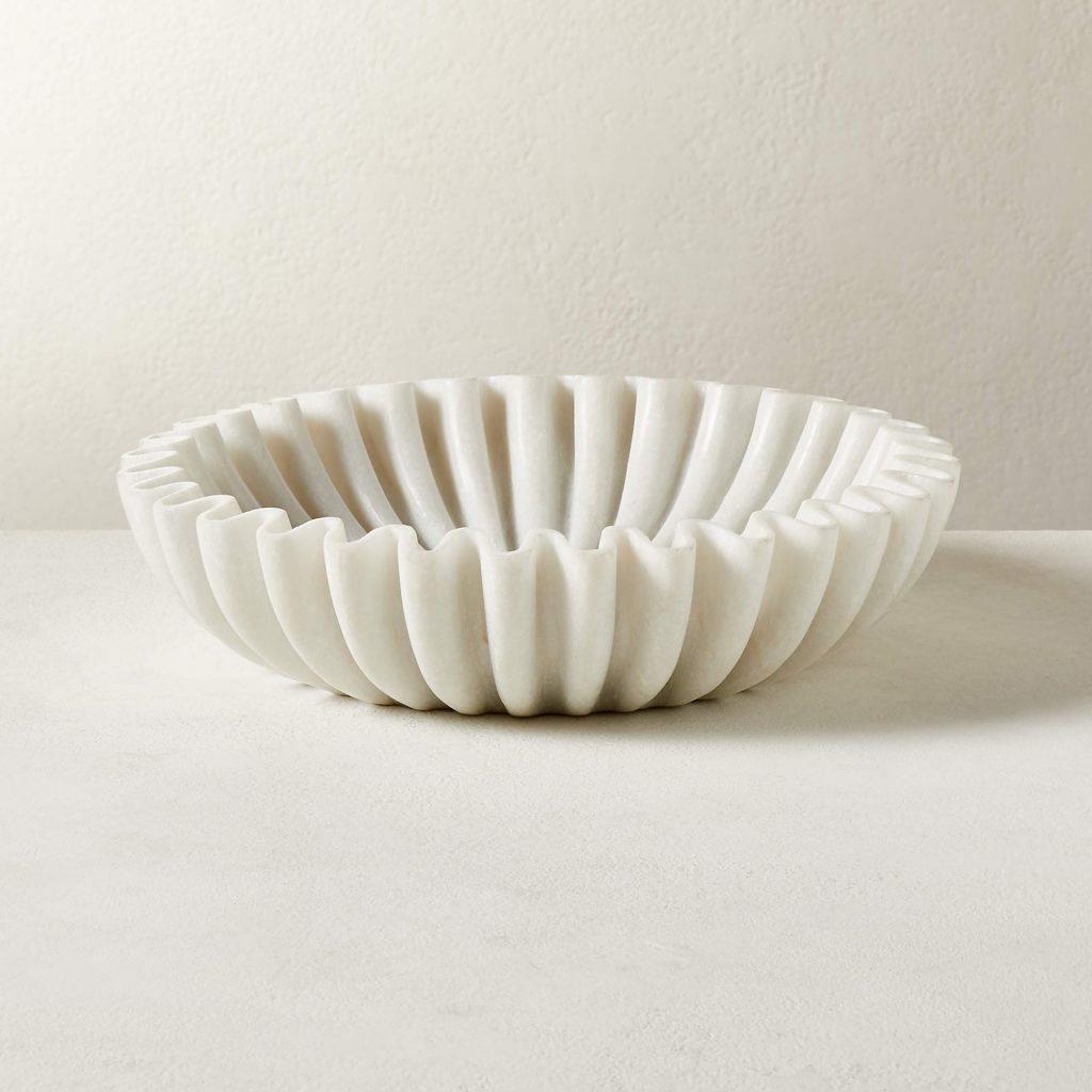
Another one of CB2’s bowls I am in love with is the Reve round fluted white marble bowl. It’s a perfect place for trinkets or keys, also at $299.

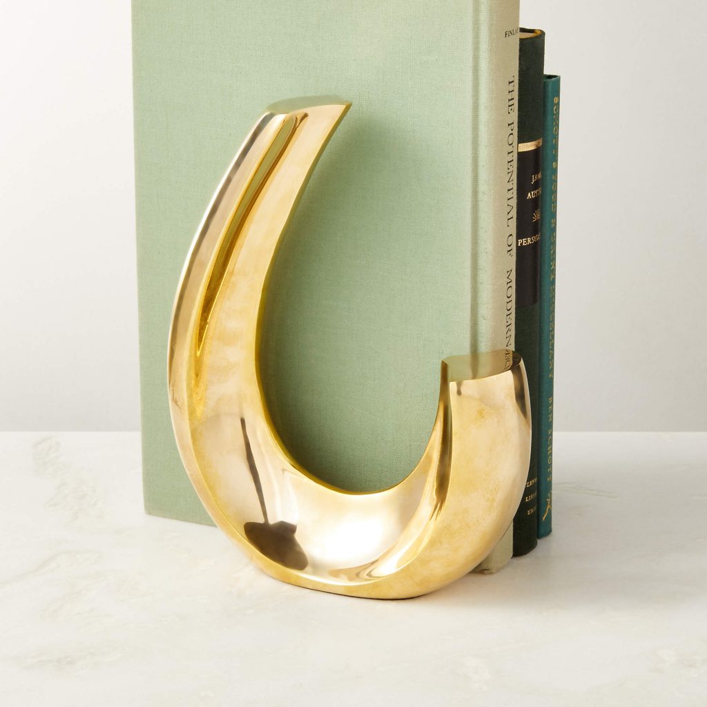
I love looking at CB2’s décor items. They have such a wide variety and I would definitely buy one and use it on your decorative shelves. I particularly like the graceful curve and gleaming finish of this brass bookend. And remember: it’s pretty and practical.

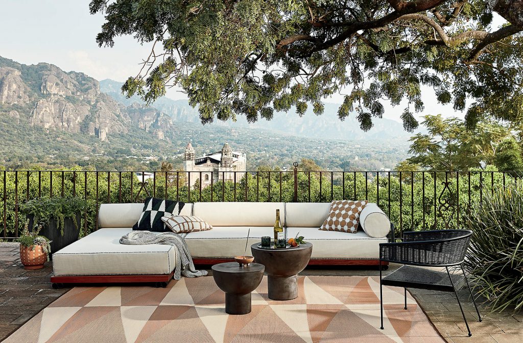
This three-piece modern, low-profile, outdoor sectional sofa by Brett Beldock is perfect for a Sunday afternoon in the sun with friends and margaritas. It has a matte black aluminum pipe frame, a medium-toned mahogany platform and the rounded back pillows are piped in and black and white stripes. It’s comfortable, has great style and is a great find for summer.

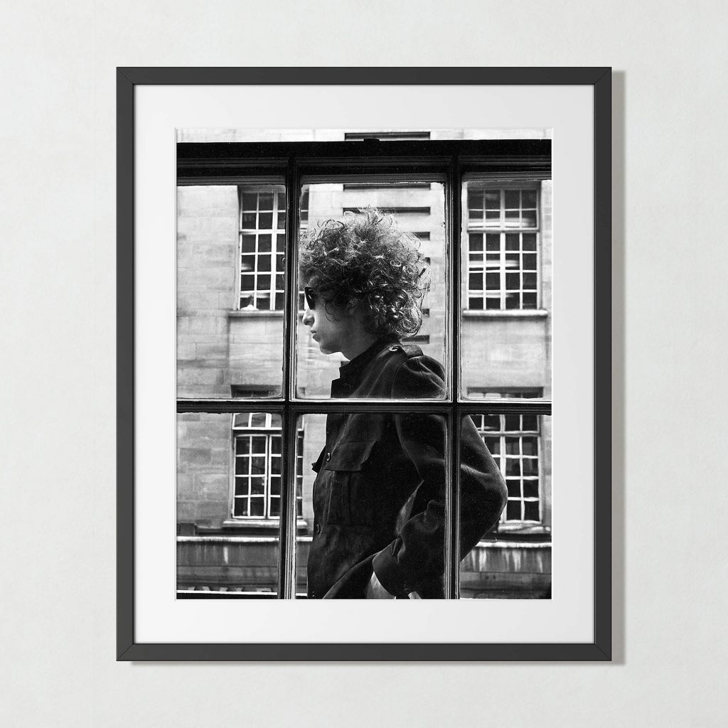
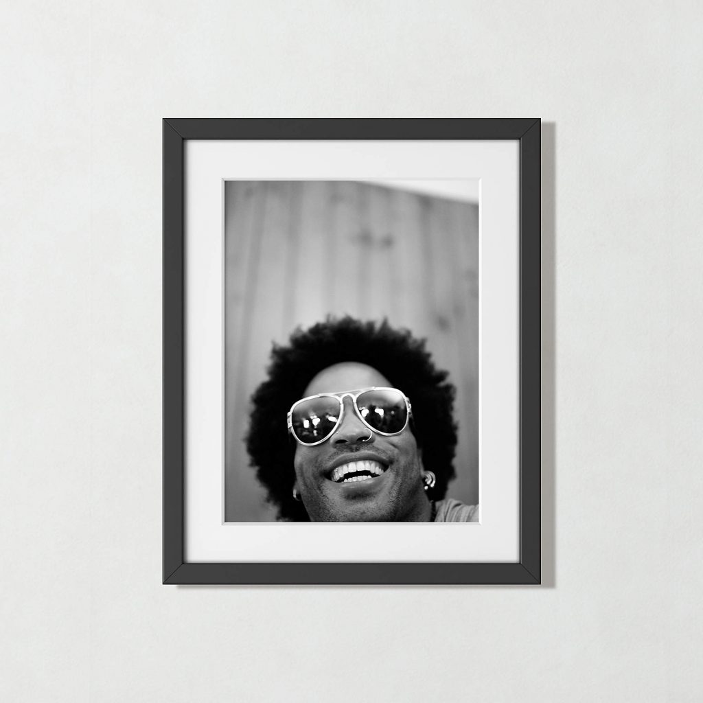
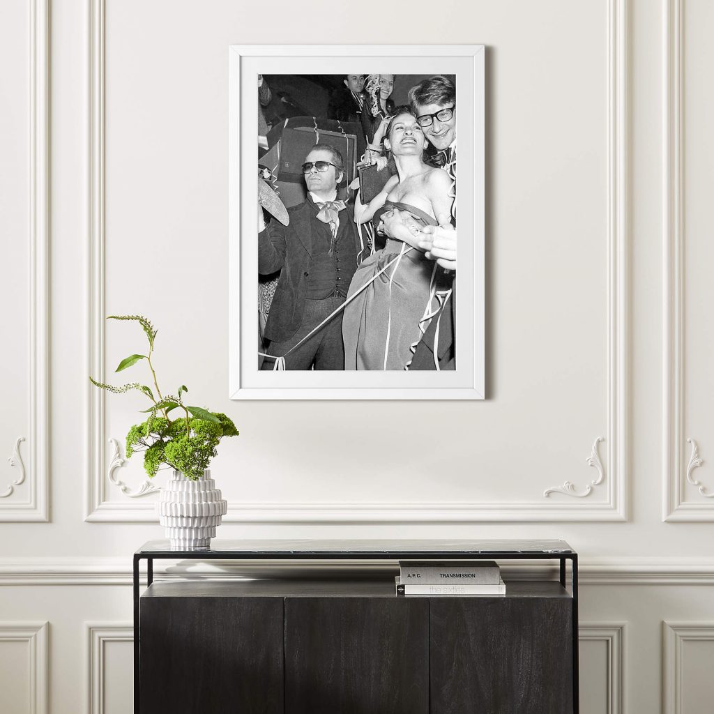
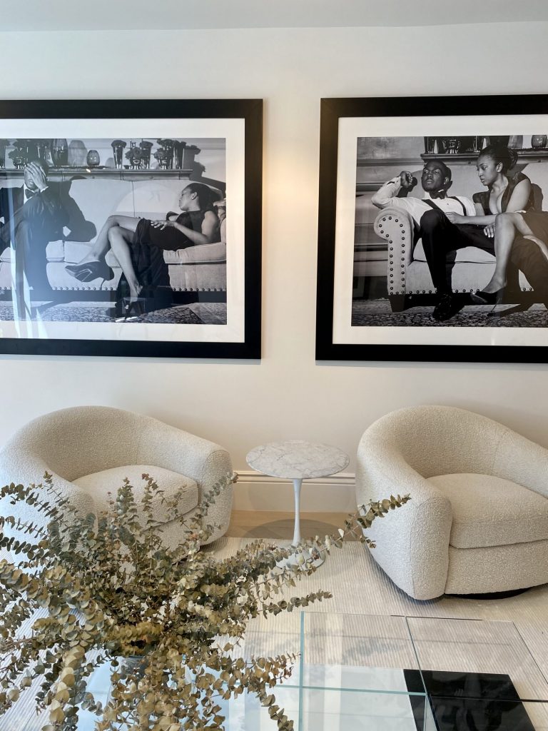
I love all the black and white photography. This kind of thing really jazzes up a space and makes it look high end. The picture of Bob Dylan was taken in May 1966 when he strolled past a shop window in London. The Lenny Kravitz one was shot in a candid moment in the Bahamas and the third photo shows Yves Saint Laurent and Karl Lagerfeld at Paloma Picasso’s Paris wedding in 1978.

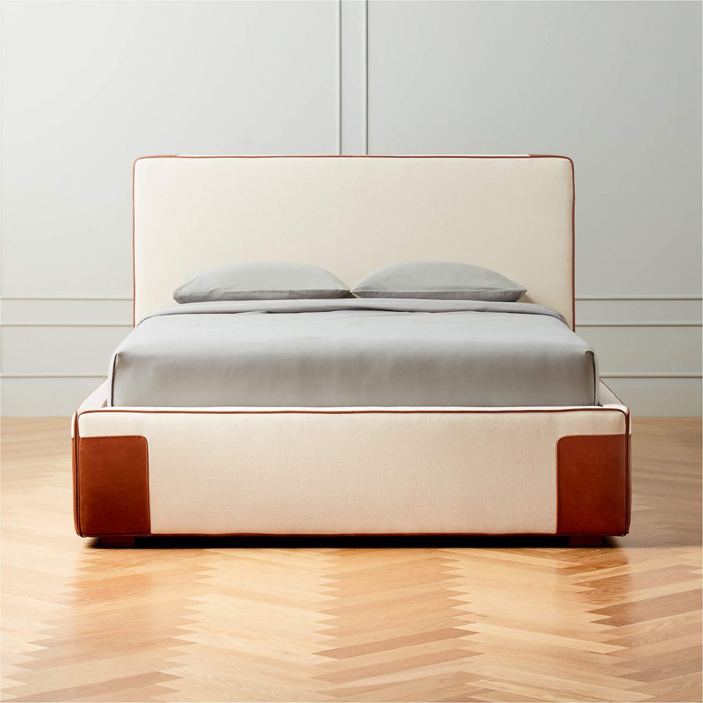
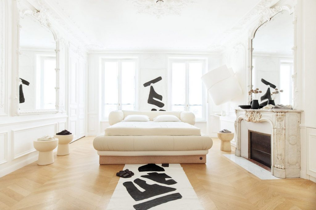
 I don’t typically buy beds from CB2 but I think I like this one. It’s the Tailor upholstered stitch king bed in sand covered in a textural ivory linen. The bed is trimmed with leather piping and leather-wrapped corners. It’s $2300 and looks good.

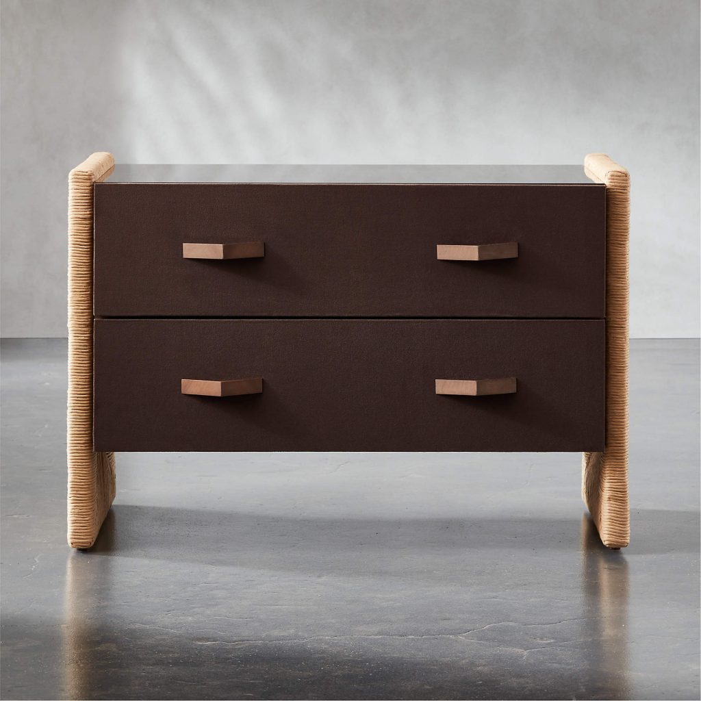
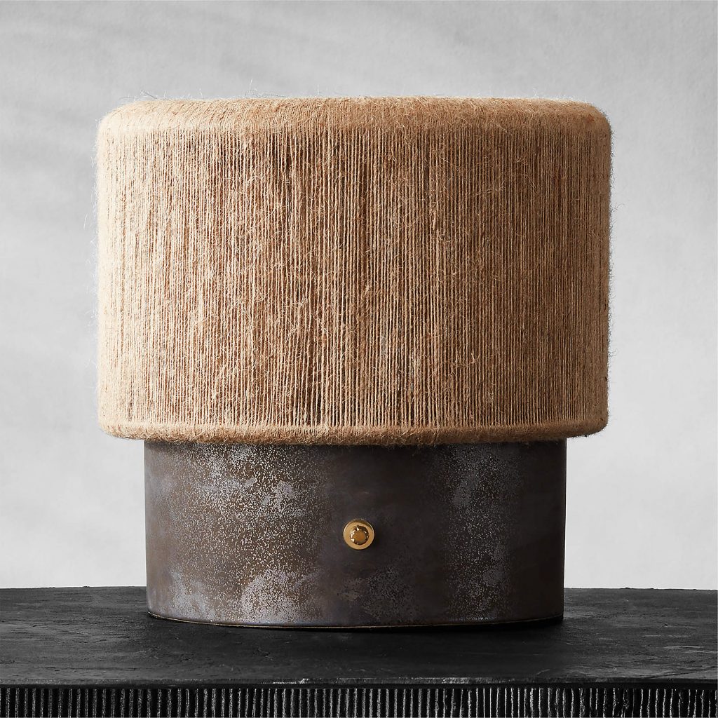
And I like this Lenny Kravitz nightstand and short table lamp, also inspired by ’70s modern style. The nightstand has paper cord sides woven from a traditional Scandinavian material, and a solid ash front with fabric-fronted drawers and bronze mirrored top. The wood handles come in stained dark walnut. The lamp has soft curves, an oversized jute shade over a ceramic column base and it’s on sale for about $320.

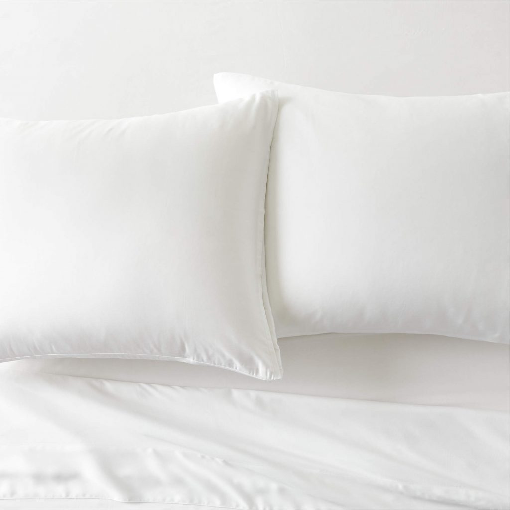
I love CB2’s linens for how natural they feel. There’s an earthy vibe to them. Here are CB2’s Benton Bamboo Sheets for $150.

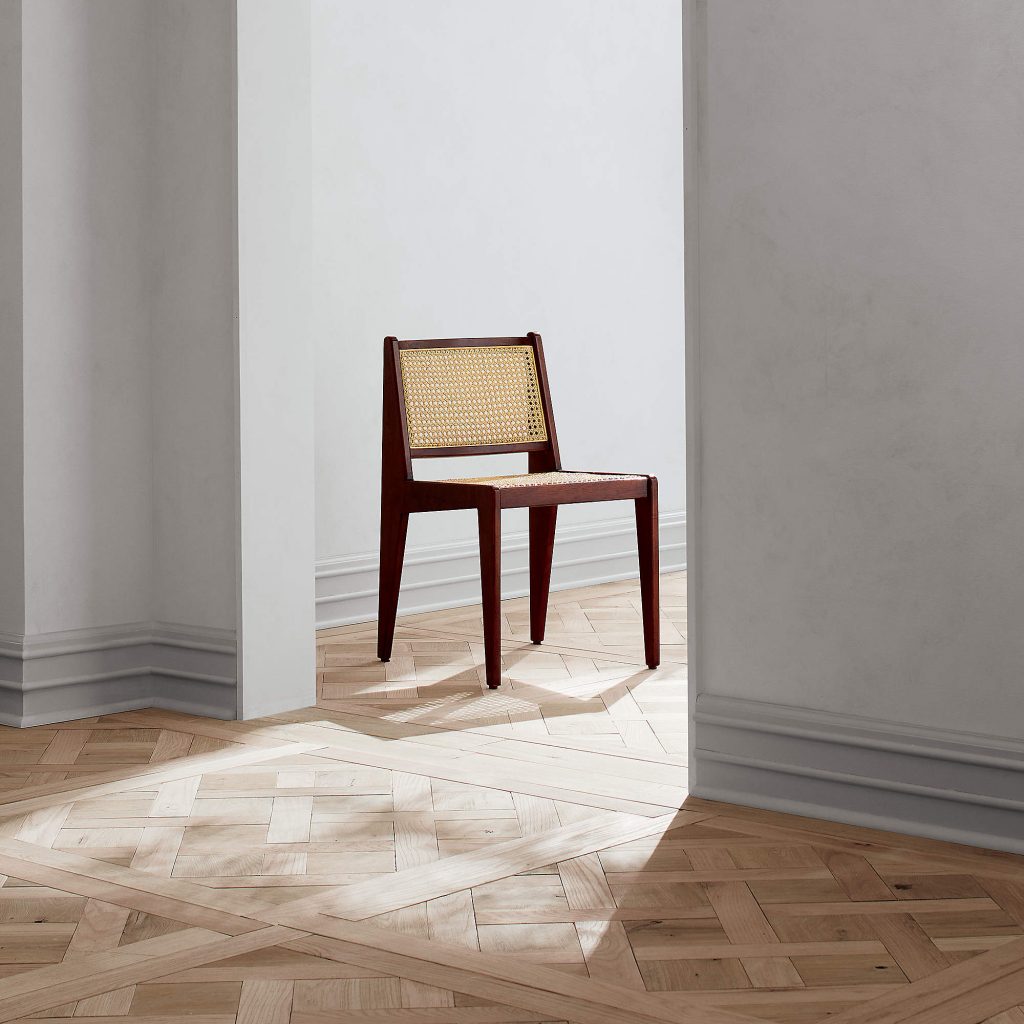
In the dining section I found a pretty dining chair for $499 that’s by Jannis Ellenberger and combines natural cane and solid wood.

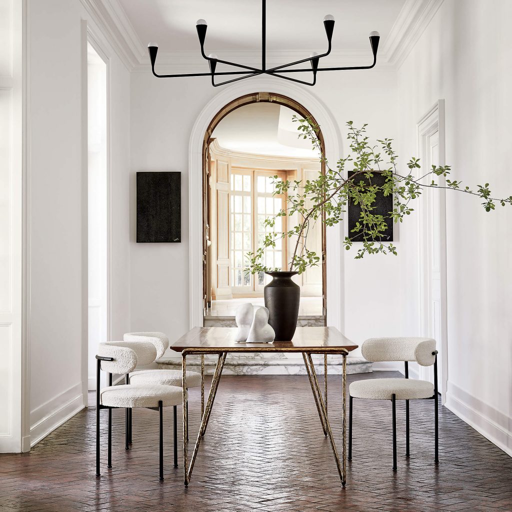
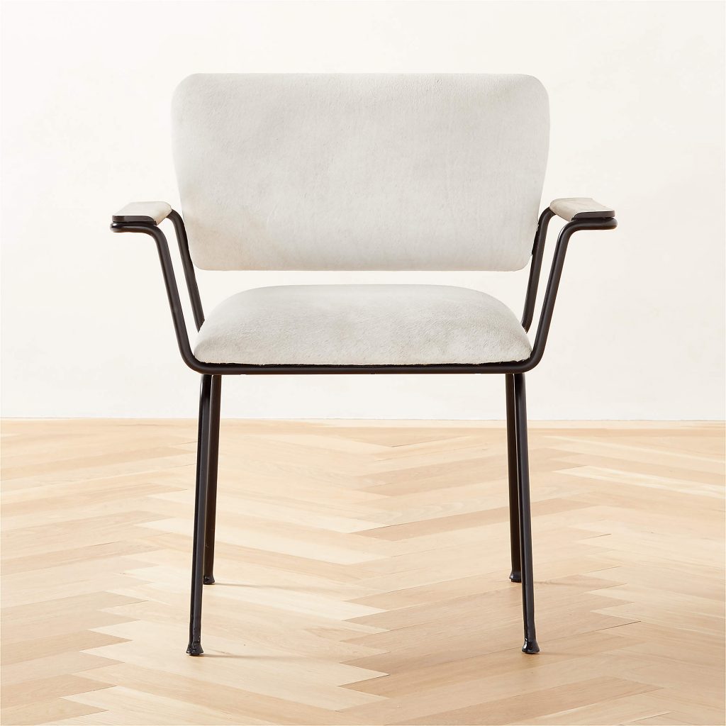
I do love a good dining chair and here’s another pretty one. Designed by Omar De Biaggio, it has a steel frame with a matte black finish and textural ivory boucle upholstery covering the curved back and seat cushion. At $1400, it is a bit expensive, but looks good and feels sturdy.

And finally, if you’re looking for an office chair, this is a great one. It’s the Marcos chocolate faux mohair at $899 and it’s a must-have.

Happy Shopping!

Decor

Lighting Up Your Life

To me, lighting is one of the essential factors in décor. No different from your sofa, coffee table, or even your art, it’s a facet of design that needs to be thought out very carefully. For example, I have these great Cleo sconces from Circa Lighting in my vestibule. Made of bronze and antique-burnished brass with a matte white shade, they were designed by Kelly Wearstler for Circa and make a statement. Architectural in their design, showing an ode to the mid-century look but a little jazzier with the metal component that protrudes and the backplate. And they’re functional, illuminating the stairway!

The Cleo sconce designed by Kelly Wearstler for Circa Lighting


These Mélange Pill Form sconces are in my dining room made of antique-burnished brass with alabaster, also designed by Kelly Wearstler for Circa. The reason I chose these is because there is a beautiful soft light that radiates from them. You always have to remember where lights are going. These are in going in a dining room, so you want your lighting to be soft and subtle at night.


The Mélange Pill Form sconce by Kelly Wearstler for Circa Lighting, emit a subtle glow


When you’re designing a space, remember to take in artificial as well as natural light sources. Many areas are delicate with just natural light. However, these areas usually have dark spots, and even though you probably don’t think much about lighting, having floor lights and lighting in areas that don’t have it is something to consider.


Articolo Lumi Floor Lamp reflects a timeless and refined elegance with the simplicity of its form.


One of my favorite lighting designers is Lee Broom, and here you have one of his Little Lens Flair pendants, composed of two halves combining the solid and the transparent. The upper part is steel with either a black matte or brushed brass finish, and the lower part has a clear, cross-cut lens diffuser. It just radiates with a beautiful glow.


The Little Lens Flair pendant from Lee Broom combines the solid and the transparent.


LED lighting is not new, but it has allowed lighting designers to be endlessly creative. So you can see why these loop types of sconces and lights are the rage. They’re fascinating, and though they used to be very expensive, they’re now, luckily, more affordable. The Glow’s Avenue vanity sconce from Etsy consists of four aluminum loops covered in satin white silicone on a black matte horizontal rod and backplate for a dramatic turn. Soft, warm light exudes from four 3000K LED integrated light rings permanently affixed to the rod. The rings have a rose gold toning added to the aluminum light ring giving an extra glow.


The Glow’s Avenue four-light vanity sconce with white loops and black matte backplate lends dramatic flair to any bathroom


Another interesting use of lighting is to include multiple fixtures to create an architectural, linear sculpture. These circular sconces in frosted white available on Etsy make a statement and are beautiful to the eye, positioned as they are, artfully. What’s great about these lights is that they are entirely rotatable, which means you can move them in whatever direction you like.


Lighting used as architecture: circular, fully rotatable sconces in frosted white available from Etsy


If you have a cabin or a country home, these Harlow Pendants by Gabriel Scott would look magnificent. They would also look great in a mid-century home as well as in an industrial space.  


Inspired by the art of jewelry design, the Harlow series evokes a geometric and sculptural language throughout its various configurations


Another favorite of mine is this chandelier from Etsy. What I love about Etsy is that it not only promotes small businesses and artisans, but you’re getting a very expensive-looking fixture for a fraction of what it would be from a more extensive manufacturer who has a showroom and overhead and so on. And, you’re also getting an excellent deal, and that’s always important for me.

For example, this Waterful Bubble Chandelier from Etsy looks similar to the very famous, costly ones from Apparatus Studio, but this one is very affordable. round-shaped sconces in frosted white available on Etsy are positioned in this way, artfully, demonstrating how lighting can be art. What’s great about these lights is that their bubble construction harks back to the bubbles in your bubble bath.


The Waterfall Bubble Chandelier from Etsy is affordable and looks great over a tub or vanity


Stairway lighting is also essential, and this is where you would typically find chandeliers. In today’s modern home, however,  you see a lot more fun in lighting, as you can see in these linear pendants that seem to be falling from the sky. These are from another excellent Etsy manufacturer.


These dramatic linear pendants make a great substitute for the traditional stairway chandelier


One of my favorite lamps of all time right now is the Saturn lamp. It’s a floor lamp and looks magnificent and like an authentic mid-century modern piece. It would be a great addition to a living room, dining room, or den.


The Saturn floor lamp looks like an authentic mid-century modern piece


This portable light is from retailer Design With Reach (DWR), whose high-quality pieces are really fun. I recommend getting this for an area you don’t spend much time in but could use some lighting.


This portable light from Design Within Reach is great for areas of your house you don’t use all the time


The Mercer Pendant, also from DWR, is a classic, round, LED drum pendant if you want something elegant and straightforward. It features an inner cloth shade encased by a hand-blown outer glass shade. You’ll never tire of its traditional shape.


For a chic and classic look, there’s the Mercer Pendant round, LED drum pendant


The DOMI blown glass pendant light is a beautiful mid-century piece that’s timeless. It’s made of blown glass and is dimmable.


Domi is reflective of a contemporary elongated bell and complements any space with refined elegance.‎


What’s fun is that people are decorating their bookcases in their houses now with bulbs and little lights, which is all part of the whole decorative movement, so if you don’t have LED lighting in your bookcase, you can always add some. Make sure you have power in the back and then poke a hole in the back of the bookcase. Then, don’t be afraid and put one in. They look great. This one is the Coprin Small Alabaster Lamp by Michael Verheyden.


Belgian designer Michael Verheyden creates objects of sublime beauty and remarkable spiritual power


My new favorite task lamp is the Gio Task Light that looks adorable on a desk and would look good in the kitchen if you’re looking at a recipe. But, it just looks good everywhere, truth to tell. I want to carry it with me as my purse to the next event/ It’s just an adorable little light.


The Gio Task Light looks adorable on a desk or a kitchen counter when you need to read a recipe
Beauty

Get Ready With Me: MERIT Beauty

Merit Beauty understands what women need in their quest for beauty. I have a minimal approach to beauty even though I film a lot, and Merit works well for me. Their products have none of the 137 toxins you can find in other products in the U.S. American makeup cannot be sold in the EU for that reason, while Merit Beauty can. And that’s important to me.

But even more important than that is looking good and looking younger, so I filmed a video where I tried out some beauty products from Merit and other lines on one half of my face only. This way, you could see what a difference is in a bare face compared with one that is well made up. I started with sunscreen, then applied my Sunday Riley brightening and depuffing eye contour cream. From there, with a Merit brush, I used the company’s foundation stick in the color Bisque on one half of my face. Next, I brushed some Biarritz shadow from Nars on my upper lid. Then I took an angled brush to put on Nars’s Mulch eyeshadow just on the crease and above. Never do the lid itself. To lift your eyes, it’s a good idea to use something like Trestique’s brow color pencil because you always want to have a complete and arched eyebrow. Then I applied bronzer, but only in the correct locations on the face – the temple, the tip of the nose and chin, the jawline, and the sides of the nose. Any other place and bronzer can make you look ten years older.

Then I dabbed on some Merit cream blush in Cheeky high on the cheekbones, took the Merit highlighter, and applied it right under the eye and down to the top of the nose. After lining my eyes, I demonstrated how the eye on the side of my face with no makeup looks smaller than the one with makeup. My favorite concealer on the planet is the Stretch concealer from Glossier, and I dabbed this into place, going further under the eye than perhaps you usually do. I like the Merit mascara because it doesn’t get goopy, and I love all their excellent fall lip oils: a coral-like color called Cara Cara, a rich Taupe, and gold called Bel Air is perfect for applying on top of any lip color for extra sheen.


Shop with my link to get all your favorite Shade Slick Tinted Lip Oil for fall: https://muse.meritbeauty.com/nina2

Decor

Arc Blanc: Timeless and Beautifully Designed

Last week I visited Arc Blanc, an extraordinary house in Hancock Park, and developer Ori Ayonmike, who is the vision behind it. I wanted to get a sense of where he gets his inspiration because I see lots of houses as a designer, and I’m always in awe of what I see with Ori.

Ori said he always likes home to feel like a hotel. “My father used to be in the hotel business, and my sister and I practically went to school in a hotel room, so I’ve felt this love for hotels from an early age, and I would want to bring that hotel-like look to the projects I develop,” he said. “Most of the time when you go to a luxury hotel, you’re in awe, and that’s really what I wanted to achieve, that emotional reaction you get when you walk into a place and say, ‘Oh my God, this is amazing.”

That’s the exact reaction I got from walking into Arc Blanc. My mouth fell open. Every project that Ori does has these details that are so beautifully thought out. Everything is so well-appointed with items that I haven’t seen really in any other project in Los Angeles. I have not seen the level of detail in any other project. So I asked him how he is inspired to create the minute details that everyone will see and feel: the staircase turnaround, the beautiful baseboards lined with porcelain, and flush with the wood.


“A lot of it happens on the fly,” Ori said. “You have a plan, and with anyone who builds and develops home, you know that, as you start to build, a lot of times when I have my guys leave for the day, I come back, and it’s just me, and it’s empty and quiet, and I start to walk around, and I go, ‘Why didn’t you do this here, that, there?’”

When the workers show up in the morning, Ori added, “It’s like, we’ve got to do this, and we’ve got to do that. And they say, ‘Oh no, you’re changing things again!’ And it’s been a recurring theme. But really, that’s where I get a lot of it. I come in, just me, and in that silence and peace, I’m able to come up with these ideas.”

Ori said he wouldn’t take credit for all the ideas he gives life to in his projects. “There are a lot of great designers and developers out there, and I’m always looking at stuff to be influenced, to get inspiration, which a lot of people do,” he said. “I’m always looking at museums and hotels.”

Developing a house means that you’re creating a home for someone you don’t know, Ori said. “And the thing is, you develop it in such a way that you want to make it special, where’s there’s that one buyer who comes in and says, ‘Oh God, I love this.’”
There were multiple offers on this home, as you can imagine. People were dying, people were crying, “I want this house.” And that must make Ori feel good.

“It does,” he said. “The last project I did which you featured on your channel, we had multiple offers in 24 hours. So that does feel good. When you put out a project, and someone loves it. And they’re ready to make the decision right then.”
I asked Ori about the kitchen in Arc Blanc. To me, it looks like an ode to Parisian design. I love how minimal it is, how clean it is. And the cantilevered table! I asked him how he came up with the plan for the kitchen.

Ori said he likes dark kitchens. “I wanted to do another dark kitchen. Last time, I did a black kitchen, so I didn’t want to do another black one, so the color is cacao. I wanted to bring in a dark vibe, but I also wanted to bring in some color, so we have the island in that and then the counter and cantilevered breakfast table in thermal ash wood. I wanted to bring in these dark tones to give you that movie vibe because you have the white oak floors and the white walls for contrast.”

I told him how much I loved the brass lamp on the island and that I had almost passed out when I saw the master bath. So many people ask me if you can mix your metals, and the answer to that is, absolutely, and this house is an ode to that. So I asked Ori how he mixed gold and black and beautiful porcelain and white oak remarkably well.

“As a designer, you start to create a palette and build these swatches together when you’re creating, and sometimes it’s almost good, and sometimes it’s not,” Ori said. “I always like to play with the ‘not sure.’ You know, when everyone is like, ‘I don’t know about that,’ that’s really where I like to be. So I come up with things that are not necessarily traditional. Like a stone that has black in it with brown cabinets. Usually, you wouldn’t go with black and brown in a space, but those are the kinds of things that I like to do that set my projects apart.”

I told Ori I loved the beautiful rich stone in the bathrooms juxtaposed with straightforward black or white fixtures, very clean. And how every bathroom seemed to be slightly cohesive and slightly unexpected.
“I wanted to do just enough where it feels like it isn’t complete, but it is,” Ori said.


I also told Ori how I loved his veranda, which has an arched opening to the street with a fountain below. He said that was intentional.

“This house is from 1924 and had arches when we purchased it, two in the family room. So we decided to use that as a theme, so we have nine arches altogether,” Ori said. “I wanted the repetition to bring in that old feel while staying modern at the same time.”


Decor

Built-in Beauty: How I Styled the Bookcase of My Dreams

I recently put in a new built-in bookcase in my den, and I wanted to show you how it turned out. Built-in bookcases are instrumental to room architecture. They give a space depth, definition, style, and personality, while also providing extra storage. (Never a bad thing.) And because of that, they can increase a home’s value. (Also, never a bad thing.) 

And they’re not just for books. Collections and objets d’art that you love can take center stage on shelving, allowing you to see and live with all the items that you treasure daily.

I love my built-in. It took me forever to commit to putting it in. But, like you, I struggle with what to do, how to do it, when to do it, and I’m thrilled with the way it turned out. That’s because, as you know, once you have a built-in, it’s there to stay. You can’t take it with you to your next home, so make sure this is something you can live with forever.

A lot of detail went into my bookcase’s design and installation. A skilled carpenter first and foremost installed it. The cabinet door fronts are made with flat MDF (medium-density fireboard), necessary to get you the right finish. Then we applied a unique molding called “The Nina” because I did design the blade myself. If you’re in Los Angeles, you can have this made by me, or you can certainly try and mimic it because who are we kidding here? It’s not like I reinvented the wheel. This molding is a specific one that I love and designed, and many ones are similar to this. What’s important to note is that this molding is no more than half an inch at maximum. You don’t want to go more than that. And it was cut linearly and applied after the fact, on top of the MDF. Then was cut right in the middle, and everything was painted on site. What I love about these particular cabinet fronts is that they look like a molded wall. I wanted the cabinets to feel very natural in place, and I also wanted them to have a clean look, so there’s no hardware on them. I didn’t want to eye to be interrupted as it looked at the built-in.

The paint we used here is the same as the wall color because I wanted the piece to feel like a Parisian apartment and have it blend in. It’s a Benjamin Moore paint with a satin finish and doesn’t have a sheen to it, which I like. It’s easily cleanable and feels very smooth. One note on that: make sure your painter sands down the built-in over and over again before painting. That way, you’ll get a smooth finish.

I applied the same baseboard, which runs all through the living room onto the built-in to flush with the wall. It looked as if it had been part of the den for years. The baseboards are 7.25 inches high throughout the house, so I had the piece built with an eight-inch base and then ran the baseboard on top of it.

I styled these shelves to take some of my favorite books, remove all the dust covers, and then select which ones I would use by color. I know many people don’t like that idea and say books for reading, not for decorating, and that’s true, but these are all decor books. So in a way, I’m purposeful with my décor books. I want them not only to give me information about décor, design, and style from my favorite designers, but I also want them to look decorative. So it’s kind of a double entendre. For example, one of my all-time favorite books is one on Helmut Newton, a famous photographer. It comes with an acrylic stand, and having a book out on display with open pages looks excellent and allows someone to leaf through the book and enjoy it. 

Except for three, all the items on the shelves are vintage pieces I purchased a month ago when I went antique shopping in Palm Springs. Palm Springs has many great old antique marts, and the pieces I got are beautiful. They have lots of gorgeous details: they’re glazed, pottery, handmade, and artisanal. So go to your local flea market or even look on eBay and find some glazed pieces in different shapes and sizes and display them on your shelves. 

    I placed these objects in a way that made sense and had some form of symmetry and balance. If I had a book with a sculpture on top of it, I placed a bowl next to it. You want to keep similar objects, like sculptures, a little distance from each other. You should put four to five books in each section and maybe place a decorative object on top of them. If I have a vase on one pile of books, I’ll put a plate on another. 

I put a very large antique glazed amphora here in the corner because the space needed the height, and next to it went a very modern acrylic bookend stand, which I already had. Then I stood up three of the books that mimicked the color of the amphora in the stand. 

For some dimensions, my shelves are three and a half inches thick, the perfect thickness. I would have loved to have some LED light strips in here, but for some reason, I completely forgot to put them in. (This happens to me regularly, where I remember things for everyone but not for myself.) So if you can add lights, go ahead and do that. The depth of the shelves is nine and a half inches, and the depth of the main piece is 23 inches. 

One last thing to mention is you should have a few little acrylic stands. They’re lovely for displaying and enjoying your pieces, and you can place them on top of a set of books for height and texture. Styling your shelves this way allows you to have the books you love and the objects you love in front of you forever.

Decor

Sculptural Furniture Makes the Usual, Unusual

There’s been a dramatic shift recently back to the 1960s and 1970s, to a period of voluminous, rounded, and sculptural furniture. Of course, straight-lined mid-century pieces are still on-trend, but more organic items were introduced in the ’60s and ’70s by some of the most fabulous designers in the furniture world.

Probably one of the most beautiful chairs ever designed, the Pacha chair created by Pierre Paulin in 1975 epitomizes the hyper-relaxed, loungy look. Curvaceous, soft, and low-slung, the Pacha Lounge Chair is comfortable and versatile. Initially produced by the Danish company Gubi, the entire modular, mix-and-match Pacha collection has been reissued.


Iconic designer Pierre Paulin’s vision was to create a sensation of ‘sitting on clouds.’


The Pukka Collection from Ligne Roset is inspired by designs created by Gaetano Pesce for his UP series starting in 1969. Pesce’s line paid homage to the sponge, an item he was fascinated by because of how it always springs back to its original shape. These pieces, made of foams of various densities and a base of high resilience polyurethane foam, are magnificent, and every corner and facet has been examined and tastefully designed.


Ligne Roset Pukka Medium Settee by Yabu Pushelberg


You also cannot go wrong by owning another Ligne Roset classic, Michel Ducaroy’s Togo Fireside Chair that he designed in 1973 and nearly 50 years later remains one of the company’s best sellers. The Togo collection features an ergonomic design with multiple density polyether foam construction and quilted covers. Each piece is attractive and inviting.


A Ligne Roset classic Michel Ducaroy’s Togo Collection


Some people have asked how sculptural pieces fit into and live in your home and I’m here to tell you there is nothing more “designer” than incorporating sculptural items into your design. They are part of the family and take on a life and personality of their own.

Faye Toogood, a London designer, created a talked-about piece, the Puffy Lounge Chair. It looks like a metal frame with a sleeping bag draped over it, and its quilt-like detachable upholstery is fat and plump, spilling freely over the sides of a hard-lined tubular steel frame. Nevertheless, it’s comfortable and a major conversation piece.


Purposeful and playful juxtaposition elements of the Puffy Lounge Chair by Faye Toogood


Another conversation piece is Toogood’s collaboration with Birkenstock, a bed of puffy layers of canvas and leather upholstery sitting on a cork base with Birkenstock’s natural mattress and slatted frame incorporated within. The headboard and full surround are upholstered in cream leather. Again, this is so fun, and sometimes it’s playful pieces like these that are not only comfortable but genuinely make a statement.


Faye Toogood’s collaboration with Birkenstock


One of the most influential designers of the past is Ettore Sottsass. In 1970, he designed a significant statement piece as part of the Mobili Grigi series of bedroom and living room objects. The curvaceous Ultrafragola Mirror/Lamp was the only piece from the collection to make it beyond the prototype phase and is back in demand now. The mirror/lamp has a white opaline shell and features a pink neon LED light. When switched off, the frame is brilliant white. When switched on, the neon light produces a bright pink glow. The curvaceous, wavy Ultrafragola was created in the 1970s by Florentine company Poltronova, making today’s re-edition mirrors individually numbered. It is a statement piece looks extraordinary sitting against your wall and brings a lot of life to your house.


A favorite amongst A-listers and design lovers alike, the neon-lit pink mirror is deemed the “antique of the future” – Hannah Martin.


A lot of people ask me about mixing statement pieces. Of course, you can, but you have to find a harmonious balance between them. You can’t have too many statement pieces in one room. And only your eye or a trained eye can tell you if you can mix the selections you have or not.

I want to share some beautiful, very affordable pieces that you can buy today from Crate & Barrel or CB2, or West Elm. First, take a look at the Galisteo triangular black coffee/end table from Crate & Barrel. These are different pods that you can mix and point in different directions depending on how you are designing your room. They’re super elegant and super chic.


Cement Sculptural Galisteo Coffee Table


This table from West Elm is fantastic. If you’re looking for a coffee table, this is the one for you because it’s rooted in perfect design. Again, very rounded and voluminous.


Hazel Coffee Table by West Elm


Another great place to find comfortable chairs is at AnthroLiving, part of Anthropologie. They currently have one of the most outstanding club chairs I’ve seen around, and I encourage all of you who need a club chair to take a look. With its U-curved seat topped with a cushion and its barrel back silhouette, the Linen Sculptural Chair is art made for living.

This chair is a modern take on a barrel-back silhouette. This chair is an actual sculptural work of art and a luxe addition to an office, club room, or living space.


Decor

Chic Powder Rooms You and Your Guests Will Love


Powder rooms are essentially two-piece, half baths that are used mainly by guests to your home. For those of us lucky to have them, this is a place where you can go crazy in terms of design.

The term powder room has been used since the early 18th century when people would enter a closet-sized room to have extra powder applied to their wigs, the must-have, fashionable item of the day. Indoor plumbing had not arrived at that time so powdering their wigs was all people would do in the powder room. When working indoor toilets came, the name stuck, so visiting the powder room became a socially acceptable way to leave the dinner table to do, in a bathroom, what we all do. When makeup came into general use, women started using the powder room again to powder their noses and repair their makeup.


Nina’s powder room has gold-painted, royal blue wallpaper with hummingbirds, a marble sink and a Lucite, mid-century chandelier.


A powder room is often overlooked when creating a look for a house. But it really is a place that must be considered and designed very carefully, so your guests have a good experience walking into a small space that is well decorated. I tend to go with primarily neutral walls in my design plans, and therefore the powder room is the perfect place for me to display my creativity. Which is what I did in my own powder room.


Nina mounted her sconces on the mirror. On the wall is artwork in ornate frames that she found at an estate sale.


I decided to do a very jazzy wallpaper because a powder room is somewhere where you never get tired of your walls since you spend so little time in them. I rarely go into my powder room, so I always like to have the door slightly ajar to get a little peek of my walls. My wallpaper is a gorgeous royal blue with gold painting and comes from York Wallcoverings. I also have a trio of my Rosenthal vases. These I collect as anyone familiar with my channel knows. Most I’ve found either at estate sales or on eBay. The artwork on the walls has ornate frames and is just beautifully painted. The pieces are not by anyone noteworthy. They are just beautiful pieces of art that I stumbled on at an estate sale.

What I love most about my powder room are the hummingbirds that seem happy just to be flying on my walls. They look adorable and have lots of color and detail to them. My chandelier is a Lucite, mid-century piece, and I absolutely love it and bought it for this space. I always like to have linen napkins available instead of paper towels. Not only are they more eco-friendly, but, in terms of design, they are also much more attractive displayed on a towel rack. I carried the black and white marble from my foyer into the bathroom for uniformity. My baseboards are marble, and if you can get the fabricator who is building your sink to also cut baseboards for you in the same material, it will give the powder room a really luxurious feeling. I would definitely use a bathroom tissue holder rather than a fixture on the wall. I don’t like perforating wallpaper and just love how it looks placed next to the toilet. Lastly, I mounted my sconces on the mirror, which is really fun, and I had my apron skirt marble sink made very tall, so I don’t have to have cabinetry in the power room. This way, the sink and vanity are elegant and straightforward.


The owner of a yacht formerly owned by Malcolm Forbes created a powder room in luxurious blue granite, adding rich touches of brass.


The powder room above, which I absolutely love, is on The Highlander, a super yacht previously owned by Malcolm Forbes and bought by New York-based interior designer Joanne de Guardiola and her husband in 2012.  (They dropped the “The” from the name.) The couple redesigned and used the yacht and listed it for sale recently for $8.5 million. I am using this example to show you how a tiny space can have a tremendous impact.

What I absolutely love about the space is the gorgeous blue-toned granite with white and gold veining and the fact that the sink and everything peripheral is done in the same stone. I really like the pattern of the stone, which is reminiscent of the water, and I’m sure that’s why it was chosen. And the best part is the beautiful touches of brass you see throughout this tiny little jewel of a bathroom.


Drew Mandel Architects created this attractive homogeneous powder room with fluted wood paneling.


Another powder room I want to highlight is for those of you who might be in construction, are looking for ideas, and don’t necessarily love to use wallpaper. This was designed by Drew Mandel Architects and what’s great about this room is that it has the fluted wood paneling that everyone loves today.  The sink is a unit unto itself and complements and coincides with all the other elements and colors in this homogeneous bathroom.


A marble chevron mosaic wall behind the sink and walls covered in hemp bring texture to this powder room designed by Lindsay Gerber.


This powder room is by Lindsay Gerber, and I wanted to feature it not just for its apron-front marble sink but also for the marble chevron mosaic wall rising up behind it. It brings texture to the room, as do the sidewalls and ceiling which are covered in Phillip Jeffries’ Manila Hemp in a charcoal hue. There is a very tactile feeling to this particular bathroom which makes it feel fantastic. I wanted to highlight how the placement of sconces is done correctly in this bathroom, unlike many other powder rooms I’ve seen. Many people install a single sconce above the mirror, a very dated look that is not as attractive or architectural as having a sconce to the right and left of the mirror. One tip here: make sure your sconces are always at eye level.


A collage of favorite pieces of art, portraits and more make this powder room fun and interesting. Anything here goes.


Another way to design your powder room is to do what designer Sig Bergamin did, put up all your portraits, works of art, things you’ve collected over the years. This collage is done on beadboard, and it’s a very fun look. So if you have a more casual space or a powder room in a second home that you want to furnish and you don’t know what to do, grab all of your gallery art and go to town.


This tone-on-tone powder room has white oak-paneled walls, a travertine sink and midcentury modern lights.


This tone-on-tone powder room is probably one of my favorites. I love this design technique that takes a few colors and uses different saturations throughout the space. I also like the beautiful white oak-paneled walls and the travertine, apron-front sink. However, what’s really striking about this space is the use of mid-century modern lights. I also love the pop of black in what appears to be a very neutral room and the sculptural collage of sconces on the sidewall.


An inexpensive and easy way to decorate a powder room: paint it in stripes just like a circus top.


The next idea I wanted to share with you is an inexpensive way to decorate a powder room: paint the space to create a circus tent look. It’s effortless to do; you just have to measure it, draw it out and use tape for a great striped look.


Dan Gonzalez emphasized the asymmetrical in this powder room leaving more room for art sculpture.


This Danny Gonzalez powder room is probably another of my favorites, and I love that he has created an asymmetrical design. There’s a huge trend right now in bathroom design toward placing the sink and mirror are in the corner of the room, while leaving the rest for decoration.  It’s fun, and I’ve done it a lot with a single pendant that comes from the ceiling and just falls somewhere between the sink and the wall.


Well-chosen inexpensive items can create an expensive look as in this powder room. You can get the Kohler sink at Home Depot.


Here’s a way to design a powder room that is a simple way to bring in inexpensive items and create an expensive look. For example, you have a pedestal sink by Kohler, which you can find at Home Depot, and though the walls are lined with wallpaper, they look like precast. All you need now is a gorgeous mirror in the same color as your wallpaper that also looks like precast! It’s a perfect look.


The last example that I had to share with you is this powder room with an apron-front sink that is more geometric than the others one I’ve featured.  It protrudes out, and those two pendant lights really stand out . So if you’re out of ideas and don’t know what to do, drop in two pendant lights that are unique and interesting, and they will create a significant wow factor for your space.


For more insight and tips, be sure to watch my powder room vlog below, only on Red Elevator.


Lifestyle

Design Reigns at the One&Only Palmilla


I recently stayed at the One&Only Palmilla in Los Cabos, Mexico, and it set my design mind alight. Nestled in a lush tropical garden setting enshrouded by a jungle of palms, the resort is a blend of traditional Mexican hacienda architecture (red-tiled roofs, white-washed walls, dark wood beams) and contemporary touches like travertine floors and walls of windows. Hugging the Sea of Cortés with one of the area’s few swimmable beaches, the resort has 173 casita chic rooms with oceanview terraces, personal concierges and butlers, and espresso machines. But it’s the wonderful accents like crisp cobalt blue or red Aztec-patterned cushions and bed linens, steel-studded doors, carved mirror frames elaborately, and wood furniture that remind you that yes, you are in magical Mexico. Look for the day beds swinging on the breeze from the sea.


Lifestyle

Miramar Beach Hotel


This week I visited the Rosewood Miramar Beach, Montecito’s newest luxury resort set on a 16-acre, pristine, private beach two hours north of Los Angeles but far from its frenetic pace. Opened in 2019, the property, owned by The Grove and Palisades Village shopping malls developer Rick Caruso, dates back to the late 1880s. The Manor House’s main building resembles a classic estate with white stone walls, a black roof, and leaded windows. (The original Miramar Hotel occupied the property from 1889 until it closed for renovations in 2000. After that, the hotel sat semi-demolished for years and went through two owners who couldn’t cut through all the red tape to develop it.)


Caruso’s inspiration for the property’s design was famed Los Angeles architect Paul Revere Williams, who designed the Beverly Hills Hotel, LAX, and the homes of Frank Sinatra, Lucille Ball, Desi Arnaz, Lon Chaney, and Barbara Stanwyck. The scallop-edge pool was inspired by Williams, and the foyer’s dramatic stairway and intricately designed wrought-iron balustrade are from Williams’ drawings.


Guests are housed in clapboard cottages nestled amid tranquil gardens, the Manor House, or beachfront lanai suites right over the sand. They can take their pick from morning yoga, lunchtime picnics, and sunset walks – — all on the beach —to cabana lounging by the pool, cocktails in the private, walnut-paneled bar, or a massage at Sense® spa. Retail stores include Gwyneth Paltrow’s Goop and James Perse, and right now, there’s a Christian Dior pop-up full of treasures. There isn’t a hotel I enjoy more than this one, I must say. (The hotel also has Miramar Club, a private membership club.)


Upon entering the foyer, you’re greeted by Harlequin-patterned floors in black and white marble created by Newport Beach interior designer Diane Johnson. The center soffit is rounded, and from it hangs a gorgeous crystal chandelier reminiscent of old Hollywood. I loved walking down the dramatic stairway as I honestly believed that I was in an old Hollywood movie. The railings are thin, the handle is brass, and everything is in scale, beautifully designed as if it were on this property for decades. The ottoman in the foyer is tufted, and two Chesterfield chairs are seen in the background against a beautiful paneled wall. It’s not unusual to find a Chagall lithograph in this hotel as Caruso collects gorgeous fine art.


Stepping into the great room, you’re greeted with chevron wood floors that are absolutely stunning and, of course, a fireplace that’s on 24 hours a day. The ceiling has gorgeous soffit detailing in the shape of diamonds, again reminiscent of an old Hollywood period. The furniture is traditional but very minimal and soft; the colors are muted. The blue-gray walls juxtaposed with white-painted paneling make everything pop, and an artwork depicting a bunny is fun. Everything has been beautifully curated, and of course, there’s a gorgeous black lacquer grand piano sitting in the corner of this room.

One of this hotel’s most remarkable features is the private, walnut-paneled bar hiding behind a door in the great room. I sat down to order a drink and loved the mid-century lights that sit on top of the bar. The cocktails were delicious too!


The spacious, ocean-view loggia directly outside of the great room is equally welcoming and has very comfortable seating covered in what looks like men’s suit fabric. The fireplace is made of copper and stone, and the area feels perfect for cocktails in what feels like a 1960’s Hollywood home. The gathered fabric ceiling detail in the canopy of the loggia is an extraordinary touch, and the Harlequin-patterned iron details of the posts and the Manor House’s leaded windows are also very much reminiscent of the period.

The private dining room has low, mid-century chairs and walls covered in hand-painted chinoiserie from de Gournay. Another pop of modern art on the wall really brings this room together.


Right now and through September 6, the Miramar has a pop-up Dior, which has taken over the resort’s Cabana Pool, Bocce Courts, and Garden Bungalow suites to celebrate the Dior Riviera capsule collections. Everything in this collaboration is from Dior, from the needlepoint pillows to the toile wallpaper and lush fabrics. I tried on some handbags and sunglasses and was mesmerized by all the outdoor items that Dior offers, from ping pong paddles to hammocks to towels and lots of other fun things that you can use in your home for a summer refresh.


To tour this Estate Style Resort Miramar Rosewood & Dior Pop-Up, please click the video below to watch now.


Fashion

Summer’s Eye-Popping Colors (No Nail Biting, Please!)

I don’t know about you, but after a year of foregoing manicures and pedicures, I’ve been beyond happy to get back into a nail salon. And don’t get me started on those foot rubs I missed so much. Do-it-yourself kits are great, and there is a slew of really good ones out there, but I’m not good at that kind of thing and prefer to lay back and tune out. Now, as many of us are venturing back to nail salons (albeit we’re wearing masks again), we can catch up on all the bright and bold polishes that summer is made for. This season means retina-burning colors that pop by the beach, around the pool, and on the town. Think fiery corals, pulsating purples, throbbing tangerines, loud limes, booming bananas, and flashbulb fuchsias. (But no neons, thank goodness! Remember the 80s?)

Muted pastels are also significant for summer and work beautifully with current fashions. Choose between greens — spearmint and mint —pale turquoise, powdery pink, and a baby blue shade that looks like a Mayan sky. Here are some of my favorites from this season’s picks:

Decor

Top Alchemy Fine Home Products

I am so excited to share my top picks with you from Alchemy Fine Home.  The San Diego-based company have scoured the globe for luxury brands, quality designers and unique pieces to make your home a beautiful place that you can admire and love.  The quality items showcased on AFH are built to last and can be paired perfectly with your existing  pieces, while still keeping your space looking  sophisticated and chic. AFH has a beautiful selection of decor and furniture products, from tables to bed frames to so much more. I especially love their Gold Member Club, which provides designer editorials and exclusive benefits such as receiving new collection releases first.  New members even get 15% off their first order for joining!

My blog post with Alchemy Fine Home, “Simple Steps For Effortless Glam,” can be found here. To shop my collection I’ve pulled a few of my favorite pieces for you.  As always, less is more.  So be sure to keep your pieces simple as to not distract your eyes from the focal point of your room.