Beauty

Have a Stylish New Year’s Eve

You have the outfit. (Sparkly.) You have the shoes. (More sparkly.) You have the jewels. (Even more sparkly.) And now it’s time to shower and get dressed for your evening of glitter, glamor and glitz. Cue candlelight and celebration. Sequins and paillettes. It’s New Year’s Eve and even amid a pandemic, it’s the most exciting night of the year. You’re hoping that one sparkling ensemble, waiting on a hanger in your wardrobe, will look great (it will), those towering stilettos you got will make your legs look like Heidi Klum’s (they will), and that the lips you kiss at midnight will be the right lips (they will). But if not, if you’re going crazy trying to figure out what to wear and how to decorate, fear not, because I’m here to share with you some some of my favorite fashion, beauty, and New Year’s party decor picks so you can ring in the new year with elegance, class, and a whole lot of style. Let the countdown begin!

Decor

Rugs & Carpeting

I get more questions about carpet size, style, and type than anything else, so in this post, I’m going to break the topic down for you.

Why Use Rugs?

Rugs literally frame your room and furniture. A rug’s color, pattern, shape, and size are also key elements in creating a unified and appealing space. And size matters. If you opt for a rug that is too small, it could jar with the scale of your furniture. And if you choose one that’s too big, the room will appear small. The right rug can also unify a room and add vibrant color and textures.

Acoustics is another reason for using rugs or carpeting. Do you ever notice when you go to a really loud restaurant how annoying and distracting it is because they haven’t thought about acoustics? Rugs and carpets absorb sound and really help with the echo that comes from ambient noise.

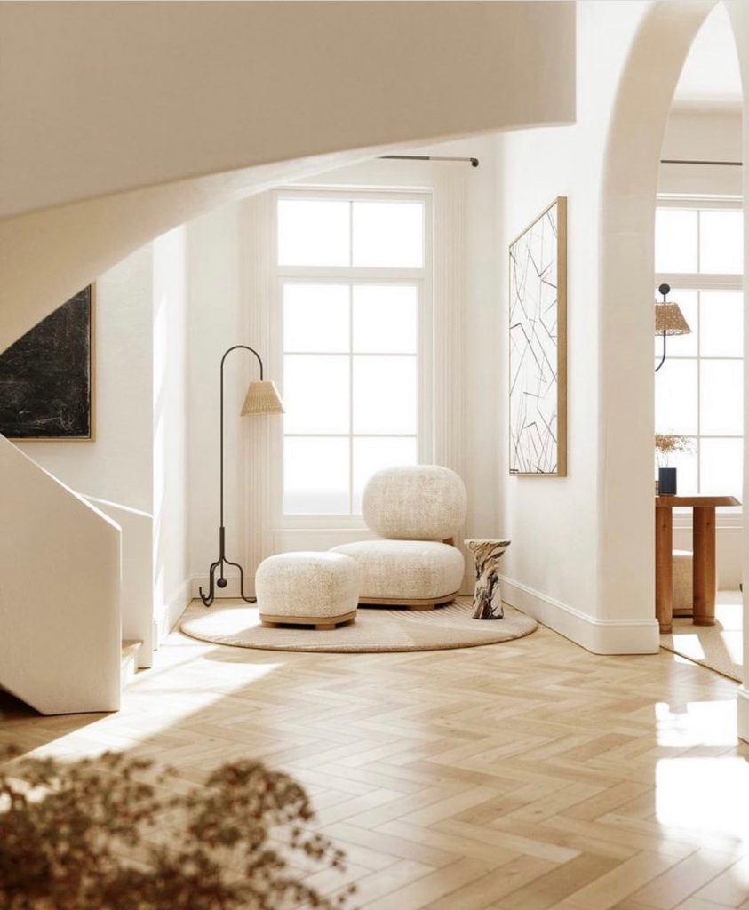
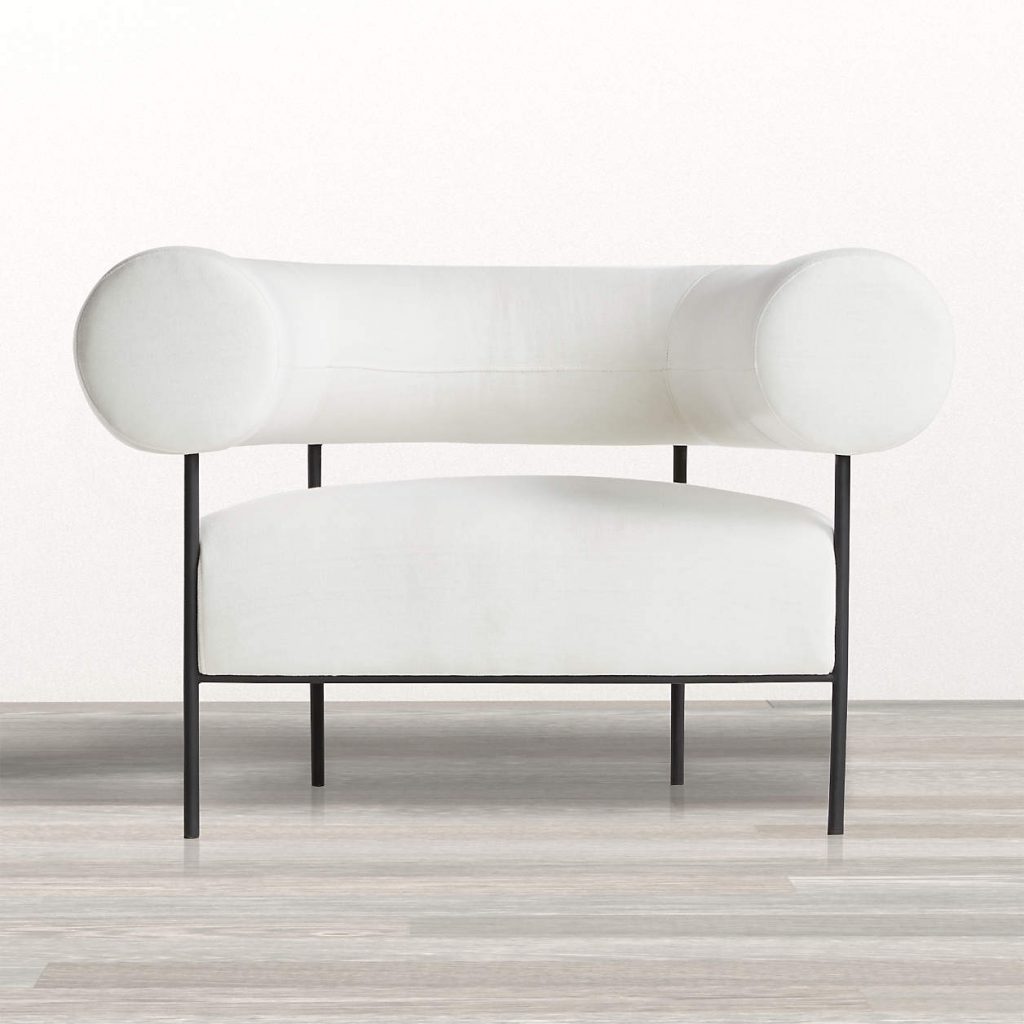
The third reason why rugs are important in design is that they define areas. If you have a very large rectangular room, for instance, you can create very intimate areas within it using area rugs so it doesn’t read just as one big cavernous space. In this photo, the round ivory chair and ottoman are floating on a round ivory rug. The rug defines this corner as a space in which you can perhaps sit and read or just contemplate life.

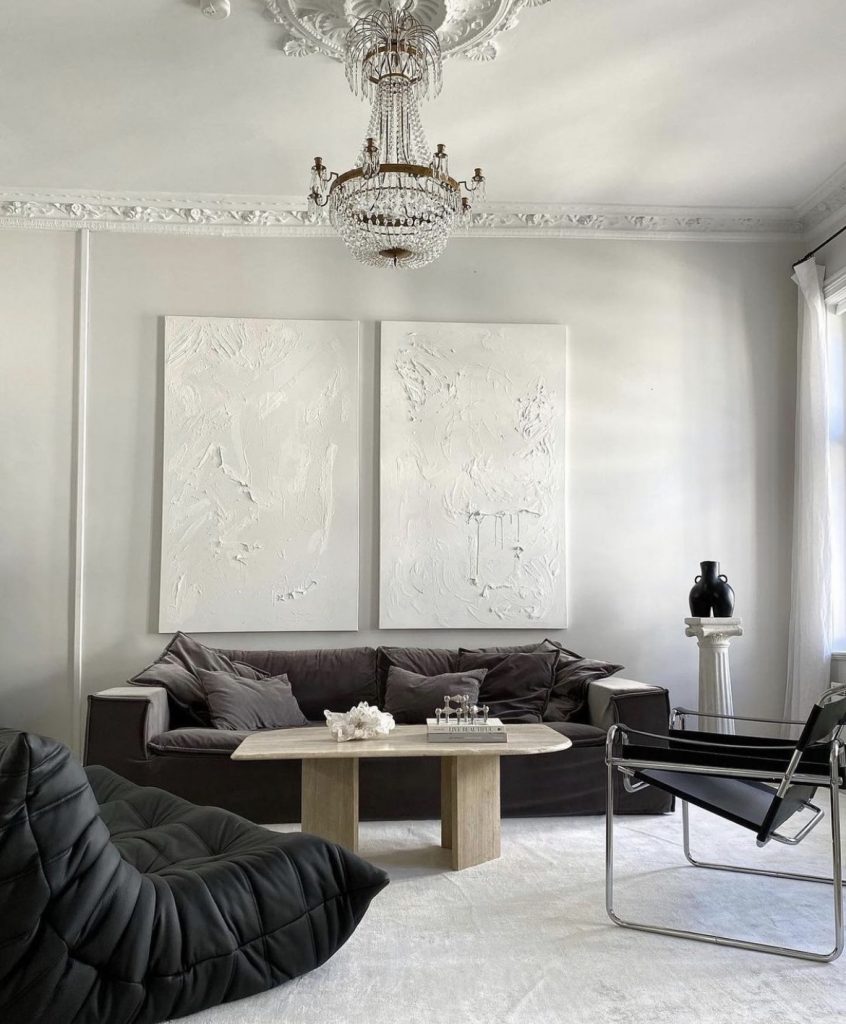
And a fourth reason designers use rugs is to enforce a monochromatic look which, as you can see in the first picture, is so effective and really draws the eye.

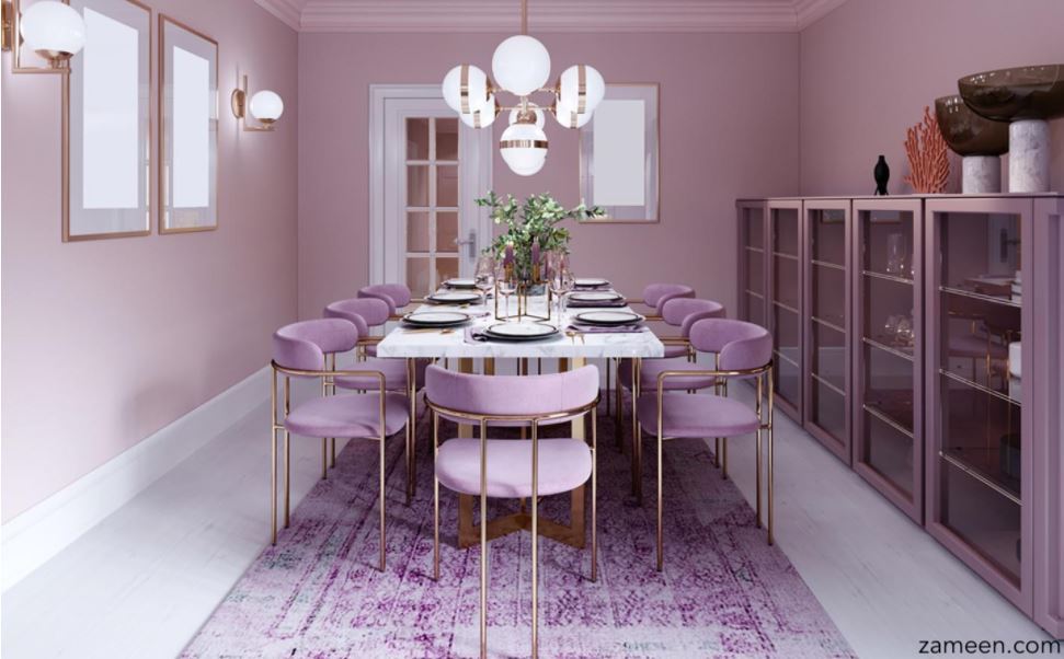
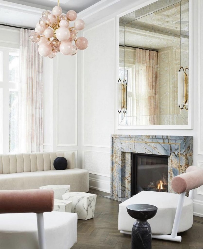
If you look at the photo above, you’ll see the rug is the color of lavender, the walls are lavender and the chairs are upholstered in a lavender velour. This is a great way to achieve a unique and monochromatic look by emphasizing color.

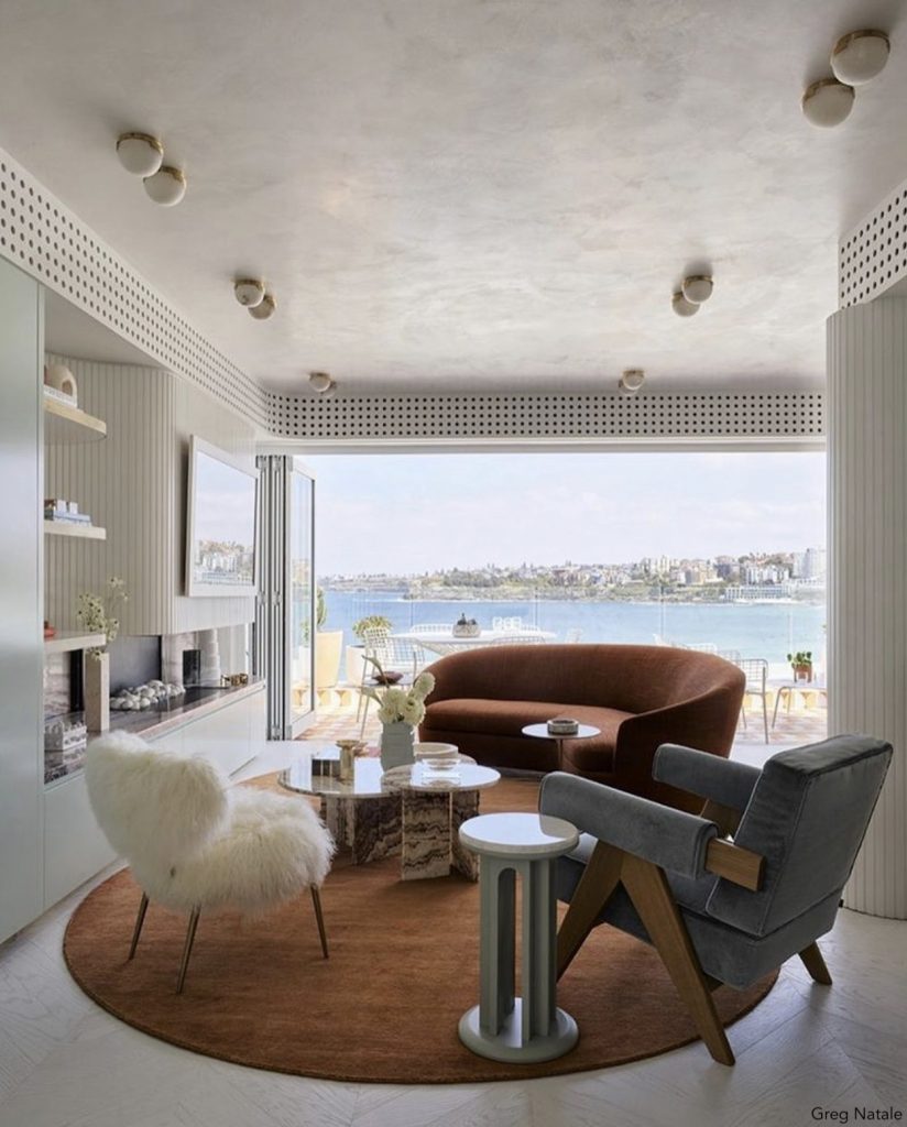
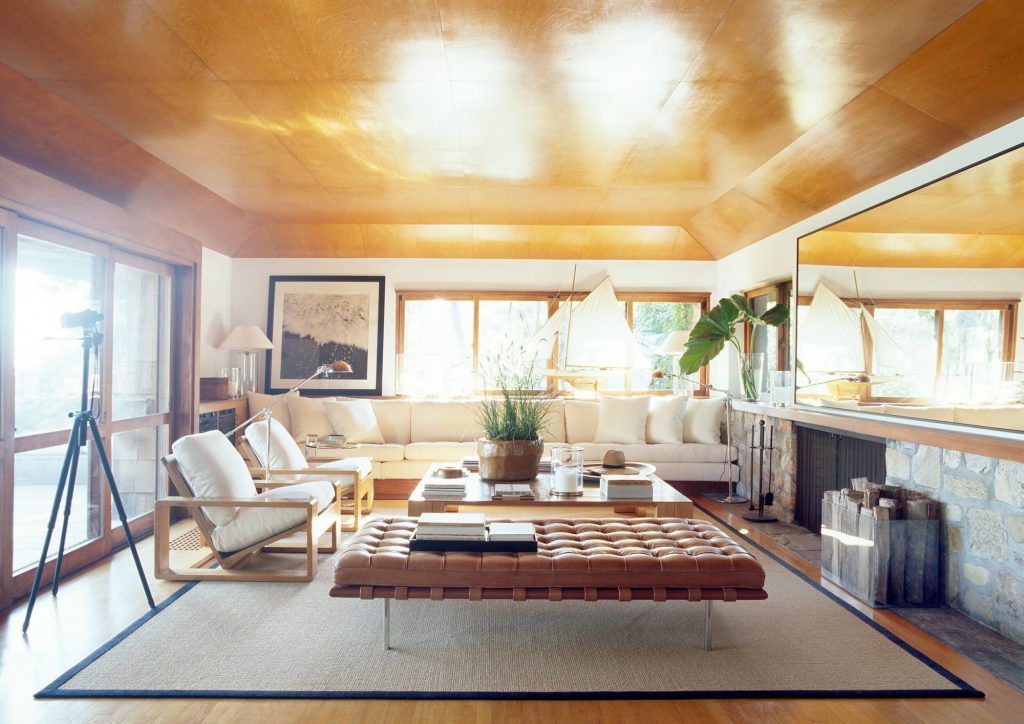
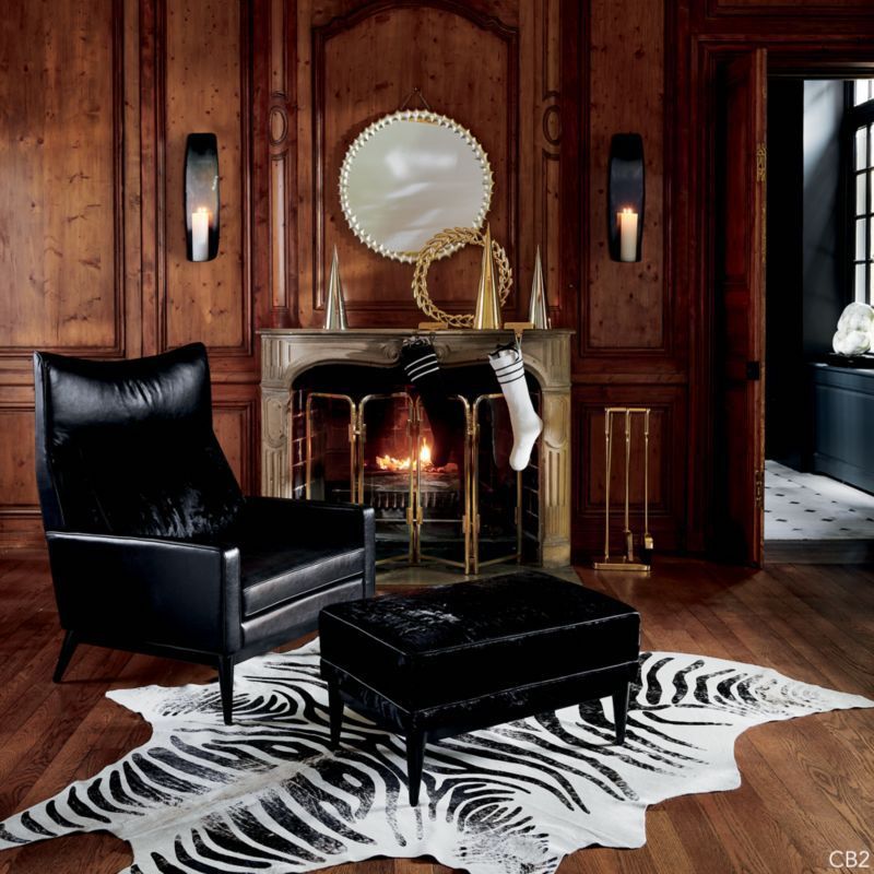
In this next photo, you’ll see a round, chocolate-colored rug with a chocolate-colored loveseat, a gray chair, and a white chair. This is an example of how you can be a little playful with your design, all the while having the rug there to define the area and what it’s used for. Imagine if the rug wasn’t in the room and all you had were these random pieces of furniture sitting about. The space would not look cohesive. So for those of you who wonder whether you should use a rug or not, my take is always yes, yes, yes. If you have hardwood floors or other flooring that allows you to use a rug, I would definitely use one.

Carpets vs Rugs

A lot of people ask me whether I prefer wall-to-wall carpeting or rugs, and my take is that they have different functions. For me, wall-to-wall carpeting looks great in certain spaces, in a home theater for instance. Here, carpeting is critical to muffle the sound. Another space where carpeting would be useful is in the primary bedrooms where wall-to-wall floor coverings are more popular. My vote is to do area rugs in the bedrooms because it allows you to change things up design-wise in the future, which you certainly can’t do with wall-to-wall carpeting. However, the disadvantage of doing that is that the bedroom doesn’t feel as cozy. A lot of people want that feeling of comfort a carpet can give when they are walking back and forth to the bathroom in the middle of the night.

When considering wall-to-wall carpeting, however, you need to keep in mind that for those people who have allergies or asthma, especially someone who’s sensitive to pet dander and dust mites, it can be dangerous. Carpet attracts a lot of dust and is far less easy to clean than hard-surface floors. You can remove dust mites by vacuuming regularly but you won’t truly get rid of them without frequent cleaning. Another negative with wall-to-wall coverings is that moisture and bacteria can get into the carpet before you realize it and start to create mold. So even though wall-to-wall carpeting is more economical, I vote that you stay away from it unless it’s for a very specific purpose.

Size, Furniture Placement, Rug position  

    People ask me a lot about what size rug they should be looking for. The good news is that most area rugs come in standard sizes: 3 feet by 5 feet, 5 feet by 8 feet, 8 feet by 10 feet, 9 feet by 11 feet, and 12 feet by 15 feet. That makes choosing one a bit easier! I’ll be linking some of my favorite rugs at the end of this post to help guide you as well.

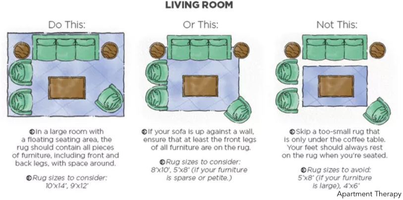
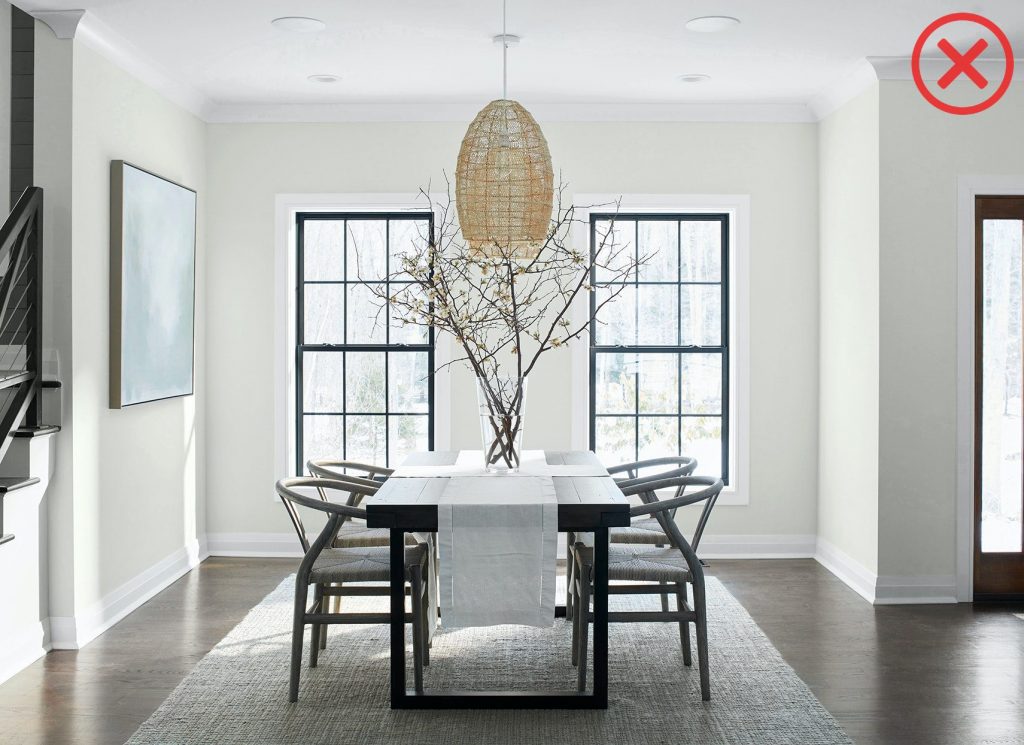
     This diagram demystifies the question of furniture placement and shows you what to do – and what not to do. On the left, you’ll see living room furniture that is sitting on a rug that is either 10 by 14 or 9 by 12.  All the legs of the furniture pieces are on the rug. The ensemble looks great and is the preferable option. In certain instances where budget is a concern and you need to get a slightly smaller rug, or you happen to have inherited a beautiful rug that is a bit smaller, as long as the front legs of each piece of furniture are on the rug, you’re fine.

     Whatever you do, do not have one piece of furniture on a rug and all the others off of it as in this rendering on the far right. This is a big no-no.

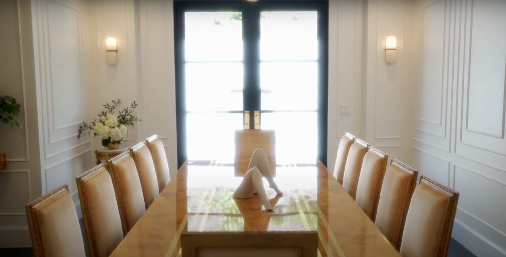
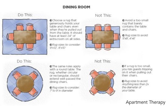
With dining rooms, the concept is the same. If you can, have all your pieces of furniture on the rug. And remember that your guests will be pulling their chairs out so allow for a big enough border around the table. Now, if your rug is smaller, you have a problem. Especially in dining rooms.  You don’t want two legs of a chair on the rug and two legs off. Nobody likes wobbly chairs and the layout doesn’t look good.

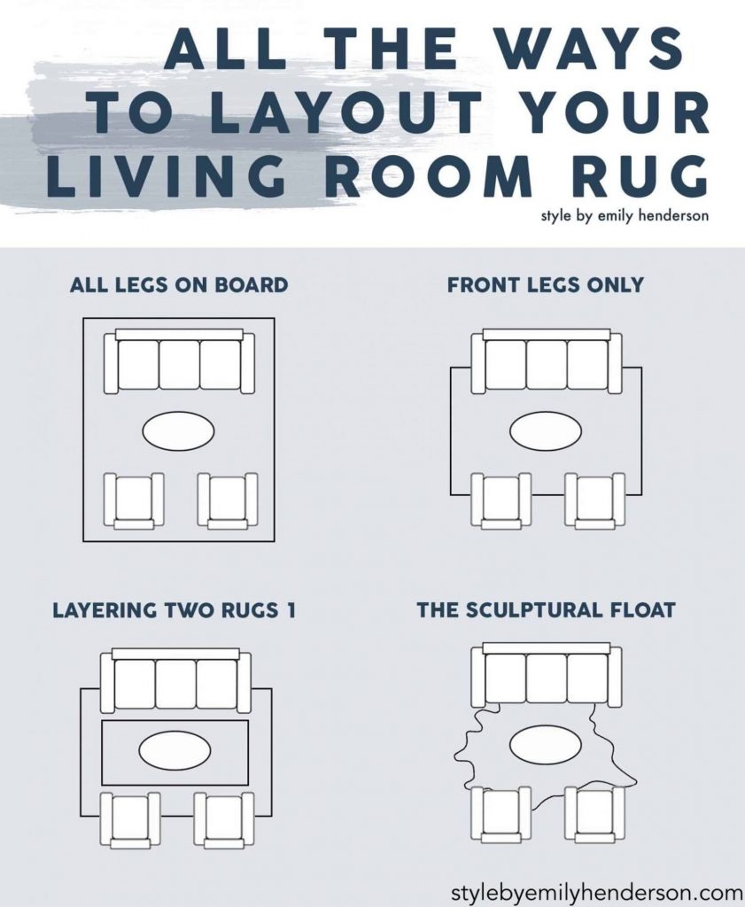
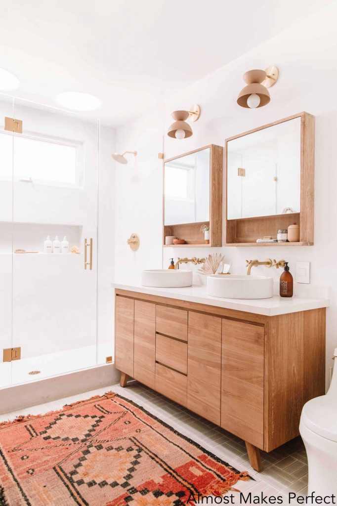
A rug can be placed vertically or horizontally. There are no hard-and-fast rules about that. But the best way to decide which direction to take is to consider the shape of the room. I would always use the longer size of the rug against the longer side of the room. Layering rugs can be lots of fun, too. The sculptural float is one of my favorites. This is when you can bring a cowhide in to create a beautiful, sculptural area.

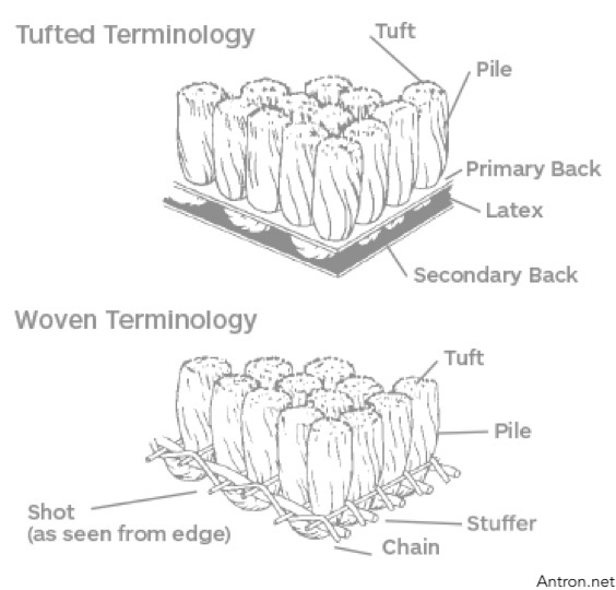
Pile: Cut versus Loop

Another question I get is whether you should get a loop or cut rug. A cut pile is a sheared rug with the endings exposed. A loop rug is made of a series of loops. A cut pile rug is cheaper and easier to manufacture but the loop is more durable because the tips are not exposed. Durability and economics are important so if you can find a loop rug you can afford, that would be a better choice. As for pile height, I like loop cuts that are flush to the floor, maybe half an inch. There are also rugs that are a combination of cut and loop pile and they give a lot of texture to your room.

New in Rugs/Carpets

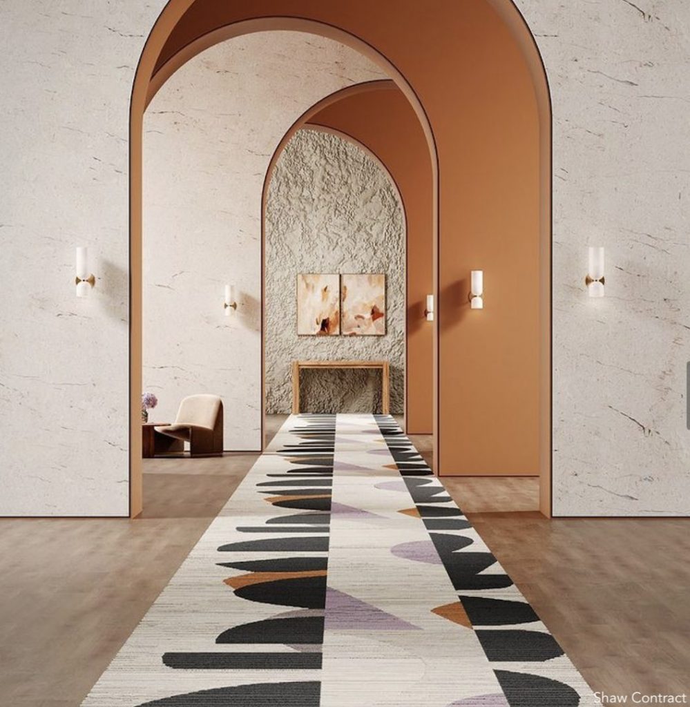
A new form of the rug is emerging that you may or may not have already heard about, and that is carpet tile. You’ve probably seen it in big box stores like Ikea. Instead of buying a large piece of carpet, you buy carpet tile in squares or hexagons or herringbone and then assemble them together.

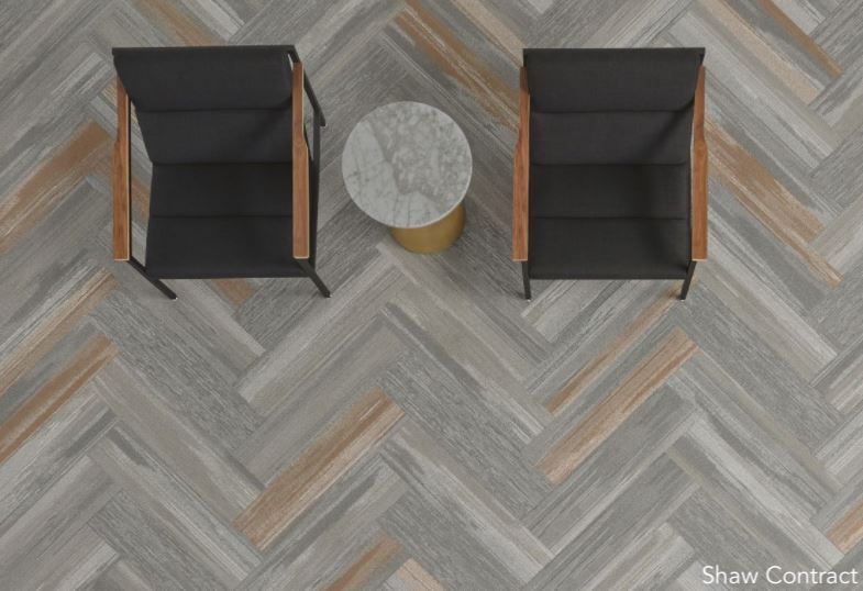
There’s a big advantage to doing this because if you spill a cup of coffee or some jam or mustard on the carpet that leaves a stain you know will never come out, with this option you just take those stained pieces out and insert fresh, new ones. In the past, carpet tiles haven’t been particularly aesthetically pleasing, but there are now some very stylish options available. For example, Shaw Contract offers some beautiful carpet tiles that feel very fresh and modern.

Cleaning

What type of carpet cleans easily and what doesn’t? Synthetic materials like faux silk will stain easily and the stain will be very difficult to remove. If you want something from which stains can easily be removed, you have to get a rug made with natural materials like wool or real silk.
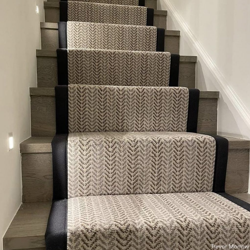
Carpet on Stairs

You should probably consider carpeting your stairs for three reasons: it protects from falls, muffles sound and preserves the hardwood underneath. There are two basic choices in the style of the runners. I prefer the “Waterfall” method, where the carpet, if it were liquid, would seem to be falling down the stairs. It involves bringing the carpet over the edge of the tread and straight down the riser to meet the next tread without molding it to the riser.

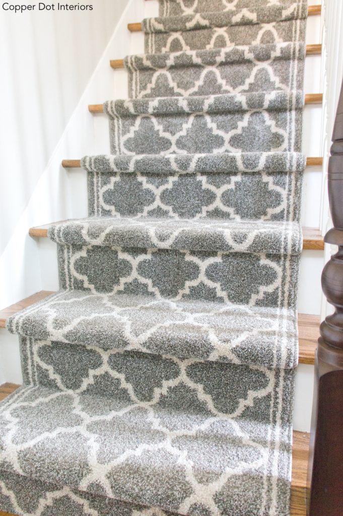
If you have a bullnose edge that protrudes, then you’ll have to do the more tailored “Hollywood” style where the carpet is tacked down directly to the staircase and wraps around the bullnose.

I hope you enjoyed this deep dive into rugs and carpeting! There are so many beautiful options out there, the possibilities are truly endless. Whether you decide to keep it traditional and timeless or get creative with an edgier modern vibe, the perfect carpet or rug can serve as a room’s fabulously impactful finishing touch.

Decor

Holiday Gifting with Italic

I did a video about Italic products in July and the response was so great that when Italic reached out again about doing another video, I said, “Yes!”

     There are a couple of reasons for that. First, it’s the holidays and I’m always at a loss as to what to buy people, and second, I just love the fact that you can get products at a high level of quality for a great price. With Italic, what you’re getting is items made by the same manufacturers that typically make products for the high-end brands (for 50 percent to 80 percent off what you would normally pay in all those swanky stores). And they’re making products without a label for smart people. Like us. We don’t want to overpay for things, but we want quality. Under this business model – direct to consumer – we’re not paying for marketing, the label, storefront, or employees.

         (By the way, I’m offering $30 off your $100 minimum purchase of Italic products when you use the coupon code: Nina30).

     I use Italic products at home. I have their silverware, knife sets, and more.  And their packaging is great. Since you have to give gifts during the holidays, and presentation, in my opinion, is 50 percent of the gift, why not give them something that comes in a chic, white box? Simple but elegant.

      I’m going to start with these Shearling Lane shearling tread moccasins. The quality bars none, the suede is ultra-soft and the cozy lining makes them perfect for winter. Packaged beautifully, they are a sure win.

      The next great gift idea is these Grecian marble serving boards made by Mutou, which also make items for Williams Sonoma and Crate & Barrel. They’re super heavy and come in round and rectangular shapes. They look expensive and they are, if you were to buy them from a fancy store. But with Italic, you can access them at a truly affordable price. Mutou also does a set of marble coasters for Italic, which make a great Christmas present.

     If you don’t know what to give the teachers in your kids’ lives, or perhaps you have employees or need a hostess or house-warming present, these are the best candles ever.  And yes, they are made by the same folks who made candles for Hermes. I’m not kidding.

The box they come in is sturdy and heavy, and the candles smell great with fragrances like Oud and Rosewood, Lilac, Jasmine and Sandalwood, and Black Currant Bergamot. The latter one might just be my favorite. Not only that, the candles are made of vegan wax set in recycled glass. They look great and as far as gifts go, they’re a no-brainer.

   Nobody loves towels more than I do. If you opened my linen closet, you would be perplexed as to why there are so many towels. But I continue with my love affair with them and love these Serene cotton towels made by one of Italic’s largest manufacturers, Terry & Loop, which also makes towels for Calvin Klein and Lacoste. They are made of 100 percent fluffy Australian cotton, come in three sizes – bath, hand, and wash – and make a great Christmas present. After all, who doesn’t need fresh new towels?

      Next, if you’ve ever had the experience of staying at some of the top-of-the-line hotels like the Ritz-Carlton and the Four Seasons and loved sinking into their soft-as-a-baby’s-bottom Frette sheets, these sheets on the Italic site are made by the same manufacturer, Slumber.  They have one elegant blue stripe, are a hundred percent cotton percale, and are soft, thick and the height of luxury. I can’t sleep in synthetics because I get hot and sweaty. In this household, the kids, everyone sleep in 100 percent cotton. And these are the bomb. And who doesn’t want to refresh bed linens for the new year?

     Slumber also makes a great version of another item that I love gifting at Christmas time: a robe. They are a cotton blend and have attractive contrast piping. Best of all, they have big, deep pockets in which to stash your cell phone, keys, and more.

      This last item I got for myself. It was very selfish of me because I was meant to get gifts for other people, but I got very excited when I saw these boots from the same manufacturer who makes Uggs. They have that great fur lining that keeps your feet toasty but, most importantly, you can get them on Italic for a fraction of what you would normally pay.

      Happy Holidays to you all!

Decor

Chic Holiday Decor

Let’s face it: Holiday decorations can be a bit gaudy. All that glitter and tinsel is just too much. And don’t even start with those teddy bears in holiday sweaters sitting on a mantel. 

What to do? Never fear. I’m here to steer you from garish to gorgeous with a few simple ideas that will make your house look its very best this holiday season.

Because everyone’s house is different, I’m going to concentrate on three major themes that you might want to choose from to decorate for the holidays: traditional (which, by the way, is not your grandmother’s idea of traditional), minimal/modern, and whimsical – a fun, out of the box décor I’m hoping you’ll enjoy.  

In terms of traditional décor, I like to bring in traditional elements but have them dispersed and presented as you see in these photos. In the first one, you see that the home is not overly cluttered yet has elements of traditional décor within the space.

Part of what makes home décor traditional is bringing in vintage or heirloom pieces. I love decorating my tree with pieces my kids, who are now grown up, have made over the years. When you do that, it adds a warm spirit and a lot of history to your home, and I encourage you to do that, and to do it plentifully…but, only on the tree. (This way your home won’t look like a DIY project!)

When it comes to holiday decorations a la Nina, I would like you guys to start using asymmetry in your décor. This will make your rooms look very elevated and chic. If you look at the room in this picture with the navy wall backdrop, you can see the design elements are asymmetrical. You’ve got a big magnolia tree/branch on the mantel which doesn’t have a twin on the other side. And you have an uneven number of these beautiful stockings. The look just gives a sense of design that a lot of people really lack when tackling traditional holiday décor. And by the way, you have all of these things already. There’s no need to spend a lot of money. Just styling what you have in the right way will make a huge difference.

Another way to approach traditional holiday decorating that I love can be seen in the photo from top interior designer Bunny Williams. She has put together multiple pieces in different shapes and sizes but all in the same tone. She sticks with all the beiges and natural and neutral tones, and because of that, it allows her (and you) to go a bit heavier on the decoration, because a lot of different colors are not vying for the eye. The resulting look is very chic. 

Another elegant way to spruce up your traditional décor is to pay particular attention to your gift wrapping. This applies to all three themes of holiday decor but is especially important in traditional decorating. Your gift wrapping needs to be thought out carefully and thoroughly. If you look at the image, the wrapping on the gifts is very simple, but very traditional and chic. I recommend  buying coordinating wrapping papers – maybe pick one or two colors and then one or two ribbons – and keep to those. Essentially, make the gifts almost part of the décor. If you have to buy all these presents and spend all that money you might as well integrate them into your home instead of placing them under the tree in an array of mismatched wrapping paper from various stores. 

Modern minimal décor is probably one of my most favorite things on the planet and can be applied to holiday decorating, too. Look at this photo from the Canada home of designer Gillian Segal. She has a gorgeous entrance with a very small table but it looks like a million dollars. It’s casual yet not fussy, the opposite of traditional. In traditional decorations, you often have a lot going on but here you can be playful, as she has been. You can have your gifts falling asymmetrically all over the floor, and this beautiful garland draped over the banister. It’s all done so artfully and is what I call perfection.

Dining rooms are the hubs of homes during the holidays so this is an important room that you must consider when doing your holiday décor. If you happen to have a dedicated room, even better, but if not, it’s fine to have dining space within another room and then go ahead and decorate the chandelier, for instance. If you do nothing else but the lighting for decoration, that is plenty and sufficient in traditional and modern décor. Buy a garland and some fruit and stick them stylishly into the chandelier. I know it sounds crazy but it’s going to look great.

One of my favorite sources for modern holiday décor is CB2. The brand is dialed in and you can’t go wrong with anything from their decorations chest. Look at this gorgeous room. You see small travertine tables and little Christmas trees. But are they really Christmas trees? No, they’re cement cones in the silhouette of a Christmas tree, and they look fantastic.

In this same picture from CB2’s catalog is a great idea for your ornaments, which is placing them on an existing tree in your home. If you don’t want to cut a tree or you don’t have time to get a tree, or perhaps you’re not religious or you’re of a different religion, maybe you want to put ornaments on a tree without having Christmas. This is a great way to do it. 

Not everyone has a grand, walnut-paneled room, but you can still hang up your stockings and then add some minimal décor. In this image, for instance, you have a round mirror above the fireplace. If you place a round wreath that layers over the mirror, then you’ve just created Christmas with your own items.

For a whimsical look, there’s Boho Chic. I especially love it because it’s probably the most difficult for me to execute so I do appreciate it when it is done artfully and correctly.

For instance, look at this fun pink Christmas tree. You can create one. Why not? Why should everything be green and red and boring? So do a pink Christmas tree. Add fruit to your chandelier garlands, add fresh flowers to your tree.

These are all really fun looks.  They don’t have to be featured everywhere, but maybe play a little with colors.

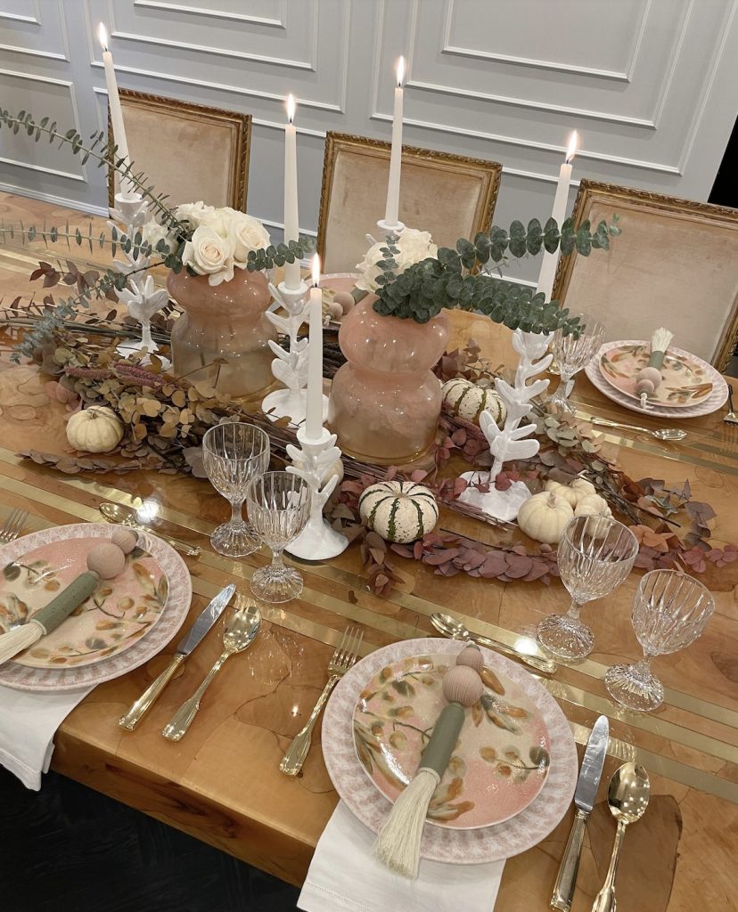
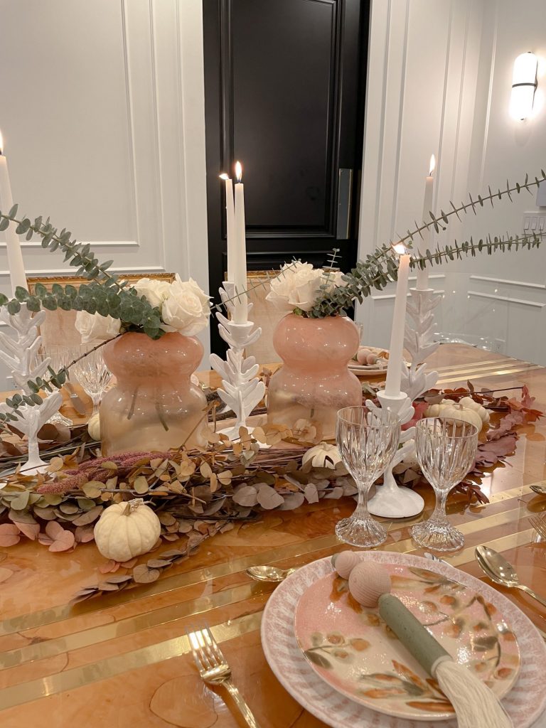
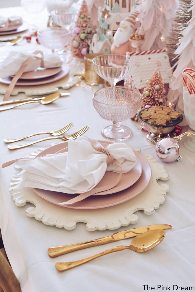
Pick hues that are a little bit out of the ordinary to create what I call the pastel whimsical Christmas look. And again, don’t forget the dining room. Just look at this how pretty this pink Christmas dining tablescape is!

The best part? It’s unexpected and you’ll win the star for originality.

Check out some of my favorite holiday picks below and even more in the new Holiday section of my affiliate shop. Happy decorating!

Decor

Mirrors vs. Medicine Cabinets

Oh, that old stalwart, the medicine cabinet. Big, bulky, easily chipped and often builder grade, it’s not anyone’s favorite. It’s convenient and good for storage. But that’s about all it’s good for. Right? But while many of the generic medicine cabinets out there are cold, clunky and lack any style, there are actually some beautiful options today that can look elegant in a variety of bathrooms. And though decorative mirrors are still a favorite amongst many interior designers (myself included), there are some medicine cabinets on the market that give those tried-and-true mirrors a run for their money. (Or, you can always build  your own!) So, with that said, which route should you choose? Let’s break it down.

     If you absolutely have to have a medicine cabinet, you can either easily build one with your contractor, or find one ready made. These days, there are several medicine cabinets out there that function well, look great and don’t remind you of your first basement apartment bathroom in who can remember where.

      The first thing you want to consider in a primary bathroom is space. This bathroom, which I love, is fairly large and therefore has the sufficient cabinet space needed in order to forego a medicine cabinet. This means that you can do a gorgeous gilded mirror on the wall because chances are you have enough room for your medicines and so on. In this pink bathroom, however, you can see that there is virtually no counter space and therefore a medicine cabinet is a must.

Here, would be a good time to consider your routine. If you have a ten-step skincare routine like I do, you’re going to want a medicine cabinet because otherwise, with all the cosmetics you use daily, everything will just become cluttered and one big mess. If you’re more of a minimalist, such as those who hardly wear makeup because they’re naturally fabulous, then you can store the few things you need in a drawer and use a drawer organizer so you can find them easily.

Because medicine cabinets often serve as the only mirror in a bathroom, they are inextricably linked with mirrors, which themselves play a huge decorative role in bathrooms. If you have a smaller bathroom, you often have to choose between the two. A mirror like the one you see here in this bathroom by The Pink Pagoda, is ornate and unconventional, a shape you can have when you don’t need a medicine cabinet. It lends a bit of glamour and really dresses up your space.

This is an example of when design supersedes (it shouldn’t, but it does) basic use, so if you have a bathroom that you really want to have an impact, mounting a bold, asymmetrical modern mirror that stands out from the rest of the bathroom can have a really wonderful effect.

In this marble bathroom with its marble drawer fronts and oblong oval mirrors, even the mirror surrounds are made of marble so it’s going to be very hard to turn them into a medicine cabinet. In these instances, you can’t place a medicine cabinet in that space.

For an ultra-modern bathroom where you want to use modern shapes, whether it’s hexagonal or round or highly asymmetrical, if you have a mirror that is clean and minimal with very little profile, definitely use that. It will give you that elevated look you’re looking for in your bathroom.

Building your own medicine cabinet is another option and surprisingly easy.  Try to think outside the box, and plan for it in advance when you have the ability to use CAD files, or have a good carpenter and contractor. This way you’re able to do a recessed custom cabinet. All you need to do is create a niche in your drywall prior to finishing your walls. You’ll probably have to do double framing, which isn’t difficult to do, it’s just a little more labor. Once you have a double frame, you have depth and can cut out a niche by making the inset first and then adding a mirror with hinges. It’s a great way to get a custom look.

Here’s an example of an  attractive recessed cabinet. It’s by Arent & Pyke. It’s vertical, looks very stylish and gives you that clean line from the cabinet being set into the wall.

This design from Habitus Living incorporates a floating marble vanity and recessed cabinets that are essentially backsplash to ceiling, wall to wall, very clean and easy to do because all you really need are hinges. This is an A+ solution for those of you who don’t have drawers or other cabinets to store cosmetics. You literally cannot go wrong with this look.

If you can’t build a custom cabinet, there are some very chic, wall-mounted ones you can consider. If you look at this one used by Mim Design, you can see what I mean. This cabinet has both a right and left hinge and an attractive knob. It’s very elegant and looks extremely designer.

Or you can do something like Decus Interiors did: find a symmetrical, rectangular medicine cabinet and do cutouts of different mirrors and different shapes, and have  your mirror guy create it for you. This medicine cabinet features both a rose gold mirror and a classic mirror. It is a very elevated look and quite unique.

Wall-mounted cabinets can also have a beautiful profile, such as these used by Clare Kennedy. The sides are a gorgeous black matte, and what she has done is matched the black matte profile back to the faucet. This is a great way to introduce a particular metal that you can then echo in your medicine cabinet.

       Another option in wall-mounted medicine cabinets are the ones in this bohemian bathroom which is very on trend and very fun. These cabinets have a lip/shelf. Now, I know some people find this stressful because they’re not sure how to decorate a shelf that sits under the cabinet, but, if you have a decorative touch, this is a really good way to make your cabinet chic and impactful.

       I am not a barn door fan, but if you look at the cabinet in this bathroom by Catherine Kwong, there’s a certain something, a je ne sais quoi about it that actually works. So if you have a penchant for barn doors, chances are you might like this cabinet, which is Nina-approved.

        For the Virgo in you, (and me!) who loves to decorate and keep things highly organized and lined up perfectly like a supermarket, this medicine cabinet is for you. It features a sliding glass door across the cabinet and even though that means the cabinet needs to be meticulously organized at all times, there’s something cute about it. If you’re not a Marie Kondo type, you always have the option to slide the door to the right and keep the junk hidden behind it while displaying some of your more attractive cosmetic items, like perfume bottles, for instance, on the side that’s visible.

As you can see, there are so many beautiful options for both medicine cabinets and decorative mirrors. Check out some of my picks below to give your bathroom that special designer look!

Decor

My Favorite Paint Colors

One of the most fundamental design elements of any room is paint. It can literally transform a room from blah to beautiful. It can make a space appear bigger, brighter, cleaner and fresher and is the ultimate backdrop for how you design your living spaces. Wall color may go unnoticed much of the time, but it can play a large role in creating a successful room because walls, after all, are one of the largest structures in a room and the right – or wrong – color makes a huge difference.

The California Collection by Kelly Wearstler for Farrow & Ball

Interior designer Kelly Wearstler’s paint collaboration with Farrow & Ball was released recently and it’s great. Farrow & Ball is a high-end paint company that has very limited amounts of colors and selections and Kelly’s new collection is beautiful because she’s brought the California landscape into her paint colors.

Tar by Farrow & Ball x Kelly Wearstler

The colors are very moody and quite neutral with pops of bright color. I particularly love the Tar color that is almost black. It looks great in a room if you paint the walls dark and install white furniture. Another of Kelly’s colors I love is Stoke, a beautiful neutral gray. If you’re in search of a gray, this is a really good one to introduce into rooms that have very loud art or lots of color because it will neutralize your space.

Stoke by Farrow & Ball x Kelly Wearstler

One of Wearstler’s neutral colors is Salt, a very crisp white. It’s hard to find the perfect white so I do recommend this one. Another one is Sand, which is reminiscent of the sandy beaches of Malibu where she has a home, and really has a California vibe. It has a little yellow in it, which I like for those of you who have neutral furniture or a lot of ivory boucle, which is very on trend.

Sand by Farrow & Ball x Kelly Wearstler
Salt by Farrow & Ball x Kelly Wearstler

I mentioned that the perfect white is hard to find and it brings up something that wasn’t an issue in the past, but seems to be an issue now. Everyone is using white and they’re using white everywhere, which is great. (Historically white was not used because people assumed it was an apartment color.)  People are using white for walls, crown moldings, baseboards and so on. But there’s a problem. It’s a mistake to paint your walls one white and your baseboards and moldings and ceiling another white. That has to stop today! It’s the worst offense I can think of! You must paint your walls, ceilings, baseboards and moldings in the same exact shade of white.

What this means is you can have a different sheen. I like more of an eggshell for baseboards, ceilings have to have flat paint so you don’t get reflection and on the walls, use the sheen you typically use but the same exact white. This is so your room looks as if it is enveloped in the color and the different shades don’t throw you off. You don’t want to jump from a lighter shade to a darker shade to a really stark white to an off-white. That is painful to the eye. I painted my dining room in Simply White by Benjamin Moore, my favorite white neutral. It’s not too yellow, it’s not too blue, it’s not too gray and it’s not too white. It’s perfect.

Simply White by Benjamin Moore


      When you’re thinking about painting your walls, my recommendation is to always buy a one-quart sample that you can test in your room. I would buy three or four of your favorite colors that you think are going to look good in your space, and test them out as I did in my dining room and as I do in all my projects. We apply them to a wall and stand and look at them at different times of the day. The reason for that is that paint changes colors according to how much light there is in your room and which direction your room faces. You’re going to want to look at it in different lights so you can really understand whether it works or not.


Ammonite by Farrow & Ball

Other than Simply White, another favorite color of mine is Ammonite by Farrow & Ball. This is a really subtle color and acts like a chameleon in a room. If you want a little more depth and not just a neutral white, I like Revere Pewter by Benjamin Moore. This is also a chameleon-like color and what’s great about it is that it has warm undertones and a little bit of gray, so it’s a nice mix if you have anything in silver or you have warm tones in your room.

Revere Pewter by Benjamin Moore

Finally, another favorite color which you see all over my house is a perfect neutral, Super White by Benjamin Moore, which is a true paper white and can actually be mixed with other subtle colors. I would recommend only using one other color with theiswhite. For example, my baseboards and ceilings are all Super White and then I have a touch of color on the walls in my foyer. You can do this too.

Super White by Benjamin Moore on ceiling and staircase trim

Some painting tips:

~High quality brushes: Do not skimp out on the brush because it’ll affect your walls negatively. If your walls have a lot of texture, make sure you use a roller that has a deeper nap so it can get into all the crevices and serve up a more even paint finish.

~Prime:  prime all your walls before painting: It’s an additional step and more money, but worth it.

~Strokes: Remember to always start at the top and go down with the paint stroke.

~Open Windows and Doors: Keep all the windows and doors open so the paint dries and you have enough light. If worst comes to worst, get some of those big light projectors you can buy on Amazon that will illuminate the space. If you don’t have enough light you have no idea how you’re painting a room.

Oh, and have fun!

Decor

Refresh Your Living Room

     Sometimes, even the most beautifully designed living room begins to feel a bit stale. As a result, there are a lot of people out there who want to know how to update a living room without breaking the bank or doing a complete redesign. There are three main ways to do this, ways that will immediately make your living room look very current.

    The first way to do this is to bring in modern pieces. And by modern pieces I mean bringing in accent tables and cocktail tables, little modern items that, juxtaposed with some of your older pieces, really give your space a designer look. You can bring in tables like this white concrete one from CB2. These are great and can float anywhere in the room, either next to the coffee table or as a drinks table in front of the sofa.


      Another item I think makes updating easy and is not expensive is CB2’s Peekaboo Acrylic table, known as a ghost table because now you see it, now you don’t.  Because it’s transparent, it can float in the room without taking up permanent visual residency. So if you have an old weathered table, this could be a great replacement. Lastly, I love this particular table from 1stDibs, a black drinks table that can sit next to any of the pieces that you already have to refresh the room.

      Obviously the two examples of living rooms I’m going to give you are rooms that are already done, but notice how they each have a little modern marvel in them. In the first one you’ve got the modern Wassily Chair designed by Marcel Breuer in 1925. Inspired by the frame of a bicycle and influenced by the constructivist theories of the De Stjil movement, Breuer was still an apprentice at the Bauhaus when he reduced the classic club chair to its elemental lines and planes. 

    And in the second living room you have that modern marble cute side table. These are conversation pieces in and of themselves, so if you’re ever worried about what to do, just remove and then add. It’s fine to have fewer pieces. Fewer pieces are always better in my opinion and bringing in a couple of modern items can help you achieve the designer look.

    The next way to update a living room, and is probably my favorite of all possible updates, is to add a daybed. I love daybeds in living rooms, whether it’s a Mies Van der Rohe or one of the beautiful new beds just released by CB2. What a daybed does in a living room is bring a sense of luxury and comfort at the same time. It invites your guests to come in to lounge, but it also gives your room a very chic look. I put them into most of my clients’ living rooms because the rooms are large enough be able to handle a daybed and sofas in them. 

      Other options for daybeds is this striking one from Crate and Barrel. With a clean-lined frame wrapped in soft leather, and button-tufted by hand, it stands at the intersection of mid-century and today. 

      This is a very simple one, and then there’s the Jonathan Adler one that’s a bit jazzier, but certainly fun if you have a living room that has some brass in it. Take a look at decorator Daniel Romualdez’s living room in his Los Angeles home. This room has two of the items we talked about, a great daybed and those ghost chairs. So again, modern mixed with traditional brought together by a faux mink rug. This place is beautiful.

     My next very favorite living room has the best daybed in it, Mies van der Rohe’s Barcelona Couch which is also in my living room and in Ralph Lauren’s Montauk home. You cannot go wrong with this particular daybed. It’s literally timeless and looks good in every room and is the perfect item.

       Nothing makes a room come together or updates it faster than an accent chair. Any of those who know me know I have a collection of accent chairs. In fact my garage is filled with them. There are so many of them that it’s turned into a problem. However, if you don’t have the disease I do, you must start buying accent chairs because they will update your space in no time. You can place your accent chair next to a coffee table, across from your couch, in a corner and on one side of the fireplace.

      And you don’t have to use a pair of chairs, a one-off is fine. One beautiful chair. Take a look for example at this France&Son’s chair that I actually have in my beach house. It’s inspired by the mid-century modern armchair designed by Swiss architect Pierre Jeanneret. I’m sure you guys have seen it. They’re everywhere. They are wonderful and I have the outdoor version because it’s in a beach house. I just love it. 

     Also, if you can afford a real one, definitely go ahead and invest in one. 


     Another gorgeous chair that is pictured here is by Leanne Ford and comes from Crate and Barrel. It’s a real statement piece and if you have nothing in your room but this and a daybed you’d be done. People are going to be elated when they walk into your living room and see that. The chair’s playful proportions take shape in the ultra-slim black metal legs and oversized, tubular cushion that flows seamlessly from arm to back. 

      The last chair I’m proposing, from West Elm, is really beautiful because it has that leathery rich rust color and has its own ottoman. This piece would look great in any room. It could be in your living room – but don’t stop at your living room. Keep going, update it all. Bring it into your bedroom, your office. The piece is gorgeous and definitely gives you the update you’re looking for.


Shop the Post
Anthropologie
Decor

Celebrating Autumn with Anthropologie

I’m thrilled to finally be able to announce my Ambassadorship with Anthropologie. Getting to share with you my favorite selections from this season’s offerings at AnthroLiving that adorn my own home, feels like the greatest gift of the season. And creating a meticulously flawless fall tablescape is one of my favorite ways to transform everyday moments into special occasions and usher in the beginning of the season’s festivities.

My tablescape is a mix of muted earth-tones and lighter pastels punctuated with elegant splashes of white (candlesticks and roses) and gold (silverware), which reflects off the dining table as a warm glow and is the tablescape’s bling. I chose elegant chargers in the palest pink, and complementary pink Ismay plates to go on top. Carefully crafted from decaled stoneware, they have a Napa-inspired, floral pattern rendered in a painterly style that’s perfect for fall’s feasts. I also went for AnthroLiving’s pink, organically shaped, handcrafted glass Lyla Vases that are perfect for holiday bouquets and don’t take up much actual or visual space on your table.

My Flora Taper Candle Holders are whimsically delicate and have a floral finish. Who knew glass isn’t the only option for candlesticks?! These beautiful pieces are made of hand-cast aluminum, brass and engineered wood and would look great anywhere in your home grouped together as a mini-collection.

I laid thick, luxurious white linen napkins under the chargers leaving the top of the Ismay plate open for AnthroLiving’s Serenity Scented Tassel in sage. I know it is not the traditional use for a tassel, but I thought it might be a fun way to dress up the table and perfume the air with delicious fall scents of juniper, sage, smoky hickory and blackened birch. I also used mini white pumpkins and a spray of dark green leaves in a nod to the darker tones of autumn.

Remember: when you are creating your own tablescape for the upcoming holidays, always go first with what you like, what looks pretty to you. Be confident in your choices. Pink is not a color associated with Thanksgiving or Christmas, but look at how effective it is in the table’s mix of dark and light colors.

Wishing you the best of the season’s festivities!

Shop the Post
Anthropologie