So many of you have asked what I do for skincare, so today I’m at my vanity in my glorious LilySilk pajamas with not a lick of makeup ready to tell you. The number one thing that you have to remember is that maintaining great skin begins with you. What you put on your skin, how you sleep and what you put in your body are vitally important.
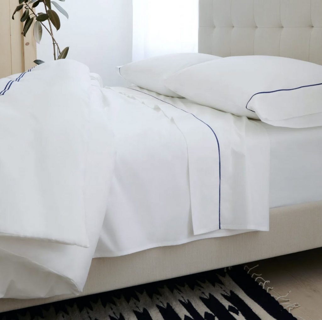
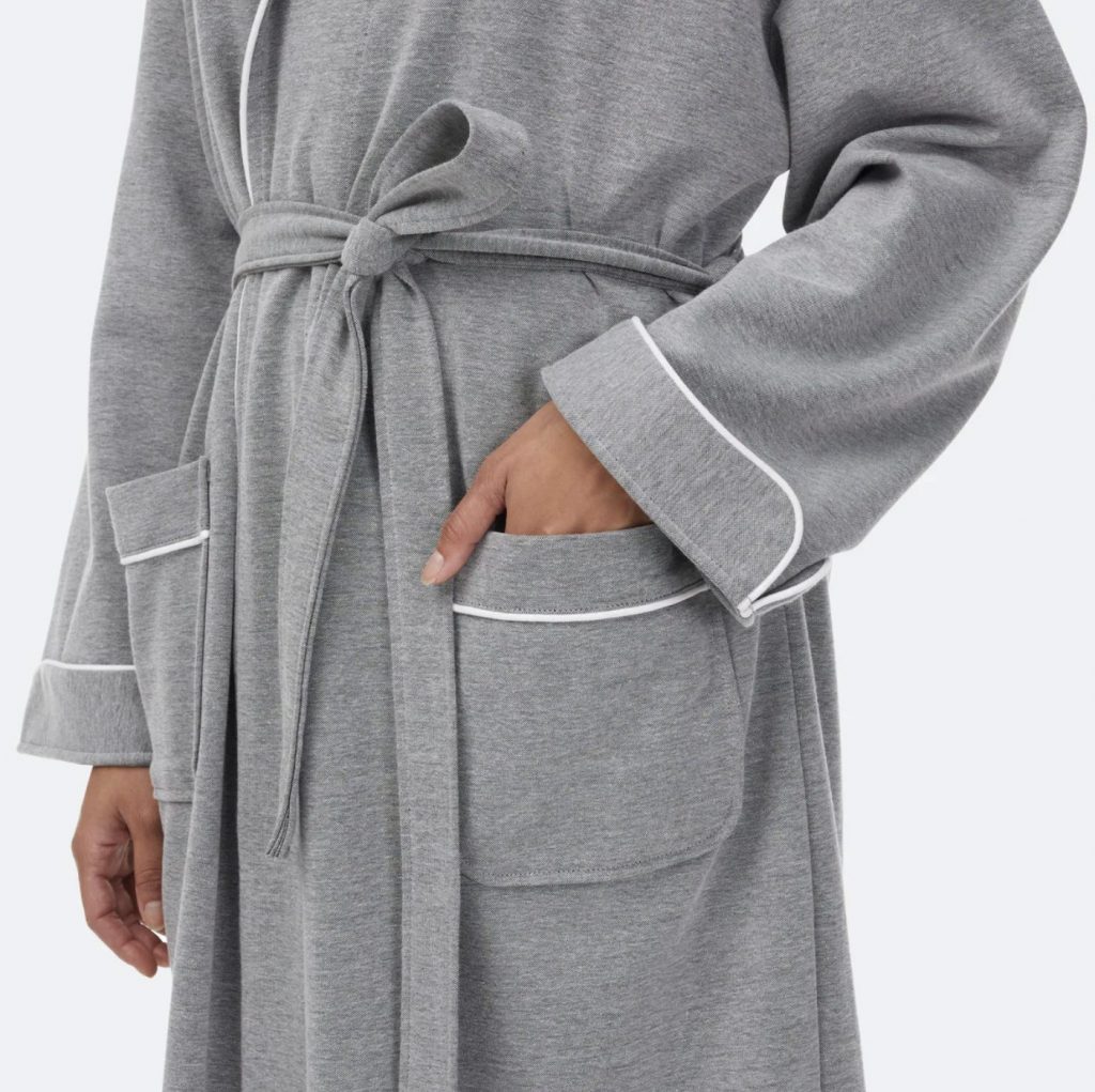
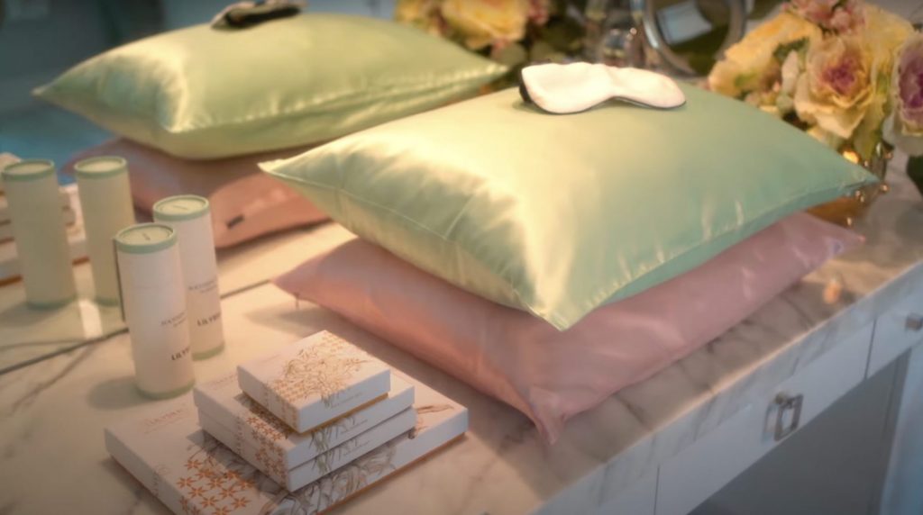
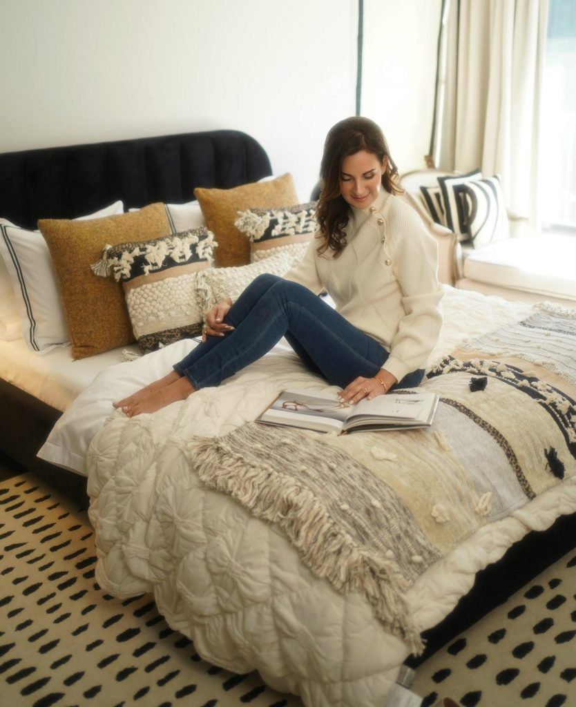
 For sleeping, I love LilySilk products. The quality of the silk is high with all items from the company made with mulberry silk, the finest silk out there. And I only sleep on LilySilk pillows. Why? Because I don’t want to get wrinkles on my face! I’m not going to spend all this money on creams and forget where I’m putting my head. Silk truly helps prevent wrinkles on your face.
 That’s because unlike cotton, which absorbs moisture from your skin, thus exaggerating wrinkles and fine lines, silk doesn’t suck up moisture at all. Silk pillowcases or pillows also provide a smooth surface for your skin whereas cotton pillowcases tug at your face, scrunching the collagen and causing sleep lines to appear. And that’s not all. Sleeping on silk battles frizz and bedhead and thank heaven for that!
Don’t forget that this particular silk is hypoallergenic so that means you won’t have bacteria brewing in your pillowcase and getting into your face and making you break out. So it’s worth the investment.
So, back to skincare. This is absolutely what I do every morning and every night, and I want to show you the process step by step because these secrets shouldn’t just be mine. They should be yours, too.
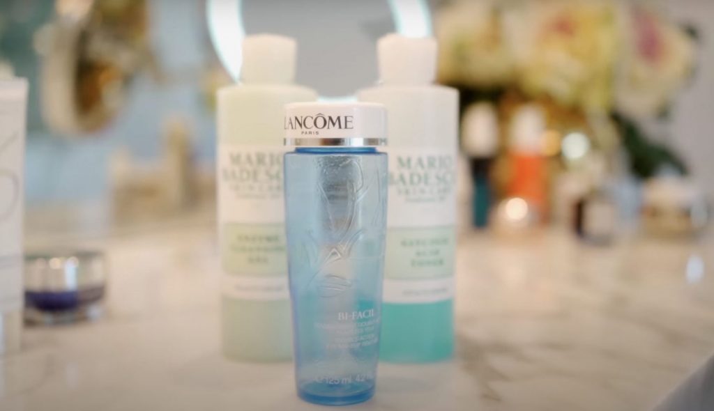 At night, for cleaning off my eye makeup I use my tried and true Bi-Facil Eye Makeup Remover by Lancôme, which I think I’ve been using since college. I have tried so many products, but this is literally the only one I’m going to recommend because it has the perfect amount of oil to water to product, so it moves the eye makeup seamlessly without leaving any residue. And additionally, it doesn’t blur your vision like a lot of other eye makeup removers which leave a lot of oil on the eyelids and eyelashes.
I get a lot of compliments on my skin and that’s because I take very good care of it and have been doing so since I was a teenager. I’ve always used sun protection, even when it wasn’t cool, and always followed my three-part makeup removal system, which has actually turned into my eight-part makeup removal system. But we won’t get into that! Just know that it’s imperative to take your makeup off every night. During the day, your skin attracts dirt and pollution which stay around until you wash it off. When you cleanse your face thoroughly, you get rid of impurities that can cause problem skin. And clean skin when sleeping also allows cells to regenerate.
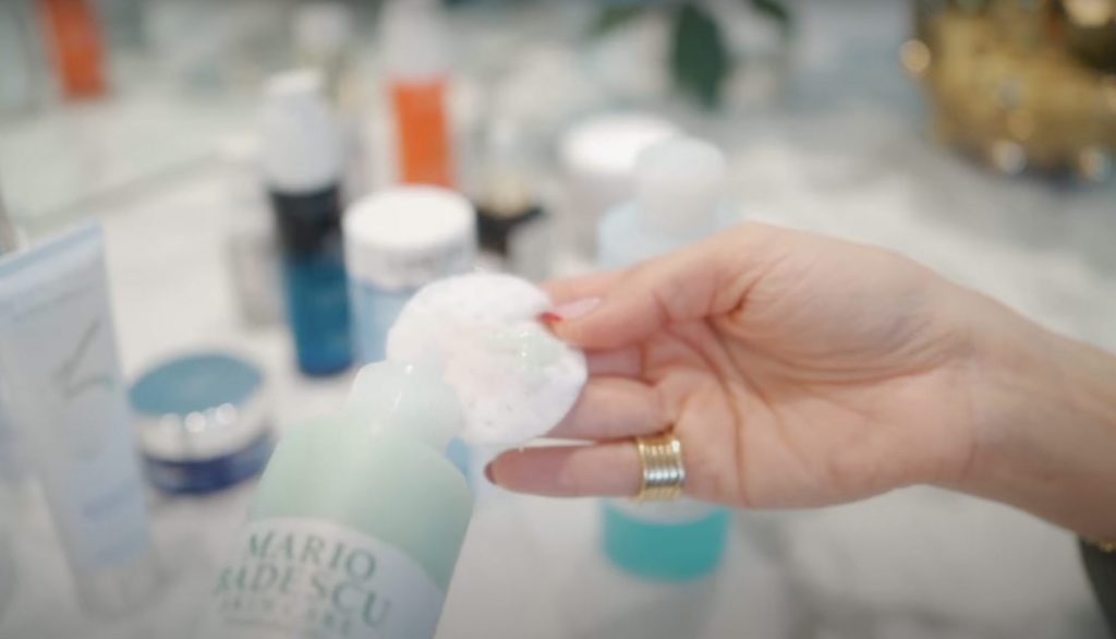
The next thing I use is my enzyme cleansing gel from Mario Badescu. You can use almost any gel or cream cleanser, but I love the Badescu because the price point is good, it’s made of all-natural ingredients and I don’t break out!
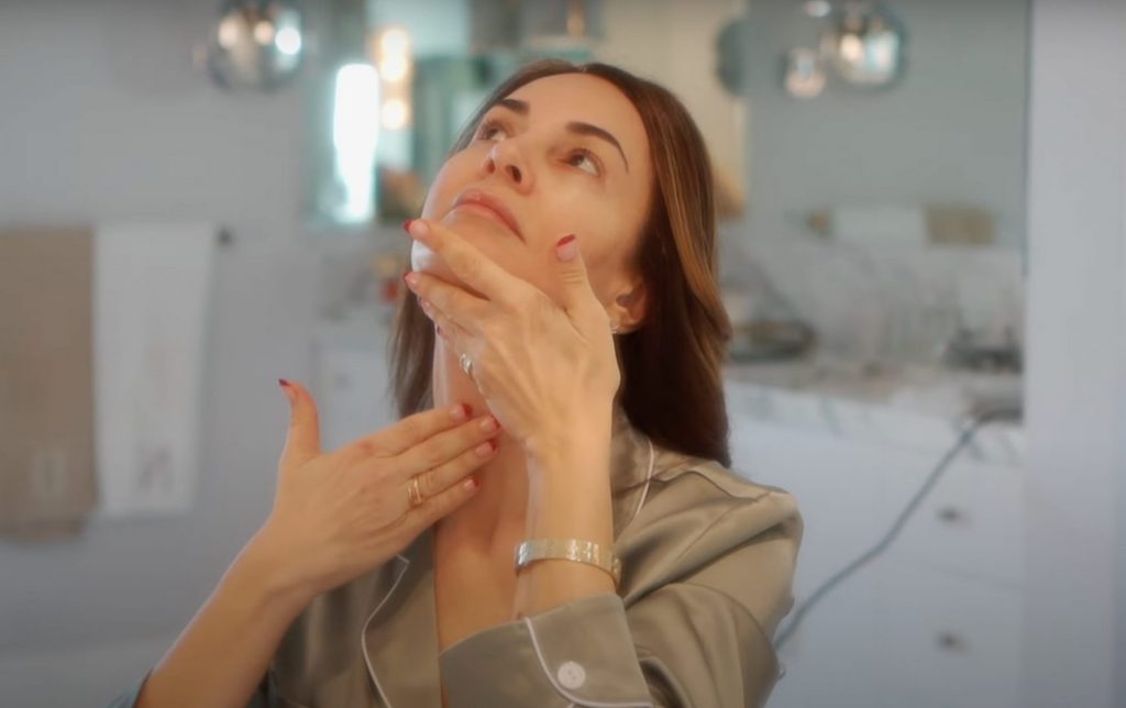
When you remove your makeup, you always want to go in an upward motion. Why? Because gravity is not your friend. It’s already pulling down your face. Don’t help it along! Give your face a lift, instead. Make sure you clean every corner and angle of your face and don’t forget the neck. You’re going to thank me in your 40s and 50s that you took care of your neck.
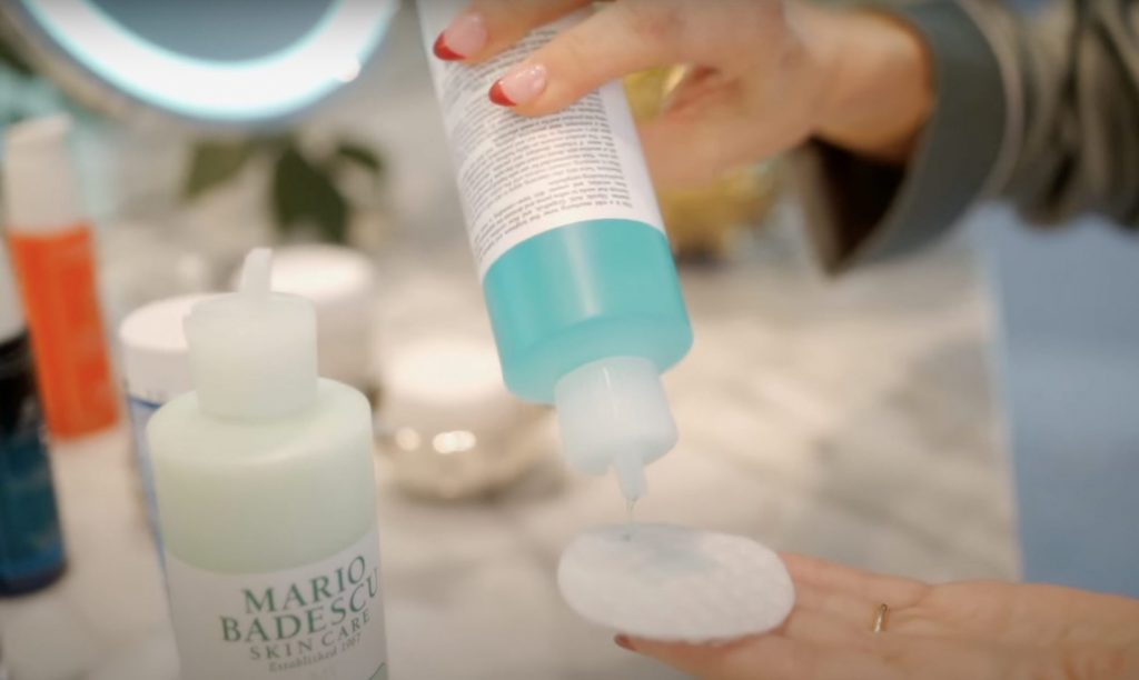
Once all makeup residue is removed from every area – your hairline, near the ears – I use a toner. Believe it or not, as much as you think your face is clean, it isn’t. Once you use a toner you’ll see. It takes away all the grime that’s at a deeper level.
Again, I love the Mario Badescu glycolic acid toner. I’ve used the Lancôme toner and love it equally, so it really depends on your skin type which toner you choose to use. The Badescu one is very natural and affordable. I don’t care really about the brand for toners because you’re only cleaning your face, you’re not nourishing the skin. The product is not working to fight aging. Once my face is clean and toned, I then move into the cream and nutrition section of caring for my aging skin.
If you buy nothing else, you need to know that you need Vitamin C. It’s an antioxidant that helps protect your skin from free radicals in the environment, sneaky terrorists that can break down the DNA that keeps you youthful. You also need to know, however, that with Vitamin C, packaging matters. Even the best formulas can quickly oxidize and become unviable if exposed to sunlight. Your Vitamin C serum should be in an airless pump container, or an opaque or tinted glass bottle stored away from light. My Vitamin C comes in a pump. If you have calibrated droppers of Vitamin C, throw them out. They’re useless. I use Sunday Riley C.E.O. 15% Vitamin C Brightening Serum, and what’s great about it is that it has a good amount of Vitamin C. You always want to know what percentage you’re getting and you should aim for one between 10% and 20%.
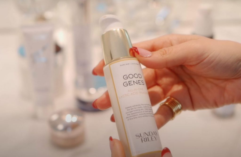
My next must-have item is also by Sunday Riley and is called Good Genes. It’s an all-in-one lactic acid serum that works on dark spots, smooths the look of lines, exfoliates dullness, and clarifies congested skin. It also has licorice in it, which is known to do wonders for the skin. Between the lactic acid and the licorice root, you’re getting a mini exfoliation while you’re sleeping. One pump is enough. I warm it up in my hands a little and apply it using the same motion that I’ve already talked about. Apply it everywhere, but don’t go near the eyes with any of these products.
After Good Genes, I use Sunday Riley’s A+ High-Dose Retinol Serum, which is a blend of retinoids and retinoid alternatives that fight aging and improve the look of congested or UV-damaged skin. It also has CoQ10 in it, along with Hawaiian white honey for an even-toned complexion, and whenever I put it on, I can immediately tell it’s working because my face and neck start to tingle.
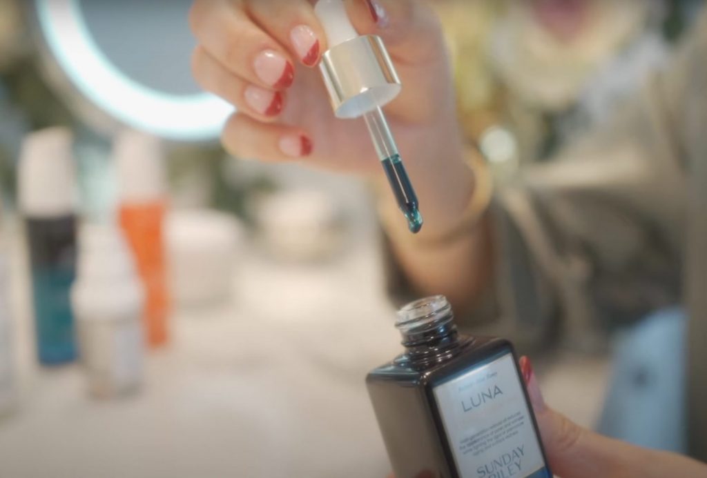
Then I apply a tiny dab of Sunday Riley’s Luna Sleeping Retinoid Night Oil, which helps your dead skin to peel off revealing new, more even-toned skin by morning. I know this is a lot of products here but it all works. Remember to apply it to all areas of your face. When you do, your skin starts to radiate. You could actually go to the Oscars now!
The last thing I do, which is something you all should get in the habit of doing, is to use eye cream. I use Sunday Riley’s Auto Correct which is meant to reduce the appearance of dark circles and puffiness. Don’t forget to wash your hands before applying any eye cream because you have a lot of acidic products here and you can’t transfer any of those to around the eyes. Warm it up and dab it on with your fourth finger in a circle around the eyelids. Don’t go too close to the eyelid because you don’t want to get product in your eyes.
Thank the lord that my morning routine is quick because I’m always in a hurry to get to my workout, Pilates, which I do three times a week.
First, you have to clean your skin in the morning, even though you feel like you cleaned the hell out of it the night before. And for that I use ZO Skin Health pads. They’re expensive guys, but they work. Take the pad and clean the entire surface of your face and neck. On the cotton, you’ll see dirt from everything that happened to your skin during the night.
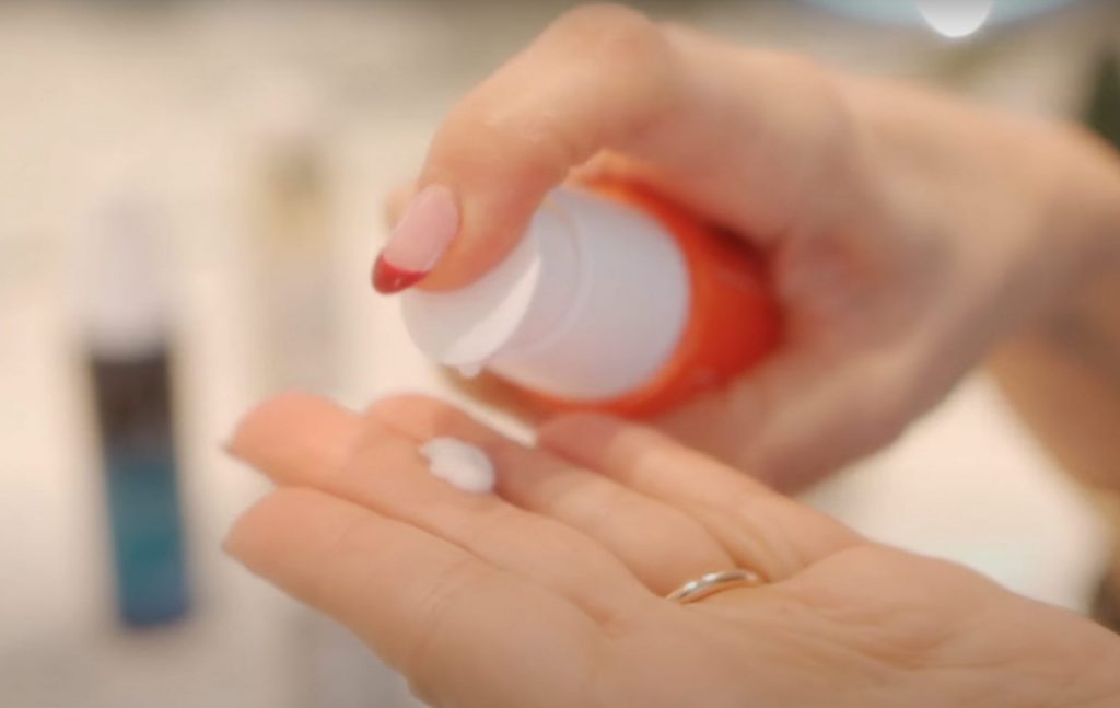
Then I put on my Vitamin C, and my ZO Skin Health Daily Power Defense, which is worth its weight in gold and might just cost that much too, because it’s so expensive. This product is a miracle. I mix it with sunscreen. Don’t ever forget sunscreen! Right now, I’m using Blue Lizard Sensitive Mineral Sunscreen SPF 50+. I like zinc in my sunscreen and this one doesn’t dry out my skin as so many sunscreens do, and it doesn’t have that terrible odor. I put a tiny drop of my Power Defense in the Blue Lizard and rub them together. Zinc does leave a residue, so mix the two products well and then massage them in.

The last thing I do, and this is my most favorite product of all time, is put on Shiseido’s Benefiance Wrinkle Smoothing Eye Cream. I dab it on and I’m gorgeous and ready for makeup!


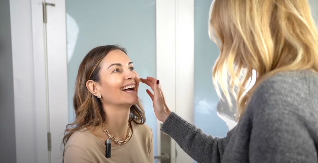
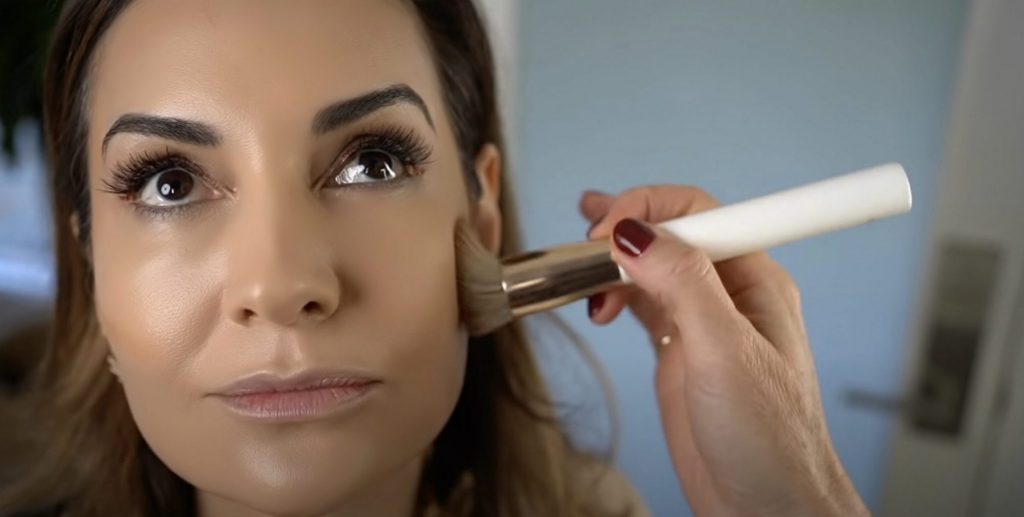
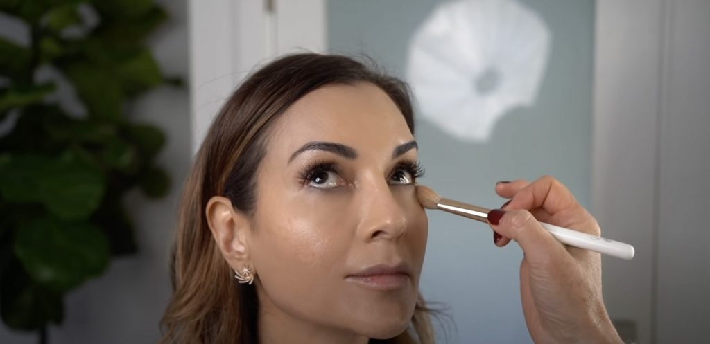 Monika then applied contour with a darker shade of her Blunder Cover Foundation. She picked up the color on the angled edge of the brush and drew it gently just underneath my cheekbones for more definition. She also lightly brushed the cover foundation on my forehead and along the chin below the mouth.