One of the most fundamental design elements of any room is paint. It can literally transform a room from blah to beautiful. It can make a space appear bigger, brighter, cleaner and fresher and is the ultimate backdrop for how you design your living spaces. Wall color may go unnoticed much of the time, but it can play a large role in creating a successful room because walls, after all, are one of the largest structures in a room and the right – or wrong – color makes a huge difference.
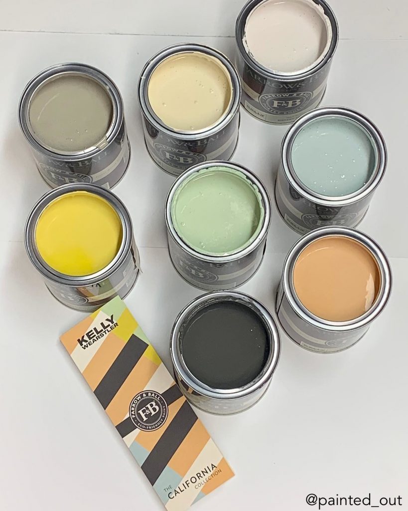
Interior designer Kelly Wearstler’s paint collaboration with Farrow & Ball was released recently and it’s great. Farrow & Ball is a high-end paint company that has very limited amounts of colors and selections and Kelly’s new collection is beautiful because she’s brought the California landscape into her paint colors.
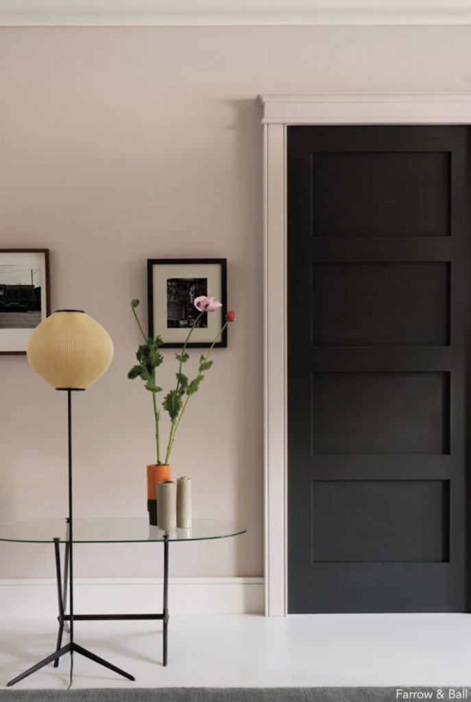
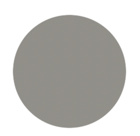
The colors are very moody and quite neutral with pops of bright color. I particularly love the Tar color that is almost black. It looks great in a room if you paint the walls dark and install white furniture. Another of Kelly’s colors I love is Stoke, a beautiful neutral gray. If you’re in search of a gray, this is a really good one to introduce into rooms that have very loud art or lots of color because it will neutralize your space.
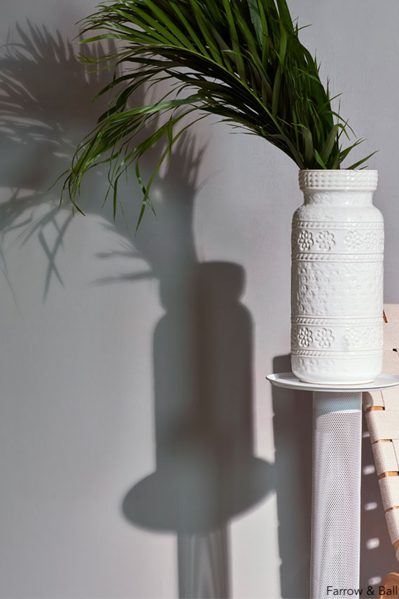
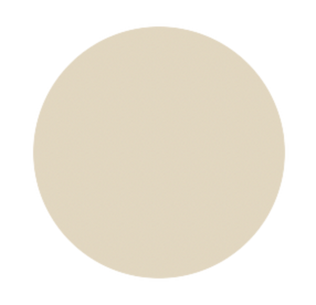
One of Wearstler’s neutral colors is Salt, a very crisp white. It’s hard to find the perfect white so I do recommend this one. Another one is Sand, which is reminiscent of the sandy beaches of Malibu where she has a home, and really has a California vibe. It has a little yellow in it, which I like for those of you who have neutral furniture or a lot of ivory boucle, which is very on trend.
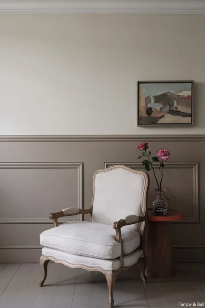
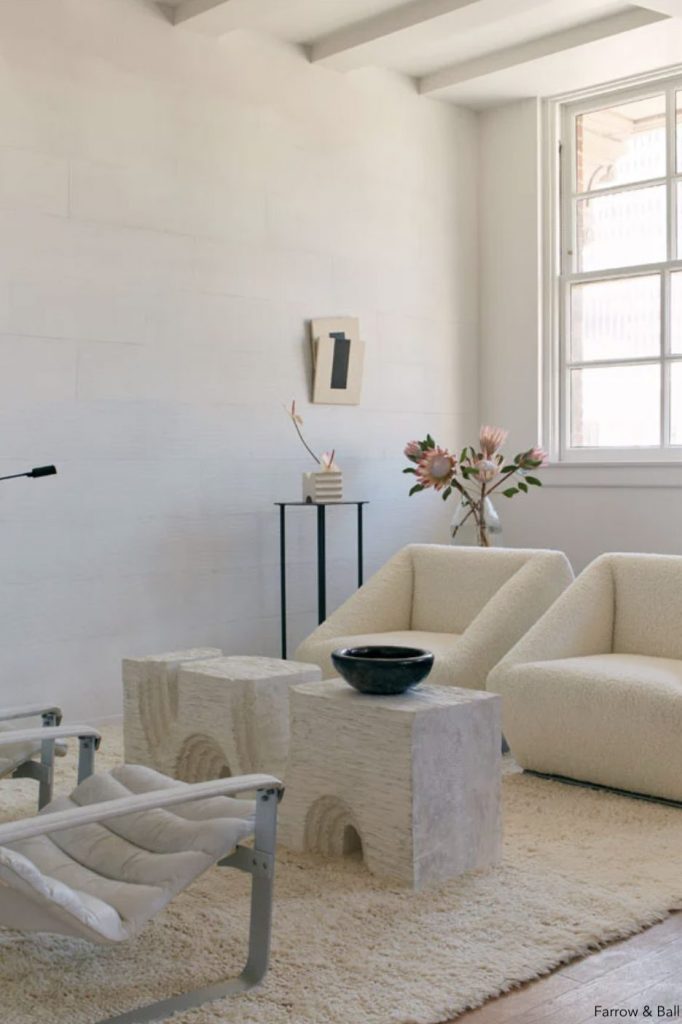
I mentioned that the perfect white is hard to find and it brings up something that wasn’t an issue in the past, but seems to be an issue now. Everyone is using white and they’re using white everywhere, which is great. (Historically white was not used because people assumed it was an apartment color.) People are using white for walls, crown moldings, baseboards and so on. But there’s a problem. It’s a mistake to paint your walls one white and your baseboards and moldings and ceiling another white. That has to stop today! It’s the worst offense I can think of! You must paint your walls, ceilings, baseboards and moldings in the same exact shade of white.
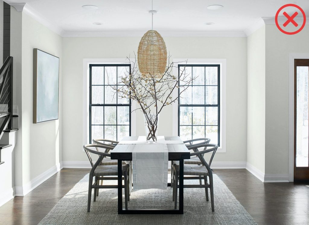
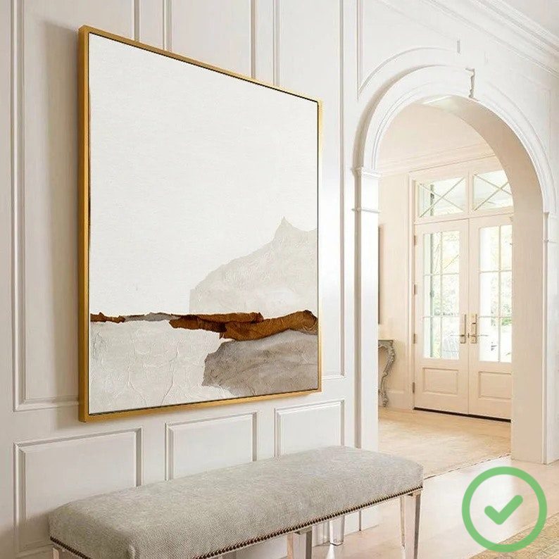
What this means is you can have a different sheen. I like more of an eggshell for baseboards, ceilings have to have flat paint so you don’t get reflection and on the walls, use the sheen you typically use but the same exact white. This is so your room looks as if it is enveloped in the color and the different shades don’t throw you off. You don’t want to jump from a lighter shade to a darker shade to a really stark white to an off-white. That is painful to the eye. I painted my dining room in Simply White by Benjamin Moore, my favorite white neutral. It’s not too yellow, it’s not too blue, it’s not too gray and it’s not too white. It’s perfect.
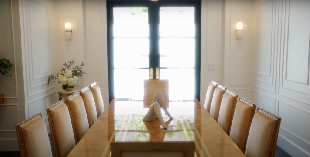
When you’re thinking about painting your walls, my recommendation is to always buy a one-quart sample that you can test in your room. I would buy three or four of your favorite colors that you think are going to look good in your space, and test them out as I did in my dining room and as I do in all my projects. We apply them to a wall and stand and look at them at different times of the day. The reason for that is that paint changes colors according to how much light there is in your room and which direction your room faces. You’re going to want to look at it in different lights so you can really understand whether it works or not.
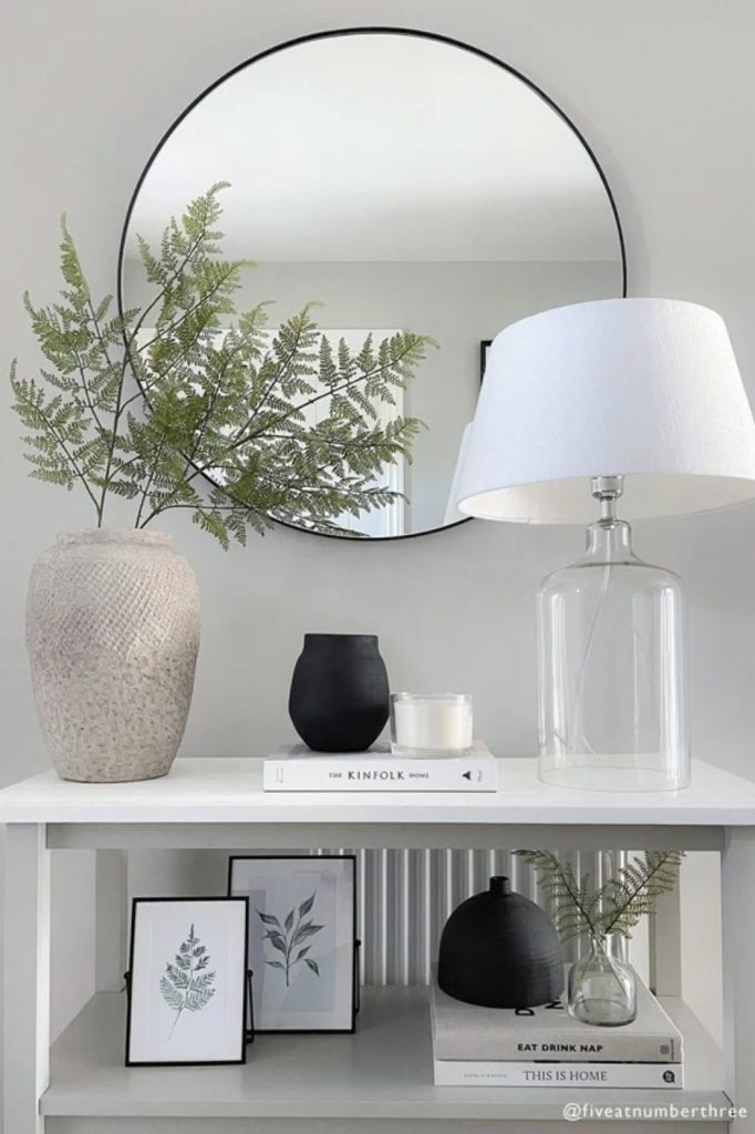
Other than Simply White, another favorite color of mine is Ammonite by Farrow & Ball. This is a really subtle color and acts like a chameleon in a room. If you want a little more depth and not just a neutral white, I like Revere Pewter by Benjamin Moore. This is also a chameleon-like color and what’s great about it is that it has warm undertones and a little bit of gray, so it’s a nice mix if you have anything in silver or you have warm tones in your room.
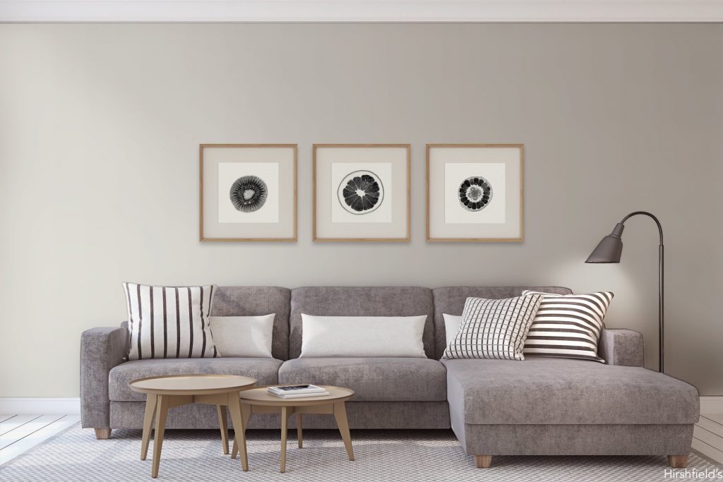
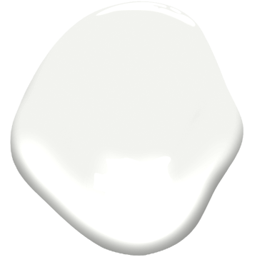
Finally, another favorite color which you see all over my house is a perfect neutral, Super White by Benjamin Moore, which is a true paper white and can actually be mixed with other subtle colors. I would recommend only using one other color with theiswhite. For example, my baseboards and ceilings are all Super White and then I have a touch of color on the walls in my foyer. You can do this too.
Some painting tips:
~High quality brushes: Do not skimp out on the brush because it’ll affect your walls negatively. If your walls have a lot of texture, make sure you use a roller that has a deeper nap so it can get into all the crevices and serve up a more even paint finish.
~Prime: prime all your walls before painting: It’s an additional step and more money, but worth it.
~Strokes: Remember to always start at the top and go down with the paint stroke.
~Open Windows and Doors: Keep all the windows and doors open so the paint dries and you have enough light. If worst comes to worst, get some of those big light projectors you can buy on Amazon that will illuminate the space. If you don’t have enough light you have no idea how you’re painting a room.
Oh, and have fun!

