I recently put in a new built-in bookcase in my den, and I wanted to show you how it turned out. Built-in bookcases are instrumental to room architecture. They give a space depth, definition, style, and personality, while also providing extra storage. (Never a bad thing.) And because of that, they can increase a home’s value. (Also, never a bad thing.)
And they’re not just for books. Collections and objets d’art that you love can take center stage on shelving, allowing you to see and live with all the items that you treasure daily.
I love my built-in. It took me forever to commit to putting it in. But, like you, I struggle with what to do, how to do it, when to do it, and I’m thrilled with the way it turned out. That’s because, as you know, once you have a built-in, it’s there to stay. You can’t take it with you to your next home, so make sure this is something you can live with forever.
A lot of detail went into my bookcase’s design and installation. A skilled carpenter first and foremost installed it. The cabinet door fronts are made with flat MDF (medium-density fireboard), necessary to get you the right finish. Then we applied a unique molding called “The Nina” because I did design the blade myself. If you’re in Los Angeles, you can have this made by me, or you can certainly try and mimic it because who are we kidding here? It’s not like I reinvented the wheel. This molding is a specific one that I love and designed, and many ones are similar to this. What’s important to note is that this molding is no more than half an inch at maximum. You don’t want to go more than that. And it was cut linearly and applied after the fact, on top of the MDF. Then was cut right in the middle, and everything was painted on site. What I love about these particular cabinet fronts is that they look like a molded wall. I wanted the cabinets to feel very natural in place, and I also wanted them to have a clean look, so there’s no hardware on them. I didn’t want to eye to be interrupted as it looked at the built-in.
The paint we used here is the same as the wall color because I wanted the piece to feel like a Parisian apartment and have it blend in. It’s a Benjamin Moore paint with a satin finish and doesn’t have a sheen to it, which I like. It’s easily cleanable and feels very smooth. One note on that: make sure your painter sands down the built-in over and over again before painting. That way, you’ll get a smooth finish.
I applied the same baseboard, which runs all through the living room onto the built-in to flush with the wall. It looked as if it had been part of the den for years. The baseboards are 7.25 inches high throughout the house, so I had the piece built with an eight-inch base and then ran the baseboard on top of it.
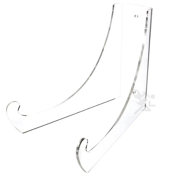
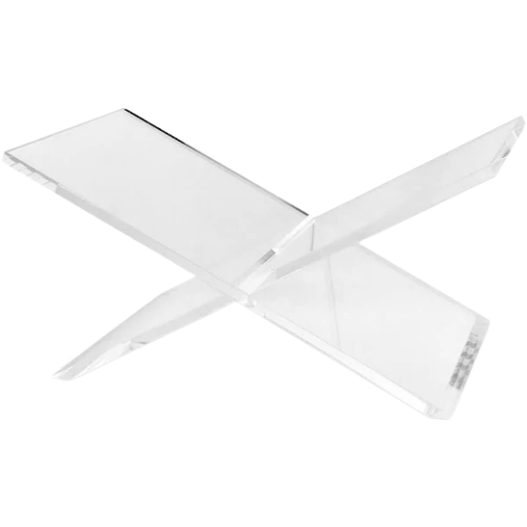
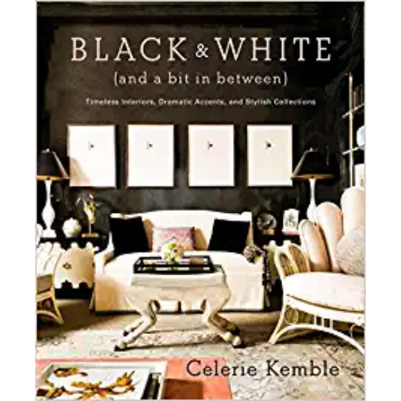
I styled these shelves to take some of my favorite books, remove all the dust covers, and then select which ones I would use by color. I know many people don’t like that idea and say books for reading, not for decorating, and that’s true, but these are all decor books. So in a way, I’m purposeful with my décor books. I want them not only to give me information about décor, design, and style from my favorite designers, but I also want them to look decorative. So it’s kind of a double entendre. For example, one of my all-time favorite books is one on Helmut Newton, a famous photographer. It comes with an acrylic stand, and having a book out on display with open pages looks excellent and allows someone to leaf through the book and enjoy it.
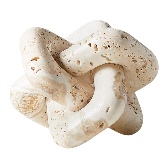
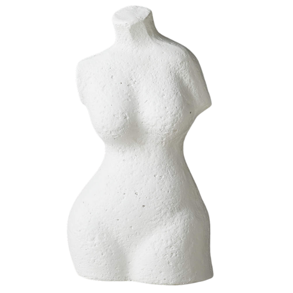
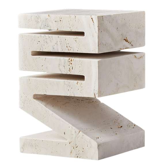
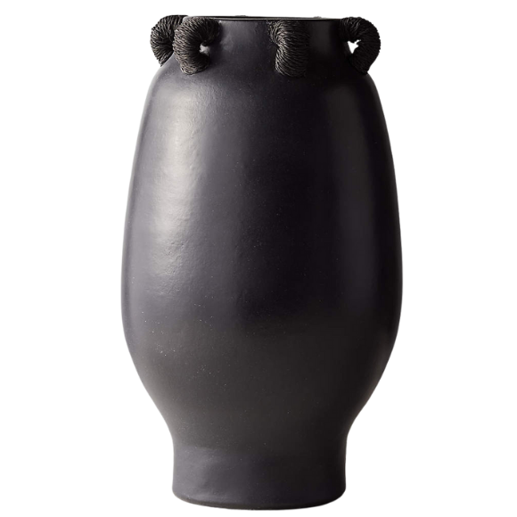
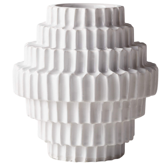
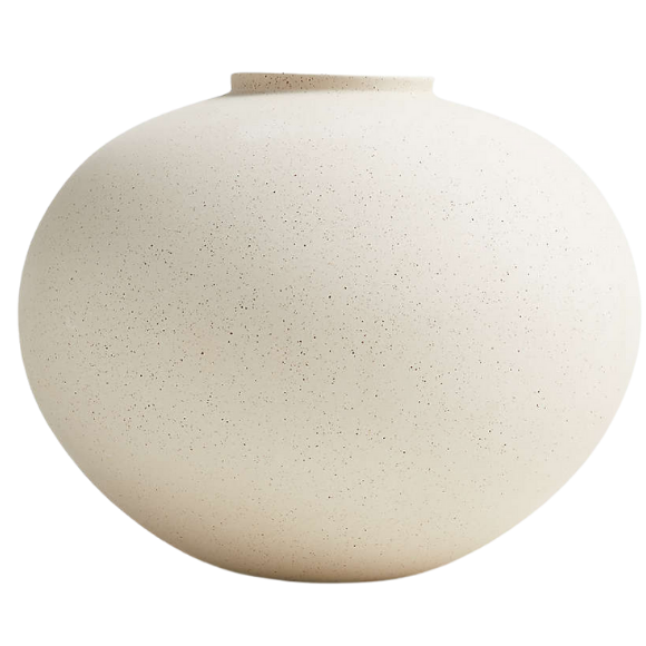
Except for three, all the items on the shelves are vintage pieces I purchased a month ago when I went antique shopping in Palm Springs. Palm Springs has many great old antique marts, and the pieces I got are beautiful. They have lots of gorgeous details: they’re glazed, pottery, handmade, and artisanal. So go to your local flea market or even look on eBay and find some glazed pieces in different shapes and sizes and display them on your shelves.
I placed these objects in a way that made sense and had some form of symmetry and balance. If I had a book with a sculpture on top of it, I placed a bowl next to it. You want to keep similar objects, like sculptures, a little distance from each other. You should put four to five books in each section and maybe place a decorative object on top of them. If I have a vase on one pile of books, I’ll put a plate on another.
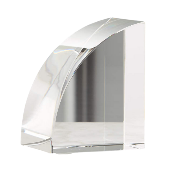
I put a very large antique glazed amphora here in the corner because the space needed the height, and next to it went a very modern acrylic bookend stand, which I already had. Then I stood up three of the books that mimicked the color of the amphora in the stand.
For some dimensions, my shelves are three and a half inches thick, the perfect thickness. I would have loved to have some LED light strips in here, but for some reason, I completely forgot to put them in. (This happens to me regularly, where I remember things for everyone but not for myself.) So if you can add lights, go ahead and do that. The depth of the shelves is nine and a half inches, and the depth of the main piece is 23 inches.
One last thing to mention is you should have a few little acrylic stands. They’re lovely for displaying and enjoying your pieces, and you can place them on top of a set of books for height and texture. Styling your shelves this way allows you to have the books you love and the objects you love in front of you forever.
